


34 → 90
164%Speed score improved, leading to a better experience for visitors and higher SEO rankings.
176%
Conversion rate boost
208
Reusable components powering a scalable design system
34 → 90
Website performance score boosted on Lighthouse testing
"Working with Grafit was exactly what we needed. They delivered on every promise - our performance scores went through the roof, traffic surged immediately, and we finally have a system that scales with our team. I'd recommend them to any tech company that wants to move fast without compromising on quality."

Mike Grabowski
Founder & CTO at Callstack
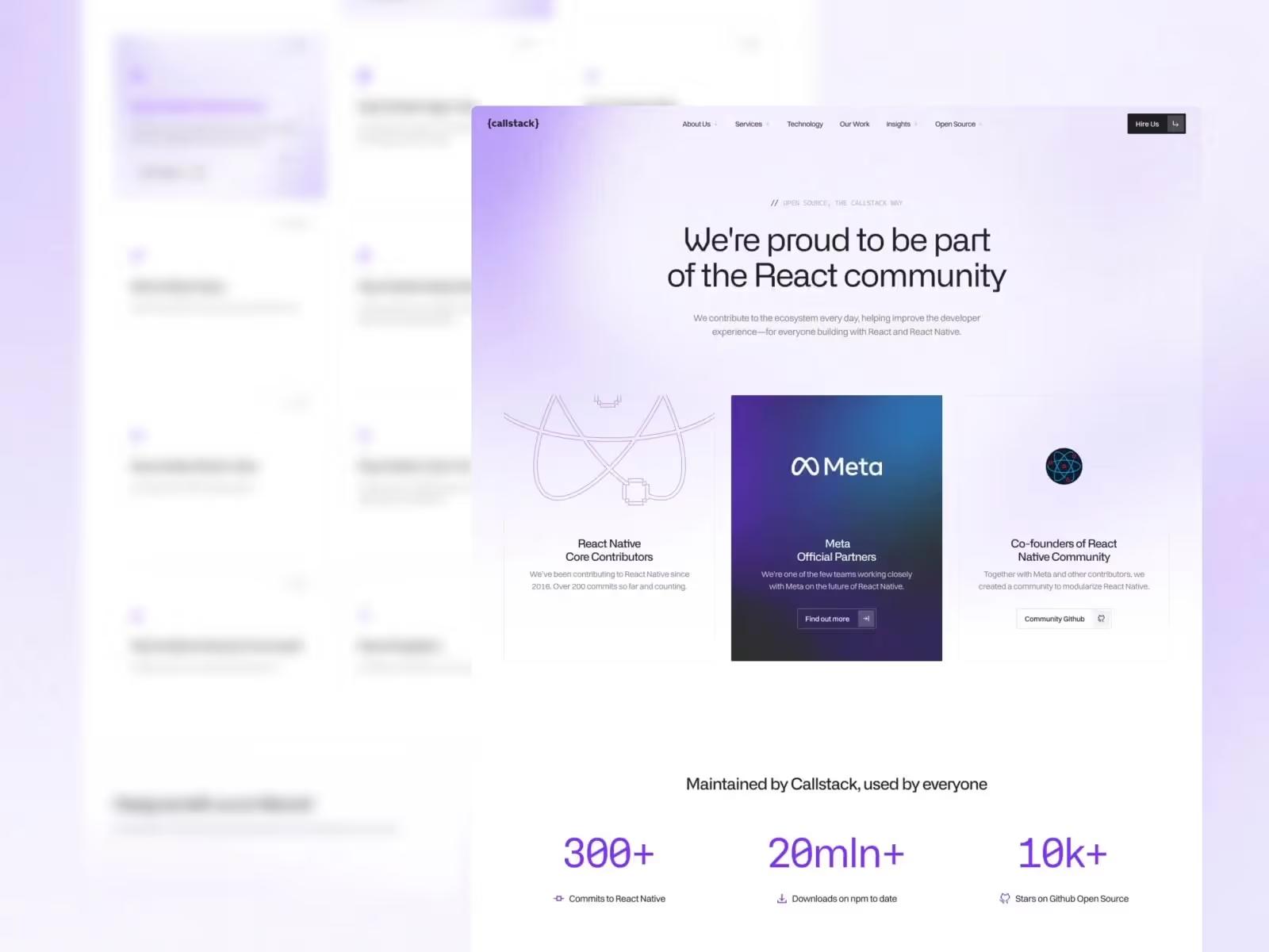
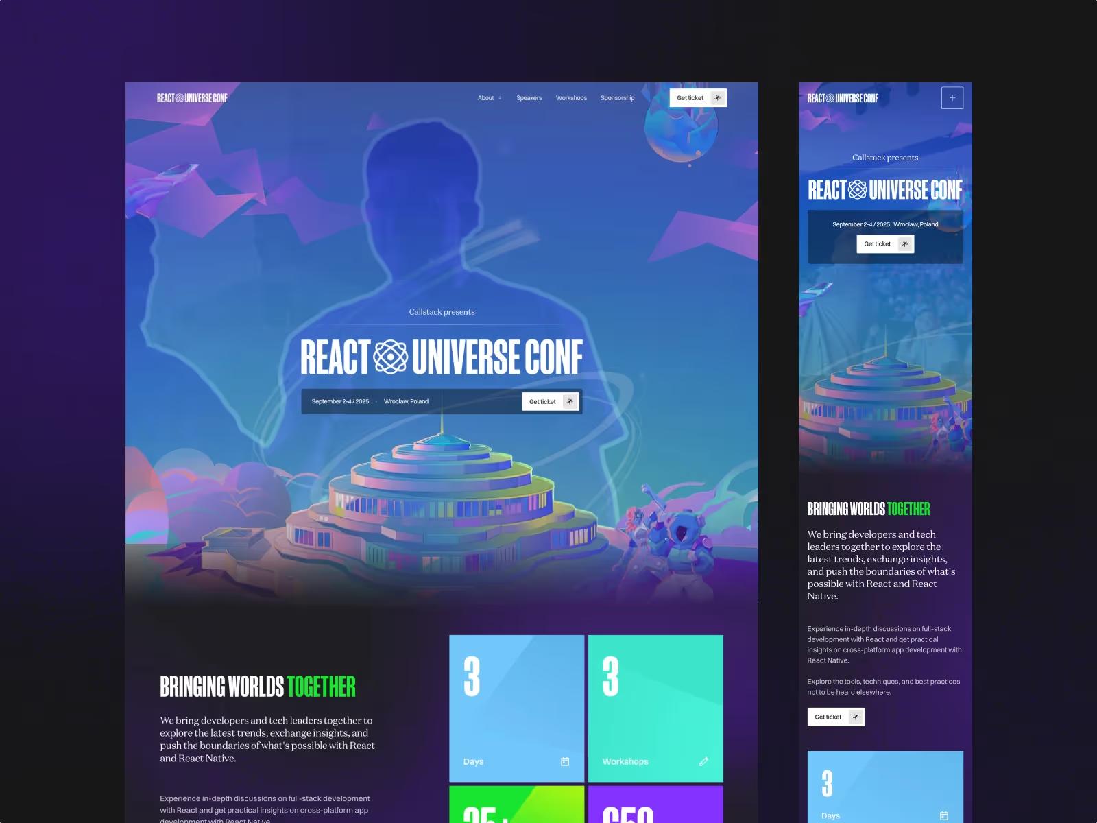
Callstack approached us with a clear vision: transform their digital presence to represent their position as React Native leaders worldwide. Their website wasn't doing justice to their technical expertise and world-class work with their clients.
They trusted us with a complete website redesign and rebuild, focusing on a content-first approach and performance-driven design.
And the results hit different:
+176% conversion rate after the redesign
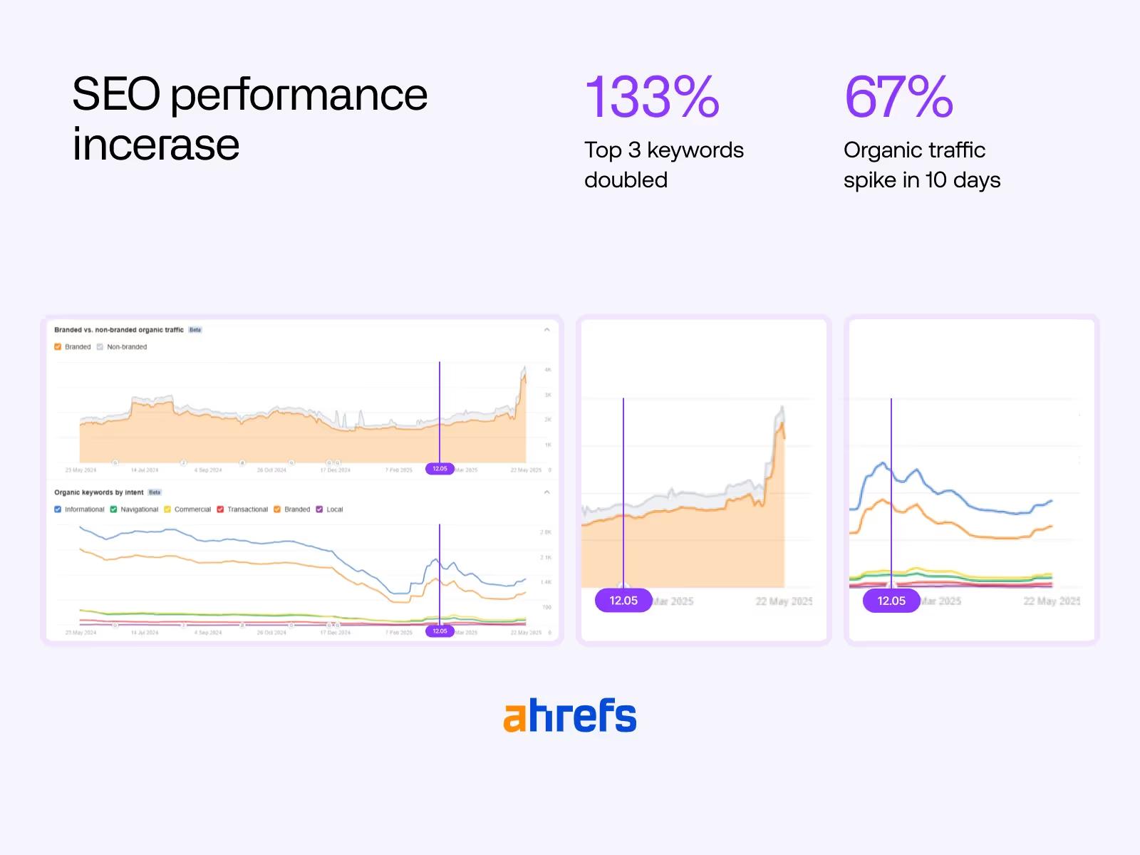
+65.7% organic traffic growth
Performance score: 34 → 90 on Lighthouse
When giants like Meta, Amazon, and Evernote need React Native expertise, they call Callstack. Based in Wrocław, Poland, this 150+ team of engineers and designers has been at the forefront of React Native development since 2016.
From performance optimization to brownfield migrations, Callstack has built a reputation for delivering results where others struggle. Their GitHub repositories have thousands of stars, their blog posts become industry references, and their team members are recognized thought leaders in the community.
They're the minds behind essential open-source tools like Re.Pack and Reassure and the go-to consultancy for enterprises tackling their most complex cross-platform challenges. With millions of developers using their libraries and $30M+ in annual revenue, they're not just building apps, they're defining industry standards.
When your website performance is worse than your clients' apps, you have a credibility problem. That's exactly where Callstack found themselves, React Native experts whose own site was holding back.
Callstack's website wasn't keeping up with their reputation. While they were building world-class apps for major companies, their own site was holding them back from connecting with new clients who judge technical skills by every interaction. They needed a website that wouldn't just look good, but actually perform.
Their site scored 34 on Lighthouse, a missed legitimacy-building opportunity for a company that optimizes apps reaching millions of users. The 78% bounce rate meant potential clients weren't staying long enough to discover their capabilities, while a 2.1% conversion rate showed significant potential for generating qualified leads.
Only 1 in 5 of their target keywords appeared in Google's top 10 results. Potential clients searching for React Native experts weren't finding them easily.
Built with jQuery, heavy assets, and poor optimization that didn't reflect their cutting-edge expertise and the efficient work they do for clients.
Their CMS needed better organization. The team already generated great content, but their setup made it hard to organize and update. The marketing team spent too much time fighting with the website instead of creating more valuable content.
They needed a strategic roadmap to production within 2-3 weeks max because important business opportunities were coming up, and they couldn't wait months for a traditional redesign. This required a phased approach - some parts custom-built, others leveraging proven Relume components to go live quickly.
As mentioned by the team, "our previous site is just broken". Messy CMS, poor structure, and maintenance nightmares that they didn't want to repeat. It was time to start fresh with something that worked from the get-go.
We need this to be clean and must be very component-driven, because it's simply faster to build that way. For us specifically, it's not the brand, animations, or fancy visuals that sell, it's the content. So it needs to be clean, content must be clear, but it also needs to have that delicate touch.

Aleksandra
Content Lead at Callstack
The Callstack team understood the project objectives and role of Grafit and Callstack team from the beginning. The challenge was going from concept to live in 6 weeks, but their clear vision and direct feedback loop allowed us to move fast and focus on what matters: execution

Jakub Startek
Co-founder & CEO at GRAFIT
We dove deep. Content audits, competitive analysis, UX workshops with their team. No assumptions—just data-driven insights about what their audience needed.
We created wireframes first, then built a beautiful interface using our component-based system. Relume helped us move fast while Figma prototypes kept everyone aligned through the process. Every design choice was deliberate, supporting their content-first strategy.
This is where things got interesting. We built 208 reusable components in Webflow, organized 1,256 CMS items across 22 collections, and implemented performance optimizations that would impress any search engine.
We tested everything thoroughly, optimized performance, and trained their team. We didn't just deliver an awesome website, we made sure it worked flawlessly from day one and was ready for further scaling.
The right stack removes bottlenecks and gives your team the freedom they need to move fast.

Webflow
The best website builder on the market

Figma
Collaborative tool for designing & prototyping UI/UX

Relume
Tool to create AI-powered sitemaps, wireframes & style guides

GSAP
JS library for high-performance animations & interactions

Optibase
Website analytics & A/B testing platform

Finsweet Components
Library of advanced Webflow components
“Working with Callstack was incredibly efficient. They knew exactly what they wanted and communicated it clearly from the start. Their team stayed involved and gave us quick feedback, so we could work efficiently and get things done instead of going back and forth with changes.”

Marcin Warno
Co-founder & CTO at Grafit
Six weeks after launch, the numbers told a story of complete transformation. Every metric improved, from technical performance to business outcomes:
We designed the experience first, then engineered it for maximum speed and searchability.
34 → 90
164%Speed score improved, leading to a better experience for visitors and higher SEO rankings.
4.2 → 1.1s
Load Time: Turning Slow into Fast
Strategic user flows plus intuitive design that guides visitors exactly where they need to go.
65.7%
Organic traffic increase
176%
Conversion rate boost
We built a system that manages large amounts of content while keeping everything running quickly.
1,306
Organized items grouped into 23 collections, all carefully planned and created
208
Reusable components powering a scalable design system
Within days of launch, we saw organic traffic surge while performance metrics hit industry-leading standards. The new component-based architecture didn't just look good, — it empowered Callstack's marketing team to move faster while maintaining perfect brand consistency.
This wasn't just a website redesign – it was a complete digital transformation. When you treat your website as a business asset rather than just a digital brochure, magic happens. We created a platform that doesn't just represent Callstack's technical expertise, it amplifies it.
The results speak for themselves: 164% performance improvement, 65% traffic surge, 176% conversion increase. Most importantly, Callstack now has a digital presence that matches their world-class reputation and a flexible foundation that grows with their business - giving their team the tools to create, update, and expand without bottlenecks.
Feels like working with an in-house team. Fast, efficient, and they know how to build for growth. Simple as that.
Mike Grabowski
Founder & CTO at Callstack
"Working with Grafit was exactly what we needed. They delivered on every promise - our performance scores went through the roof, traffic surged immediately, and we finally have a system that scales with our team. I'd recommend them to any tech company that wants to move fast without compromising on quality."
Mike Grabowski
Founder & CTO at Callstack
Let's chat about how strategic web design can accelerate your growth.
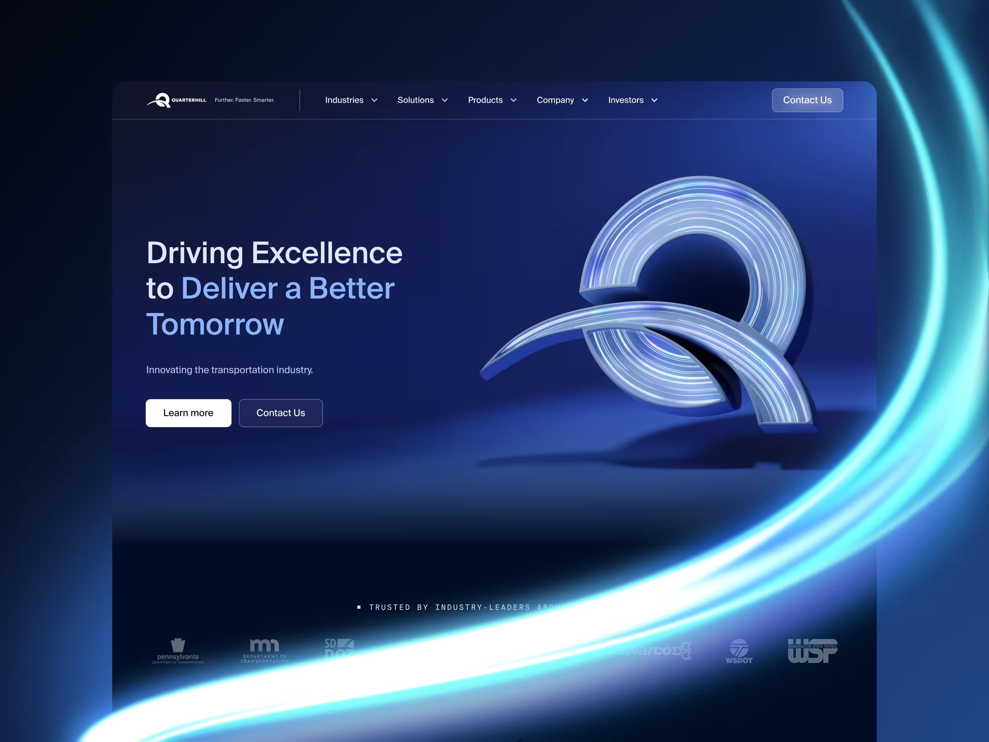
Quarterhill's acquisitions had created a fragmented digital presence across three separate websites. We successfully consolidated them into one powerful platform, simplifying navigation and offerings.
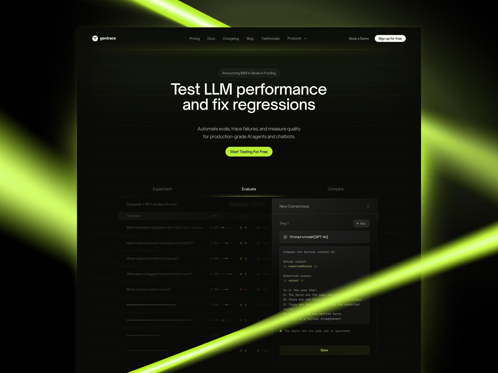
Strategic brand transformation for Gentrace that simplified their complex AI testing platform for developers, supporting their Series A launch with impressive results.
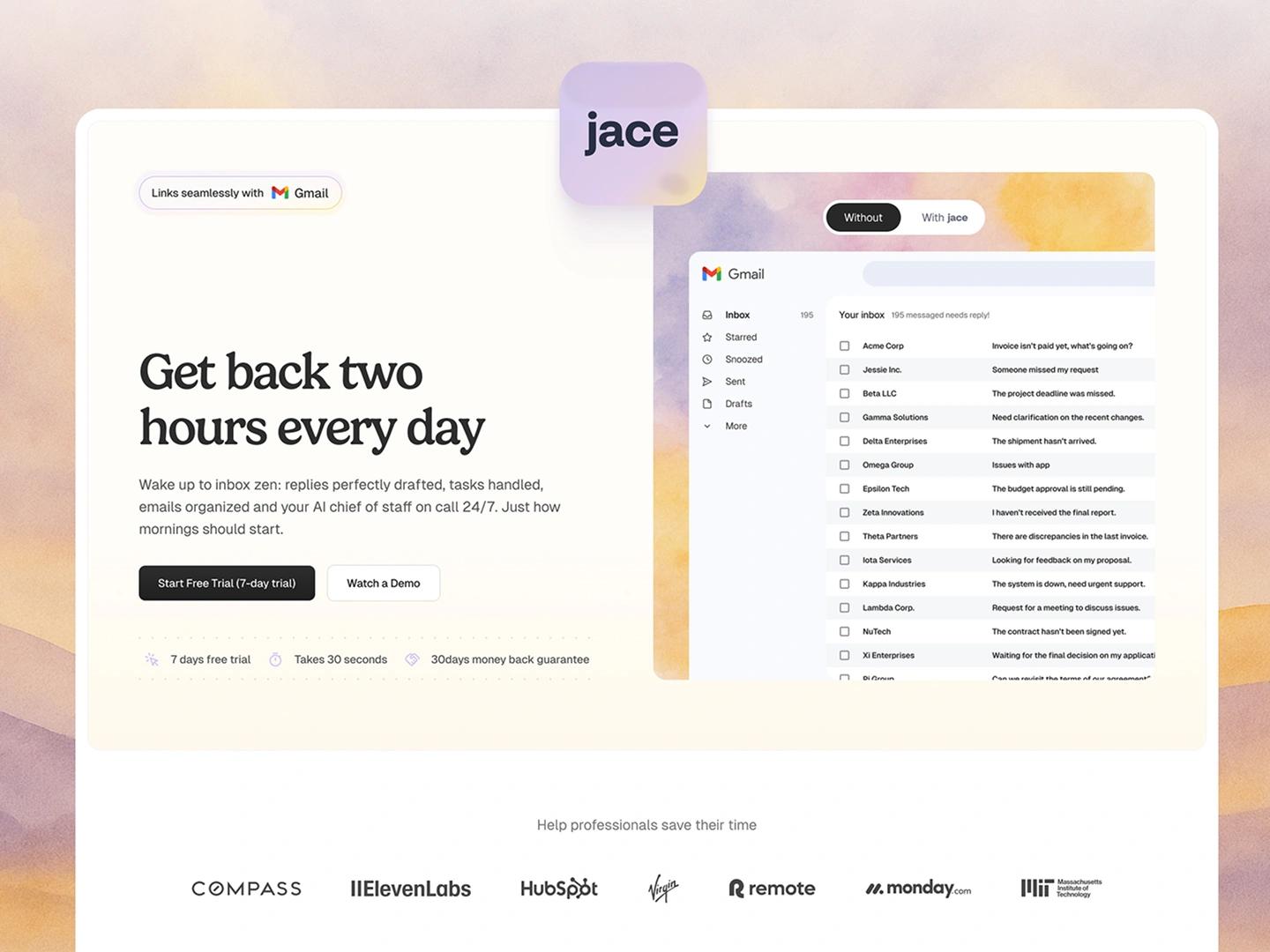
Learn how jace.ai turned product insights into a 300% conversion lift with a growth design partnership built on Webflow and continuous CRO.


