
.avif)
Your SaaS website isn't just a digital business card. It's your most hardworking sales rep – the one that never sleeps, never calls in sick, and (if done right) consistently turns visitors into customers.
But let's be honest. Most SaaS websites are just... there. Pretty, perhaps. Functional, maybe. But actively converting? Rarely.
After analyzing dozens of top-performing SaaS websites, I've pinpointed 20 page types that genuinely move the needle.
No fluff, no marketing speak – just pages that work and why they work.
Before You Start Building: The Strategy Stuff
I know you're itching to dive into the page templates, but skipping the strategy is like building a house without a foundation.
Trust me, I've seen startups redo their entire websites six months later because they skipped this part.
Know Who You're Talking To
- Create actual buyer personas. Not the generic "marketing manager at mid-size company" type, but detailed profiles with specific job challenges and goals. What keeps them up at night? What makes them look good to their boss?
- Map their journey from "I have a problem" to "I'm ready to buy." Different pages serve different stages, and understanding this prevents the classic mistake of pushing a demo to someone who's just becoming aware of their problem.
- Get real insights through user research. Use surveys, customer interviews, and analytics to understand how people actually make purchasing decisions. The gap between what people say they want and what they actually click on can be eye-opening.
Align With What Actually Matters
- Look at your sales goals first. Which pages will move the needle on your current objectives? A beautiful resources page might look nice, but if you're laser-focused on enterprise deals, your enterprise-specific pages deserve priority.
- Be honest about your resources. Can your team actually create and maintain all these pages? Resource assessment isn't sexy, but it prevents the embarrassment of half-finished website sections.
- Project the ROI for each page type. Estimate the potential return based on your conversion data. Some pages might sound great in theory but won't deliver the impact you need.
Plan Your Implementation
- Take inventory of what you already have. Before creating new content, audit existing material that can be repurposed or expanded for new page types.
- Document technical requirements upfront. Need a calculator? Interactive elements? Form integrations? Identifying these early prevents painful mid-project pivots.
- Define clear success metrics for each page. Conversion rate, time on page, scroll depth – pick the KPIs that align with each page's purpose before you build.
- Design your testing strategy. Plan how you'll A/B test elements to continuously improve performance after launch.
Development Process That Actually Works
- Start with wireframes. Create low-fidelity layouts focusing on information hierarchy and user flow before getting distracted by design details.
- Develop copy that sells. Write page content that emphasizes benefits and addresses common objections head-on.
- Design with purpose. Create visual elements that enhance your message while maintaining brand consistency throughout.
- Build with performance in mind. Implement pages with SEO, accessibility, and loading speed as priorities, not afterthoughts.
- Test everything. Quality assurance isn't just for your product – your website needs rigorous testing too, especially interactive elements.
The 20 Pages That Actually Convert
1. Integration Pages
Example: Default.com/product/integrations
When prospects evaluate your product, they're mentally running through a compatibility checklist. Will this play nicely with our tech stack? Integration pages answer this critical question before it becomes a deal-breaker.
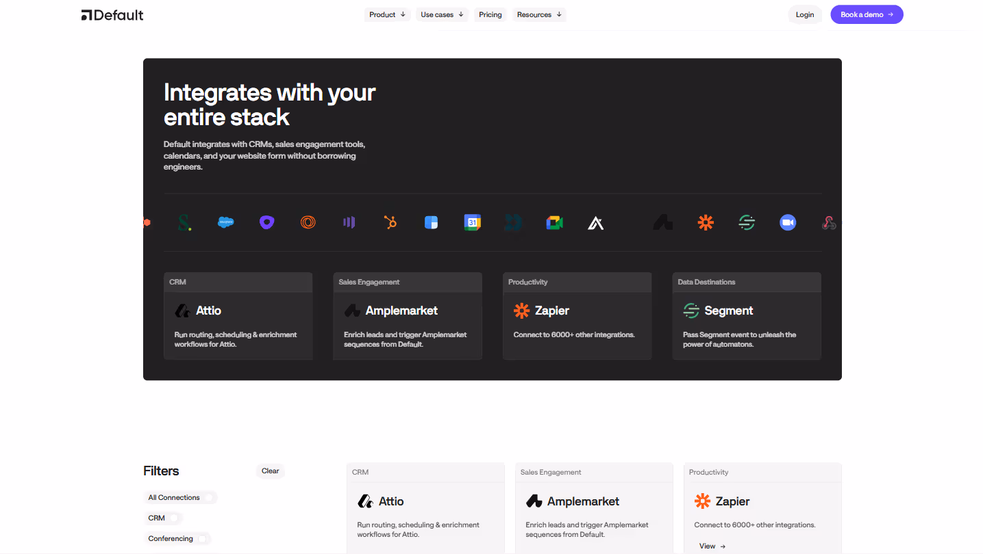
The most effective integration pages don't just offer a logo soup of partner companies. They demonstrate an understanding of how your users actually work.
Consider organizing integrations by workflow category rather than alphabetically. A marketing manager doesn't think, "I need something that works with a company that starts with S" – they think, "I need something that connects with our email marketing system."
Show the practical value of each integration with brief use case snippets. "Sync customer data bi-directionally with Salesforce" is infinitely more valuable than "Connects with Salesforce."
For enterprise prospects, technical details matter. Include API documentation links where appropriate, and consider featuring quotes from developers who've implemented your integrations successfully.
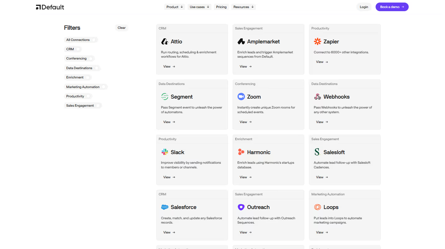
And don't hide your integration roadmap. A "Coming Soon" section signals continuous development and gives prospects confidence that even if their niche tool isn't supported today, you're actively expanding your ecosystem.
The best integration pages anticipate and answer the real question behind the prospect's search: "Will this fit seamlessly into the way we already work?"
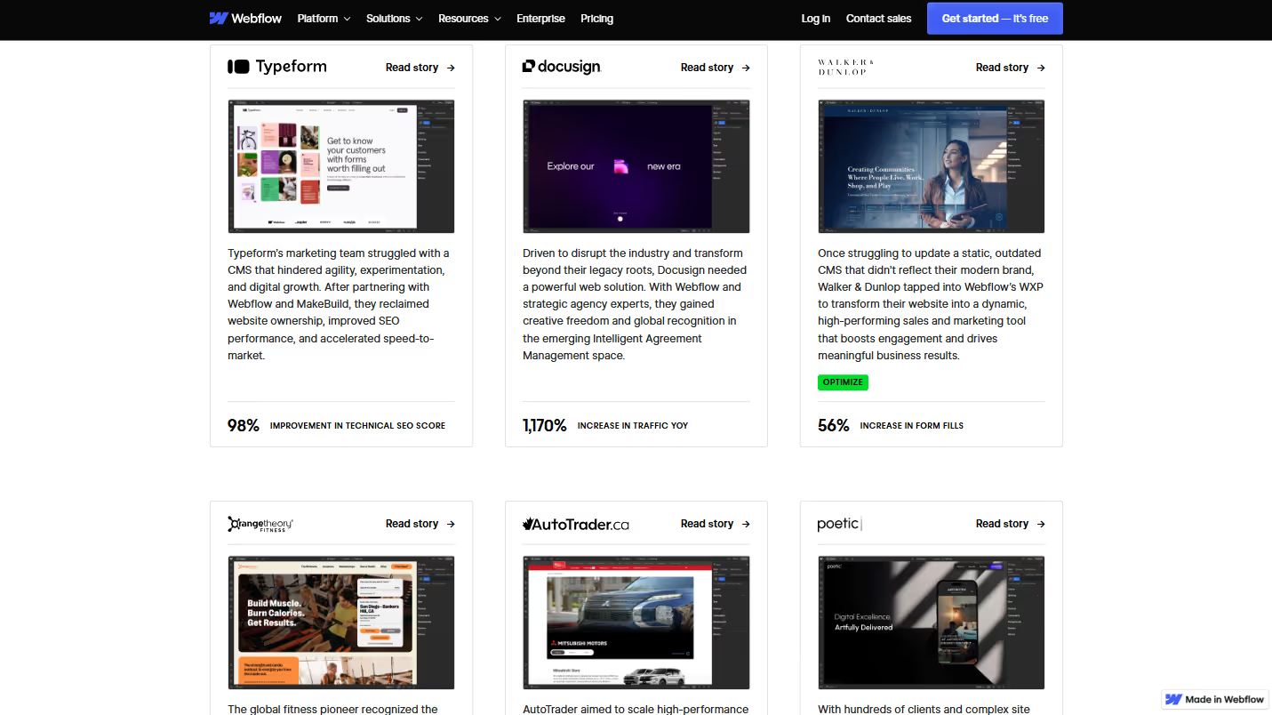
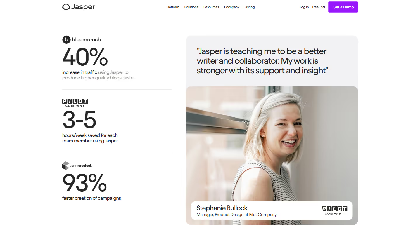
2. Customer Stories
Example: Webflow.com/customers
Nothing sells your product like someone else's success with it. But generic testimonials have lost their impact in an age where authenticity is currency.
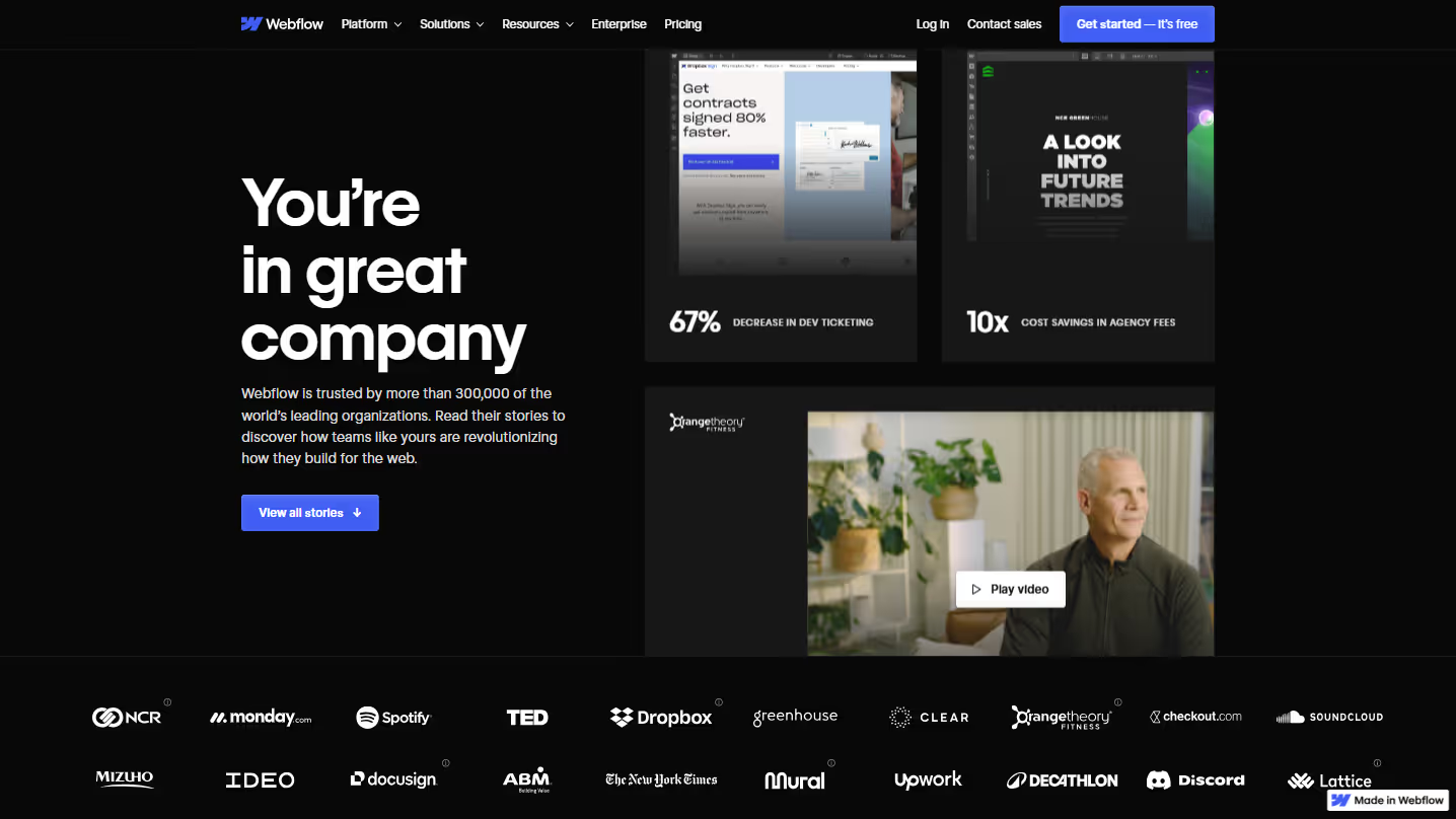
Effective customer stories showcase diversity across industries and company sizes. This signals to prospects that regardless of their situation, others like them have found success with your solution.
Focus on measurable results rather than vague praise. "47% increase in trial conversions" carries more weight than "we really like the product." Numbers build credibility when they're specific and relevant.
Let customers speak in their own voice. Heavily edited marketing-speak is immediately detectable and undermines trust. Direct quotes that sound like real humans create genuine connections.
Video testimonials add a dimension of authenticity that text alone can't match. A genuine smile or moment of enthusiasm communicates more than paragraphs of written praise.
Make stories findable by adding category filters. This helps prospects quickly discover relevant examples from companies facing similar challenges.
Place customer stories strategically throughout the buyer's journey, not just on a dedicated page. They serve as evidence precisely when skepticism naturally arises.
3. Segment-Specific Pages
Example: Ramp.com/startups
Generic messaging tries to speak to everyone and ends up resonating with no one. Segment pages acknowledge that different customer groups have fundamentally different priorities and challenges.
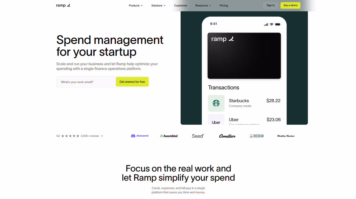
Tailor your language to match how this segment actually talks. When you adopt their terminology, you signal that you understand their world. For startups, discuss "runway" and "growth rates." For enterprises, emphasize "compliance" and "cross-department implementation."
Feature social proof exclusively from similar companies. A Fortune 500 testimonial might actually discourage a small business prospect who assumes your solution is too complex or expensive for their needs.
Address segment-specific objections directly. If startups worry about pricing flexibility, highlight your scaling options. If enterprises worry about security, emphasize your SOC 2 compliance.
Customize your CTAs to reflect segment priorities. "Start your free trial" might work for SMBs, while "Schedule a security review" might better serve enterprise prospects.
Use authentic imagery that reflects this segment's reality. Stock photos that don't represent your target audience create an immediate disconnect.
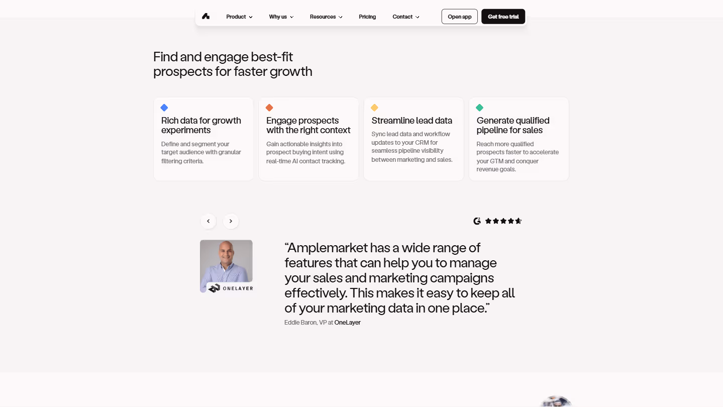
4. Persona-Specific Pages
Example: Amplemarket.com/amplemarket-for-marketers
Similar to segment pages but focused on roles rather than company types. These pages speak directly to the individual making the decision, addressing their personal goals and challenges.
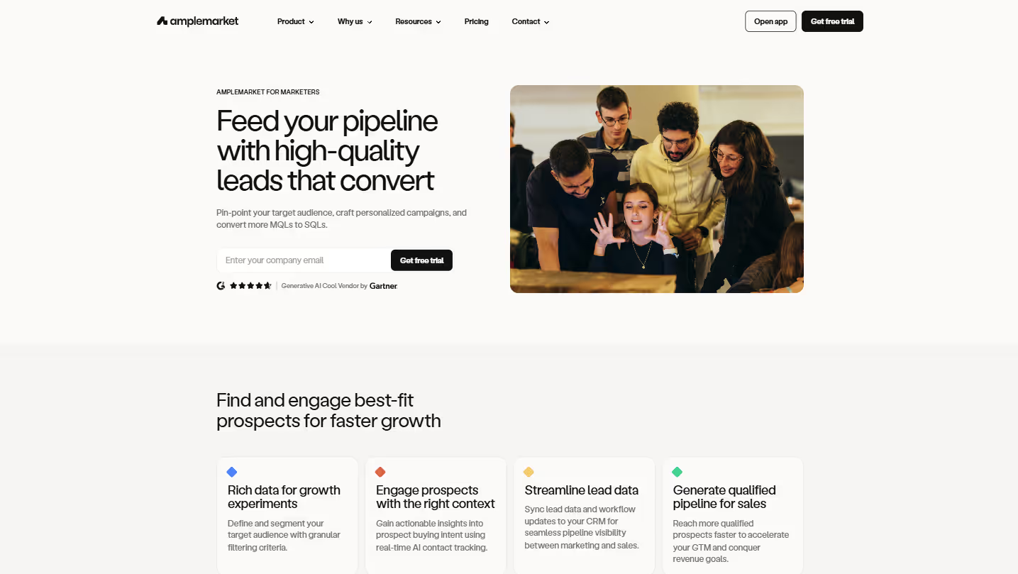
Align your content with what keeps this persona up at night. For marketers, this might be attribution or campaign performance. For developers, it might be API flexibility or integration ease.
Speak the language this role uses daily. Industry jargon isn't a negative when it's authentic to how these professionals communicate with each other.
Focus on features that matter most to this role. A CTO and CMO need different things from your product, even if they work at the same company.
Include testimonials from peers in identical roles who can speak directly to how your product made their specific job easier, not just how it benefited the company broadly.
Show how your product fits into their existing workflow. Context matters more than capabilities for personal adoption.
Offer role-specific resources like templates or guides that provide immediate value, establishing your product as a tool that understands their specific needs.
5. Industry-Specific Pages
Example: Jasper.ai/solutions/by-industry/ecommerce-and-retail
Industry pages demonstrate that you understand the unique challenges and regulatory landscapes specific to sectors like healthcare, finance, or education.
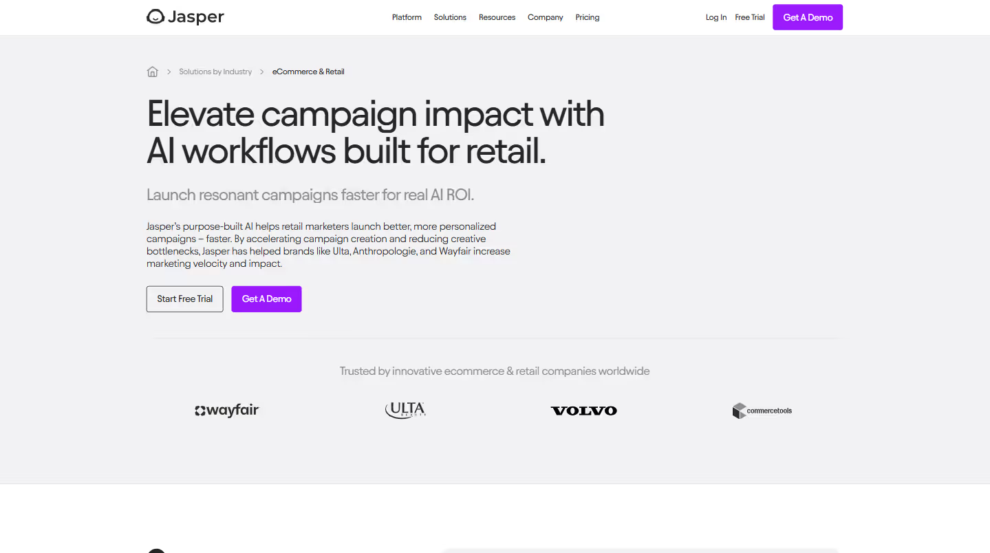
Address industry-specific regulations upfront. For healthcare, discuss HIPAA compliance. For finance, highlight SOC 2 certification and data security measures. This isn't just about preference—it's often about legal requirements.
Showcase workflows that mirror how people actually work in this industry. The sales process in manufacturing bears little resemblance to the one in higher education, and your product demonstrations should reflect this reality.
Present metrics that matter to this vertical. While marketers might care about engagement rates, healthcare professionals focus on patient outcomes, and manufacturers prioritize efficiency metrics.
Feature testimonials from recognized industry leaders. Sector-specific social proof carries significantly more weight than generic endorsements from unrelated businesses.
Highlight specialized features or integrations that address industry-specific pain points. Make these central to your messaging rather than buried in general feature lists.
Use authentic industry terminology without overdoing it. This signals your familiarity with the sector without coming across as trying too hard.
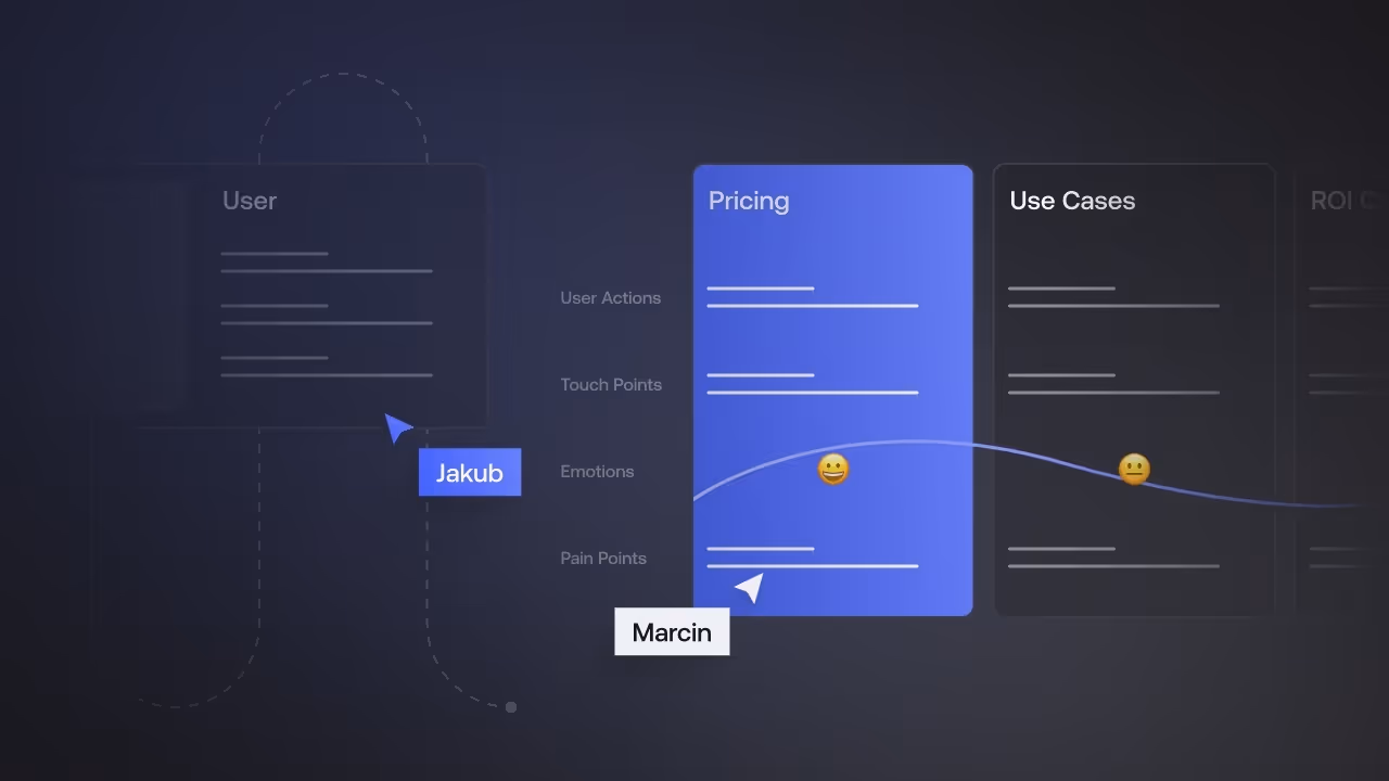
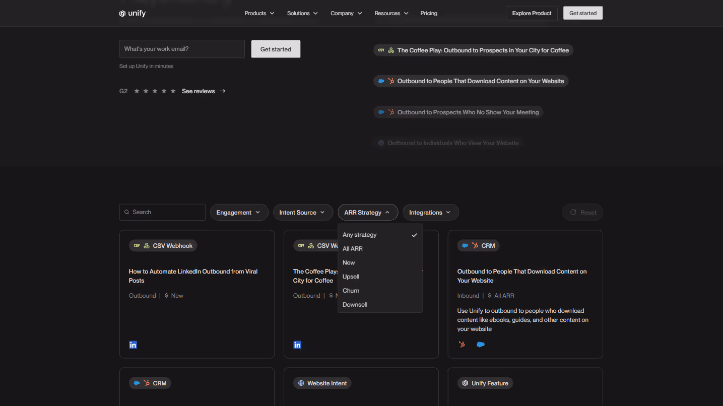
6. Use Case Pages
Example: UnifyGTM.com/use-cases
Use case pages bridge the gap between features and outcomes, showing specifically how your product solves real problems. They transform abstract capabilities into practical applications.
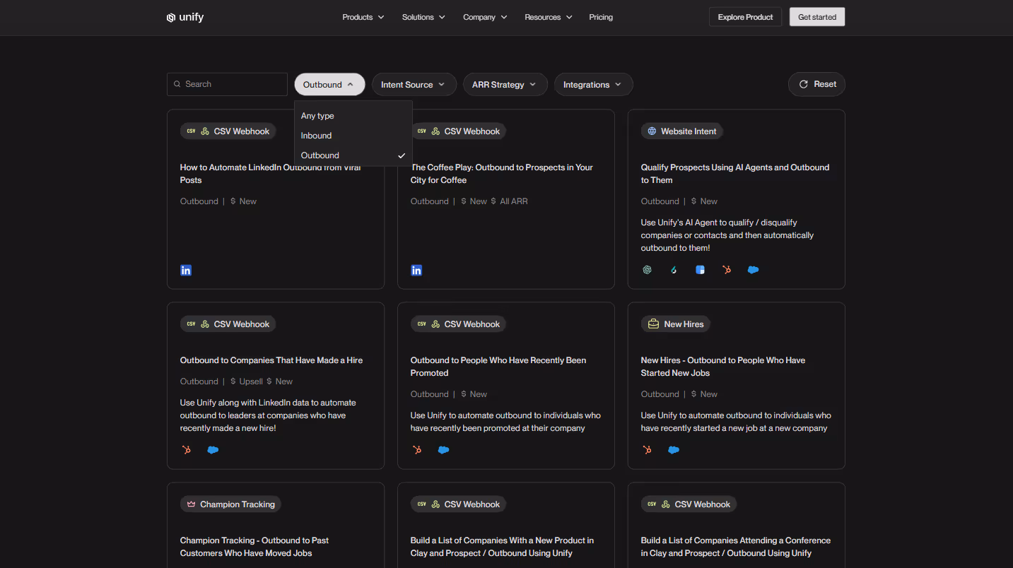
Make these pages searchable and filterable so visitors can quickly find scenarios relevant to their needs. The easier it is to find applicable use cases, the more likely prospects will see your product fitting into their world.
Provide step-by-step examples that show not just what the product does, but how users can accomplish specific goals. The clarity of the path from problem to solution is often more convincing than the features themselves.
Include before/after comparisons when possible. Showing the contrast between the old way and your solution makes the benefits tangible rather than theoretical.
Quantify the impact with specific metrics. "Reduce reporting time from 5 hours to 30 minutes" is more compelling than "save time on reporting."
Connect use cases to customer stories when available. Seeing that Company X actually achieved these results with these specific steps adds immediate credibility.
Use visual aids—screenshots, short videos, or diagrams—to illustrate complex processes. Visual demonstrations help users mentally test-drive your solution for their specific needs.
Offer downloadable templates or quick-start guides for common use cases, providing immediate value while lowering the activation energy required to get started.
7. ROI/Savings Calculator
Example: Lattice.com/roi-estimator
ROI calculators transform abstract value propositions into concrete numbers that prospects can use to justify purchases internally. They bridge the gap between "this seems useful" and "I can prove this is worth buying."
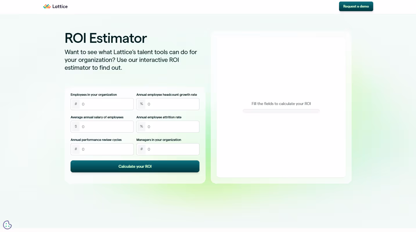
Keep input fields minimal to prevent form abandonment. Each additional field reduces completion rates, so focus only on what's necessary to generate meaningful results.
Make your calculation methodology transparent and adjustable. Hidden black-box calculations breed skepticism, while allowing users to adjust assumptions builds trust and ownership.
Present results in multiple formats to appeal to different stakeholders. Some decision-makers respond to graphs, others to dollar figures, and others to time savings expressed in hours or days.
Include both financial and non-financial benefits. While CFOs care about dollar savings, department heads often value outcomes like improved employee satisfaction or reduced turnover.
Provide downloadable results that prospects can share with decision-makers. This transforms your calculator from a webpage into a sales enablement tool for your champion.
Back up calculator outputs with relevant customer testimonials. When a real customer confirms the projected savings are achievable, your calculator gains instant credibility.
8. Lead Generation Landing Pages
Example: Lattice.com/lp/grow
Lead generation landing pages are the workhorses of SaaS websites - purpose-built to convert specific traffic into qualified leads. Unlike general website pages, they have a singular focus: capturing visitor information.
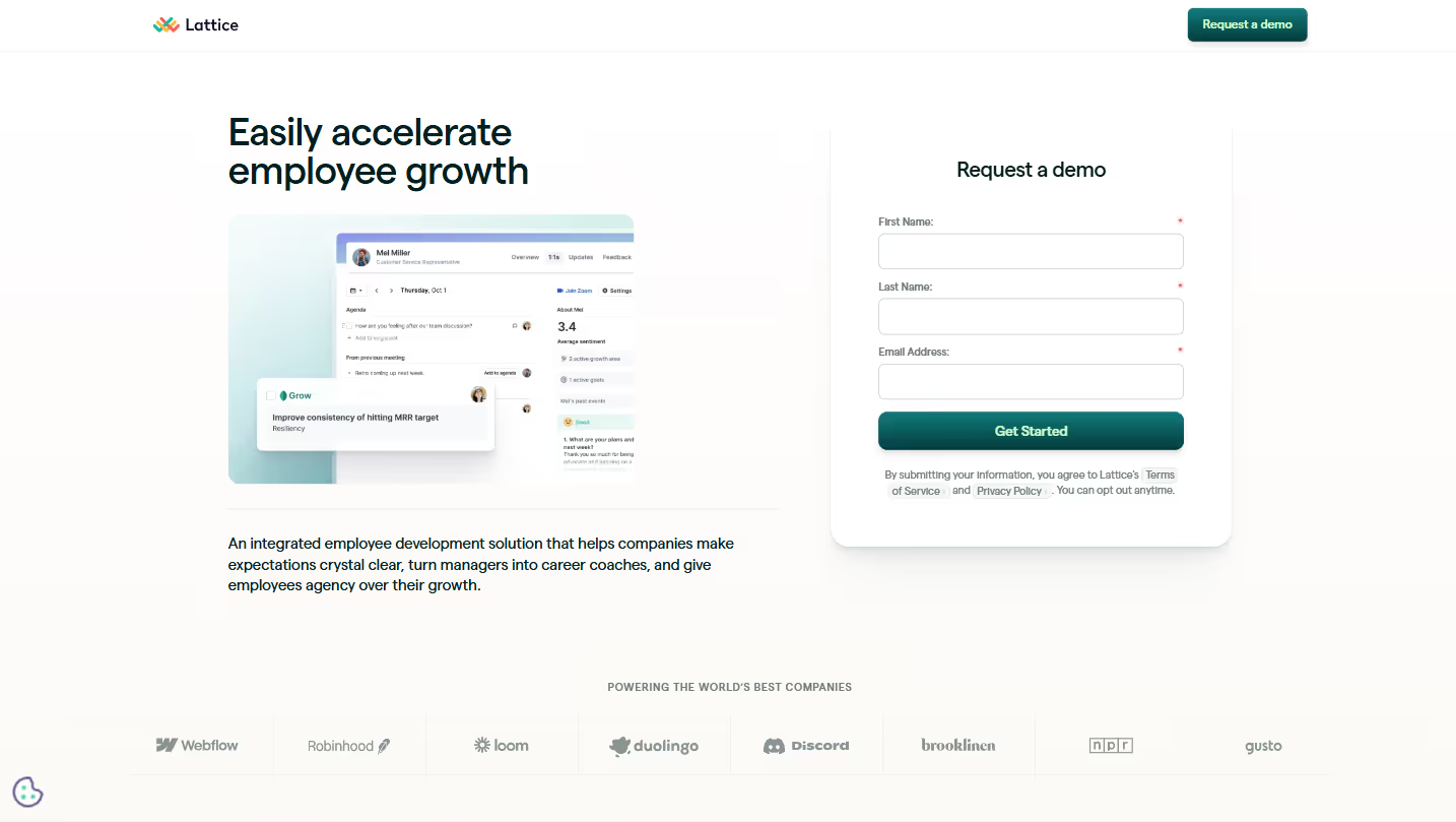
Craft headlines that address specific pain points rather than touting product features. "Stop losing leads to scheduling conflicts" resonates more than "The best scheduling tool on the market."
Strip away navigation options that could distract visitors. Every additional link is a potential exit route that reduces conversion probability. The path forward should be clear and singular.
Keep forms ruthlessly minimal. Ask only for information you genuinely need at this stage—each additional field reduces completion rates by roughly 4%. For most B2B contexts, name, email, and company are sufficient initial touchpoints.
Position your form strategically. For simple offers, place it above the fold. For complex or high-commitment offers, place it after you've established value but before you lose momentum.
Include specific trust indicators relevant to this offer. Customer logos, security badges, and testimonials specifically related to the landing page topic build immediate credibility.
Create a sense of appropriate urgency when relevant. Limited-time offers or cohort-based programs provide legitimate reasons to act now, but manufactured scarcity can damage trust.
Test different CTAs beyond the standard "Submit" button. Action-oriented phrases like "Get the report" or "Start saving time" consistently outperform generic button text.
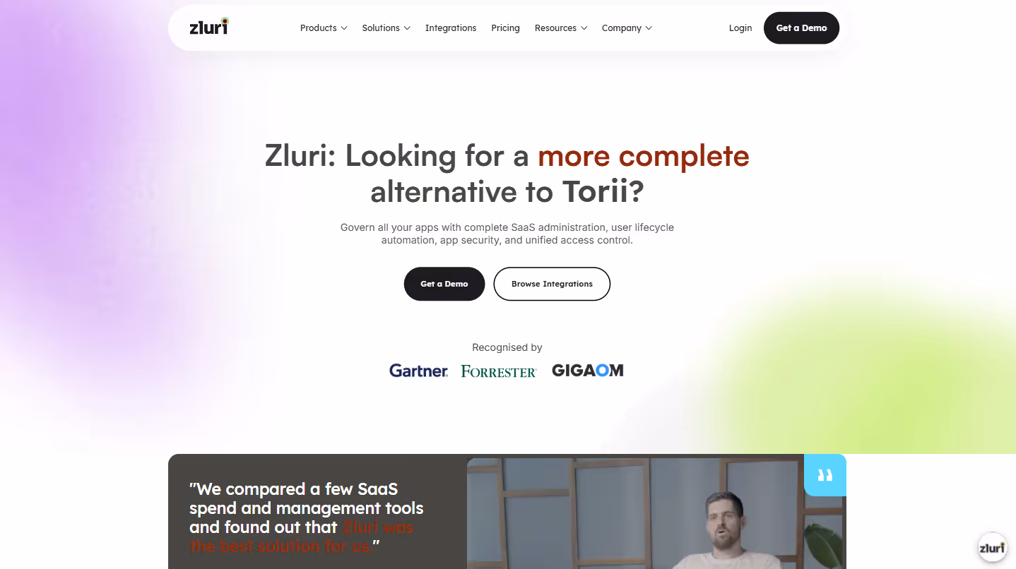
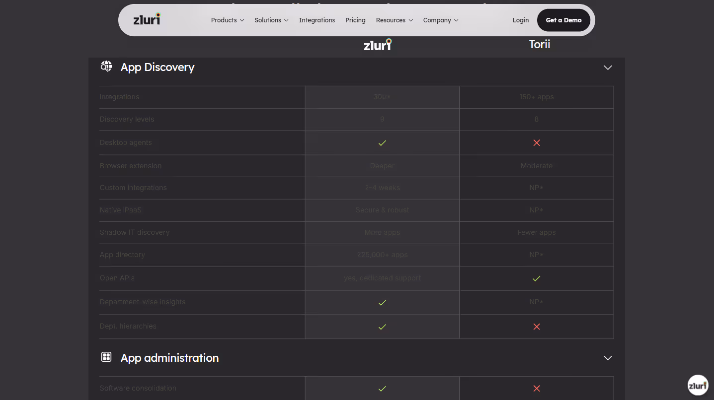
9. Comparison Pages
Example: Zluri.com/comparisons/zluri-vs-torii
When prospects are evaluating options, they're going to compare you with alternatives - whether on your site or elsewhere. Comparison pages let you frame that conversation on your terms while still being honest.
Maintain factual accuracy about competitors. Dishonesty is instantly detectable and destroys credibility - prospects researching alternatives are likely to spot even small misrepresentations. Being factually correct while emphasizing your strengths is the sweet spot.
Focus on differentiation rather than disparagement. "Our solution offers real-time alerts, while Competitor X provides daily summaries" is more effective than "Competitor X has slow, outdated alerts."
Use clear visual comparisons with intuitive symbols or color-coding. A well-designed comparison table communicates differences at a glance before the prospect reads a single word.
Include third-party validation whenever possible. Reviews from G2, Capterra, or industry analysts provide objective credibility that your internal comparisons can't match on their own.
Address switching concerns directly. If you're targeting competitors' customers, acknowledge the friction of changing systems and explain your migration support or data transfer capabilities.
Feature testimonials specifically from customers who switched from competitors. Their perspective on the transition experience and resulting benefits resonates powerfully with prospects considering the same path.
Include a clear, confident CTA designed specifically for comparison shoppers. These prospects are typically further along in their decision process and may respond better to "See for yourself" or "Start a comparison trial" than generic calls to action.
10. Product Tour Pages
Example: UnifyGTM.com/product-tour
Product tour pages give prospects a taste of the user experience without requiring them to commit to a demo or create an account. They're the digital equivalent of test-driving a car - reducing perceived risk through firsthand experience.
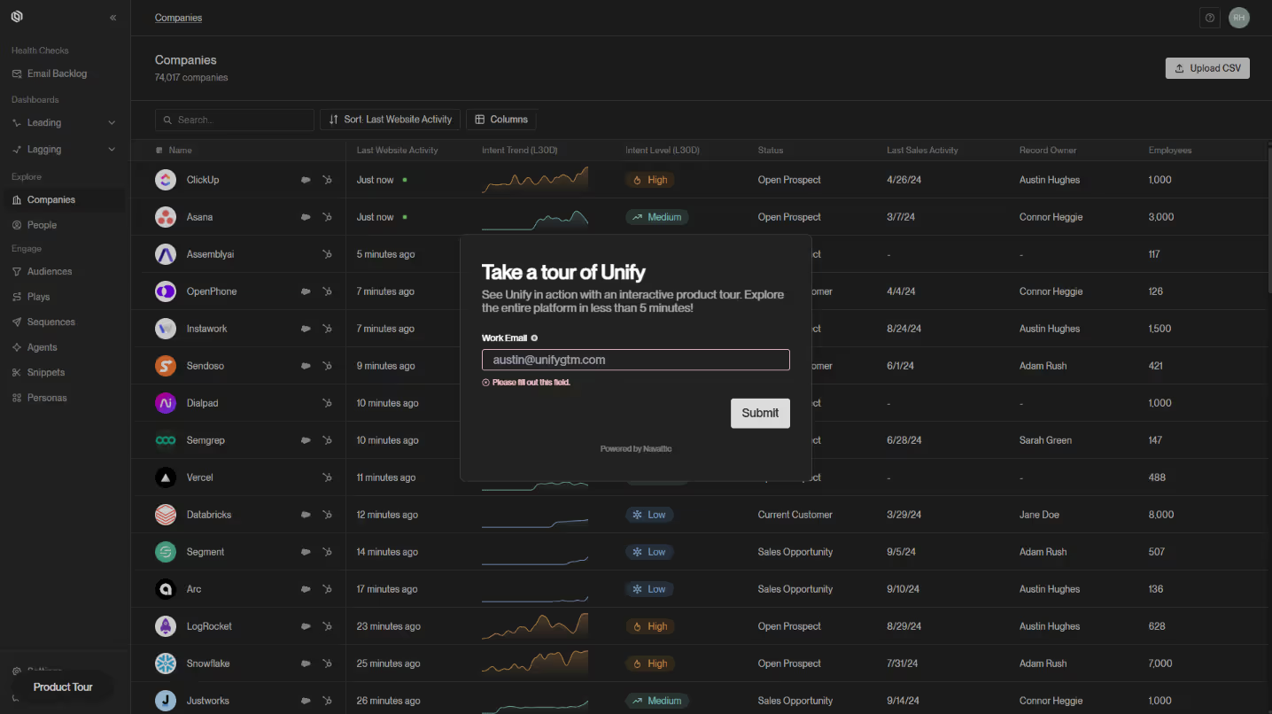
Focus on showing rather than telling. Videos, animations, and interactive elements create a quasi-hands-on experience that static descriptions can't match. A 30-second demonstration often conveys more than several paragraphs of explanation.
Break complex products into digestible sections. Rather than overwhelming visitors with your platform's entirety, guide them through key workflows that align with common use cases.
Connect features directly to benefits throughout the tour. Instead of "our analytics dashboard includes custom reports," try "create custom reports that help you identify revenue opportunities in minutes."
Consider offering both guided and self-directed exploration options. Some prospects prefer a structured narrative, while others want to jump directly to the features most relevant to their needs.
Include realistic example data in your screenshots and demos. Generic placeholders make it harder for prospects to envision using your product in their context, while thoughtful examples help them see themselves as users.
Highlight in-context use cases that demonstrate how real users incorporate your product into their daily work. These practical examples bridge the gap between feature demonstration and real-world application.
End with clear next steps that acknowledge different stages of readiness. Some viewers will be ready for a trial, while others may need more information or a conversation. Providing multiple pathways respects their place in the decision journey.
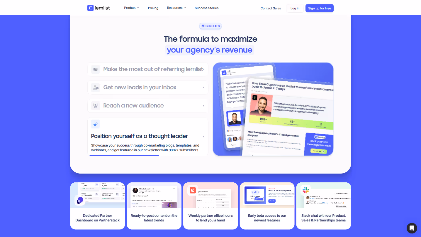
11. Partner Pages
Example: Lemlist.com/service-partners
Partner pages do double duty: they attract potential collaborators while signaling ecosystem strength to prospects. A robust partner network suggests product maturity and implementation support - critical factors for larger organizations.
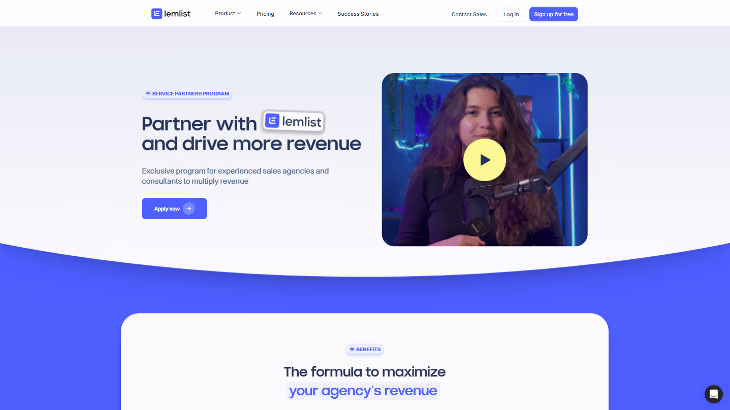
Clearly explain partner program benefits and requirements. Effective partner pages articulate what partners gain (revenue opportunities, leads, training) alongside what's expected from them (expertise levels, certifications, minimum performance).
Showcase existing partners thoughtfully. Rather than an overwhelming logo wall, organize partners by specialty, region, or tier with brief descriptions that highlight their unique expertise and help prospects find relevant support.
Include success stories and case studies that feature partner contributions. These demonstrate the ecosystem's effectiveness while giving partners valuable exposure and credibility in your marketplace.
Make the application process transparent and simple. Outline requirements, timeline, and evaluation criteria without unnecessary complexity. A streamlined application increases both the quantity and quality of partnership inquiries.
Highlight the resources and support available to partners. Whether it's co-marketing opportunities, sales enablement materials, or technical documentation, showing how you invest in partner success attracts better partners.
Include testimonials from current partners about their experience. Authentic partner feedback about working with you serves as powerful social proof for potential collaborators considering your program.
Offer different partnership tiers with clear distinctions. If you have multiple partnership levels, explain the benefits, requirements, and advancement path for each tier to encourage progression within your ecosystem.
12. Enterprise Pages
Example: Synthesia.io/enterprise
Enterprise pages speak to the distinct needs of larger organizations, where buying committees, security reviews, and scalability concerns create a fundamentally different purchasing process than for SMBs.
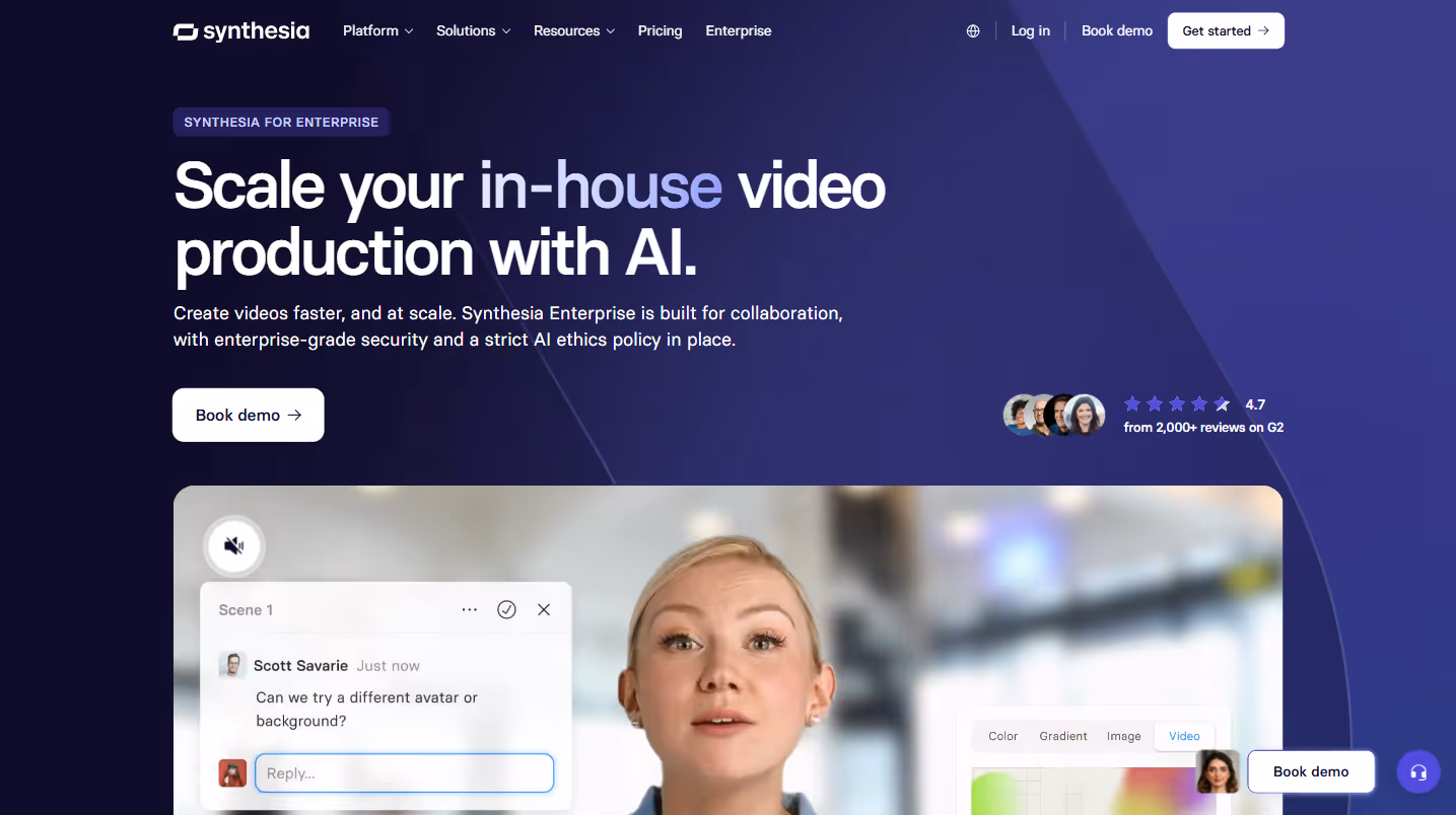
Highlight enterprise-specific features prominently. SSO integration, role-based access controls, and advanced security features aren't just nice-to-haves for enterprise buyers - they're often non-negotiable requirements that deserve center stage.
Address scalability, reliability, and compliance concerns directly. Enterprise prospects worry about whether your solution can handle their volume, meet their uptime needs, and satisfy their regulatory requirements. Provide specific details about how you've built for scale rather than making vague claims.
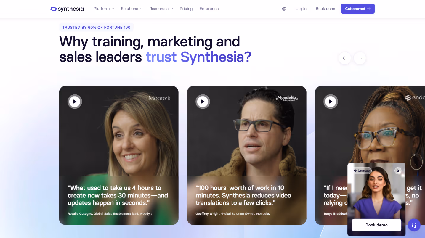
Include logos of current enterprise customers strategically. Recognizable brands signal that organizations with similar requirements have vetted and approved your solution. If possible, group logos by industry to help prospects find relevant social proof.
Feature enterprise-focused case studies with meaningful ROI metrics. Enterprise buyers need concrete evidence to support their business cases. Detailed stories of implementation and measurable outcomes from similar organizations carry significant weight in committee decisions.
Emphasize dedicated support and implementation services. Enterprise buyers expect white-glove treatment with named account managers, customized onboarding, and specialized support channels. Detail the enterprise-specific support experience rather than generic promises.
Explain customization and integration capabilities thoroughly. Enterprise environments rarely adopt out-of-the-box solutions. Outline your API capabilities, custom development options, and experience integrating with common enterprise systems.
Include information about SLAs and uptime guarantees. Enterprise operations require dependability, and formal agreements about performance metrics, response times, and system availability demonstrate your commitment to enterprise-grade reliability.
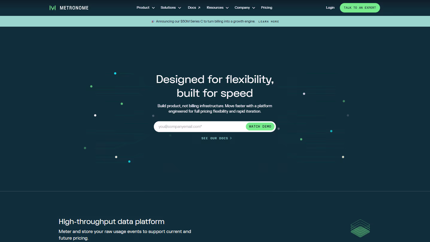
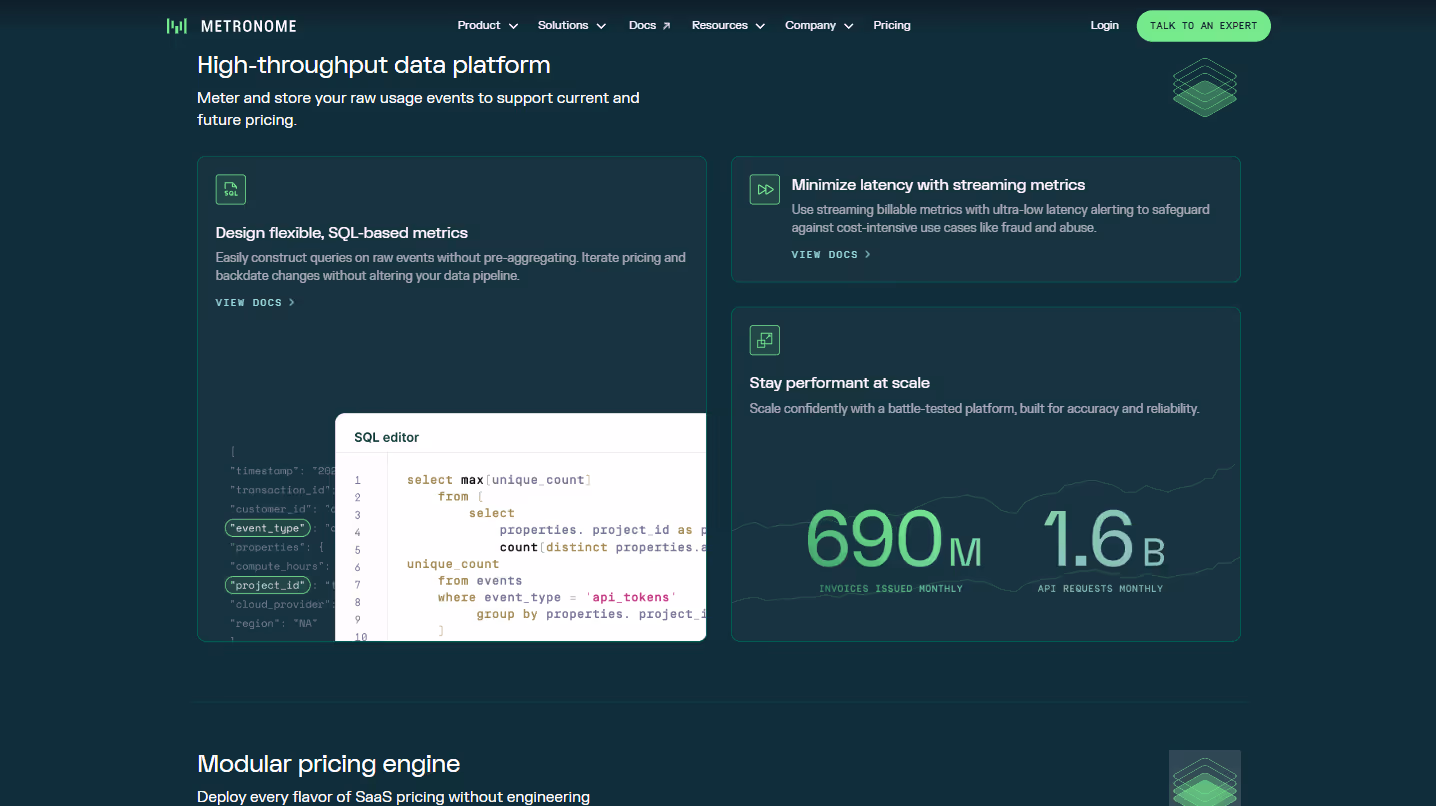
13. Platform Overview Pages
Example: Metronome.com/product-overview
Platform overview pages serve as the technical compass for your product, helping evaluators understand not just what your software does, but how it's built and why that matters.
Create a clear visual hierarchy of features and capabilities. Rather than presenting everything as equally important, use visual design to guide visitors through your platform's components from foundational elements to specialized features. This visual structure helps prospects mentally organize your offering.
Use animation or interactive elements to demonstrate key functionality. Static descriptions rarely capture the dynamism of software. Subtle animations, hover states, or interactive demos bring functionality to life in ways that screenshots alone cannot. These elements help technical evaluators visualize the user experience without committing to a full demo.
Include a high-level architecture diagram for technical buyers. Engineering and IT stakeholders need to understand how your system fits within their technology landscape. A thoughtful architecture diagram addresses integration points, data flows, and technology stack without overwhelming non-technical viewers.
Explain what differentiates your platform from alternatives with specific technical advantages. Rather than generic claims about being "better" or "faster," highlight architectural decisions that create meaningful differences in scalability, flexibility, or performance.
Highlight extensibility and integration capabilities prominently. Modern software rarely exists in isolation. Showcase your API approach, webhook support, and pre-built integrations to demonstrate how your platform connects with existing systems and can adapt to future needs.
Break complex features into digestible components with progressive disclosure. Layer information so visitors can explore at their preferred depth - from high-level overviews to detailed specifications. This approach serves both executive sponsors and technical evaluators without overwhelming either.
Include both technical and business benefits throughout the page. Technical excellence alone rarely justifies purchase decisions. Connect architectural strengths to business outcomes, showing how your platform's design translates to competitive advantages, cost savings, or growth opportunities.
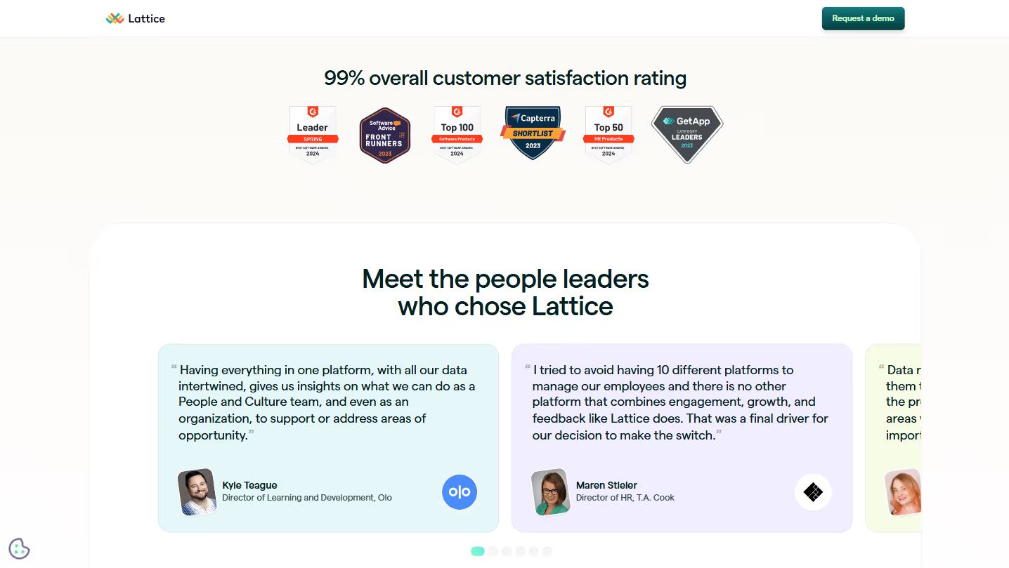
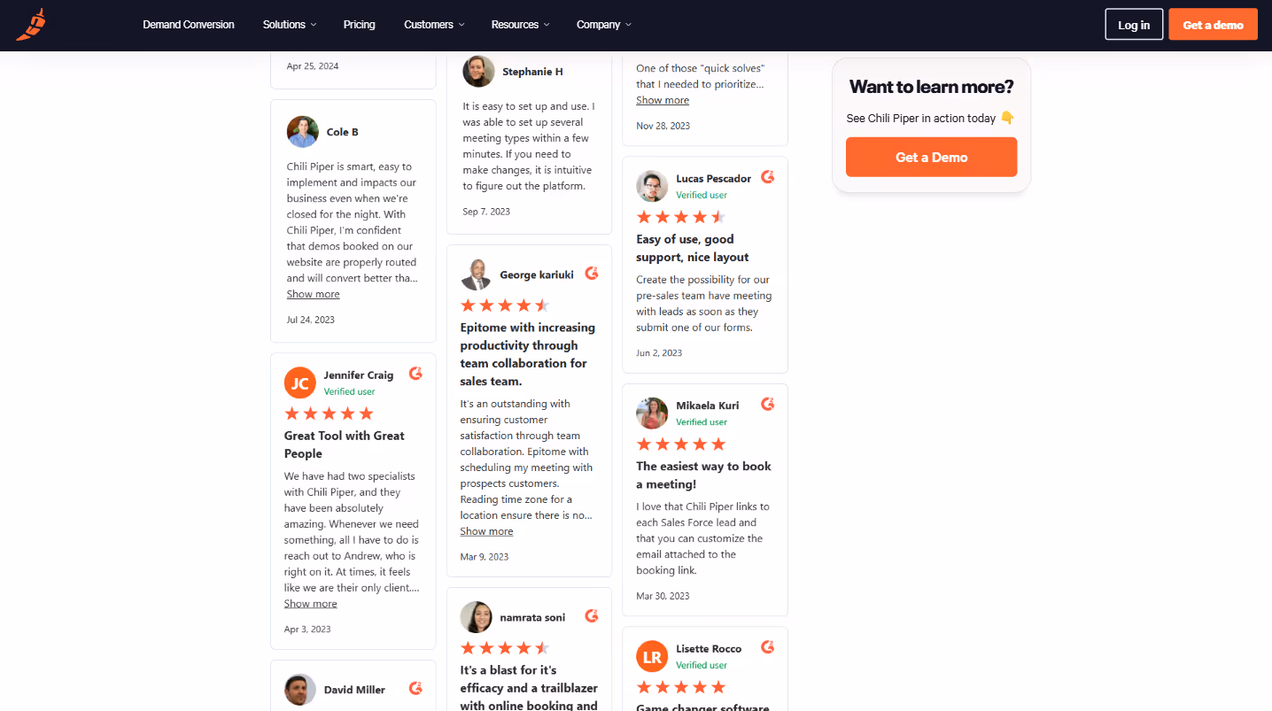
14. Social Proof Pages
Example: Chilipiper.com/wall-of-love
Social proof pages aggregate customer enthusiasm across channels, creating a collective endorsement that's greater than the sum of its parts. These pages transform scattered positive feedback into a compelling narrative about your product's impact.
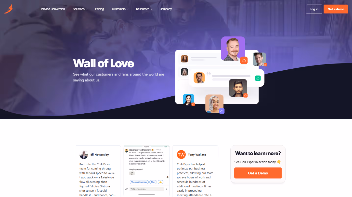
Gather diverse testimonials from multiple sources to create authenticity. Mix social media mentions, review site feedback, support conversations, and direct quotes to show genuine enthusiasm across channels. This variety feels more organic than a page of identical-looking testimonials.
Include authentic user photos and identifiable details whenever possible. Real faces and specific job titles create credibility that anonymous quotes simply can't match. Prospects instinctively trust feedback they can connect to a real person.
Make testimonials filterable by industry, company size, or use case so visitors can find relevant stories. A healthcare administrator cares more about what other healthcare organizations experienced than generic praise from unrelated industries.
Feature video testimonials prominently for high-impact social proof. Brief, authentic video clips capture nuances of customer enthusiasm that written testimonials can't convey. A genuine smile or moment of excitement communicates volumes about satisfaction.
Highlight specific metrics and results mentioned by customers. Transforming vague praise into concrete outcomes ("reduced reporting time by 62%") makes testimonials significantly more persuasive and helps prospects envision similar results.
Update your social proof regularly to keep content fresh. Recent dates on testimonials signal ongoing satisfaction, while outdated feedback can raise questions about current product quality. Implement a quarterly refresh schedule at minimum.
Link to more detailed case studies when available, allowing interested prospects to dive deeper into stories that resonate with them. This creates a natural path from initial social proof to more substantive evidence of your product's value.
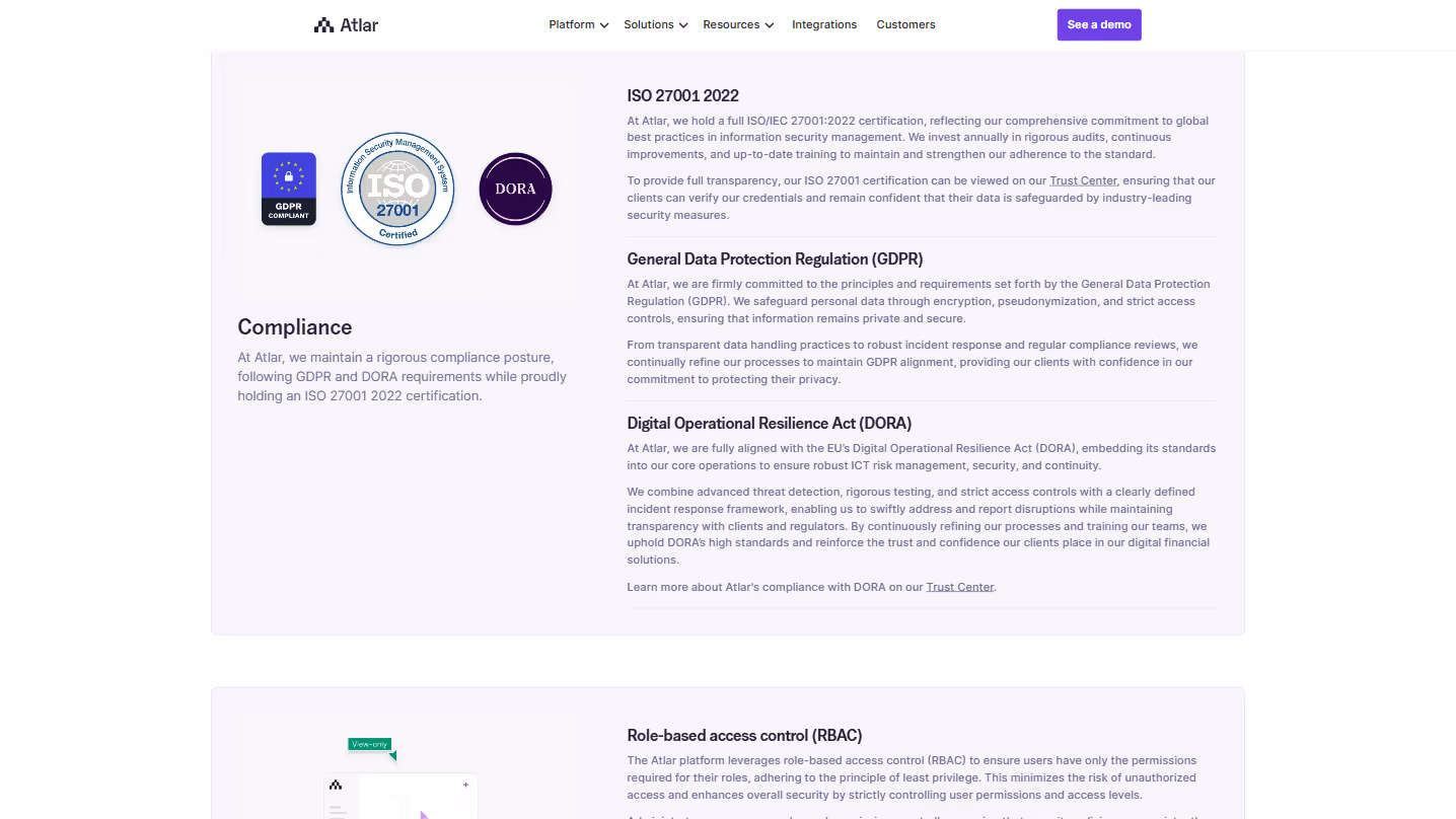
15. Security Pages
Example: Atlar.com/security
Security pages address the final hurdle for many B2B purchases. Inadequate security information isn't just a missing feature - it's often a deal-breaker.
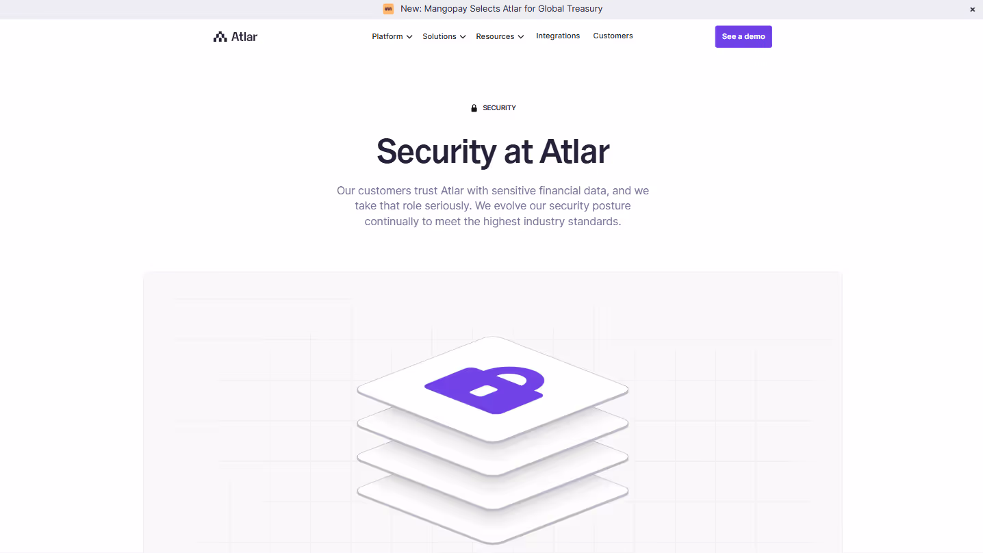
Display security certifications prominently. Position trust badges (SOC 2, ISO 27001) above the fold for immediate reassurance.
Balance technical details with plain language explanations. Technical reviewers need specifics, while business users need clear assurances.
Be transparent about data locations and processing. Clearly state where information is stored, especially important for companies in regulated industries.
Address both security (protection from threats) and privacy (responsible data usage) concerns directly.
Provide downloadable security documentation for technical reviews. Many enterprises have formal security assessment processes requiring detailed information.
Outline your vulnerability management and security testing approach. How you handle security operationally often matters more than specific technologies.
Include information about SLAs and uptime guarantees to establish reliability expectations.
16. Demo Booking Pages
Example: Seamless.ai/demo-booking
Demo booking pages should make scheduling frictionless while gathering just enough context to deliver a valuable demo.
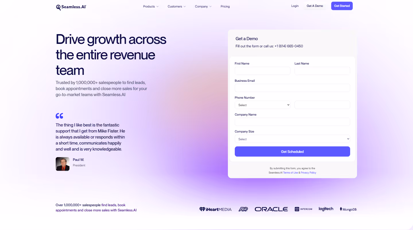
Minimize form fields ruthlessly. Each additional field reduces completion rates, so ask only what's truly needed for qualification and preparation.
Set clear expectations about what prospects will see. This attracts qualified leads and reduces no-shows by clarifying the demo's scope and value.
Implement calendar integration showing real-time availability. Removing scheduling friction significantly increases conversion rates.
Include social proof specifically about demo value. Quotes about how helpful past demos were carry more weight than generic product testimonials.
Offer options for different demo types when relevant. Some prospects want quick overviews, others need technical deep-dives, and offering choices respects their needs.
Send immediate confirmation with preparation details. Include who will attend from your team, what to have ready, and any prerequisites for maximizing demo value.
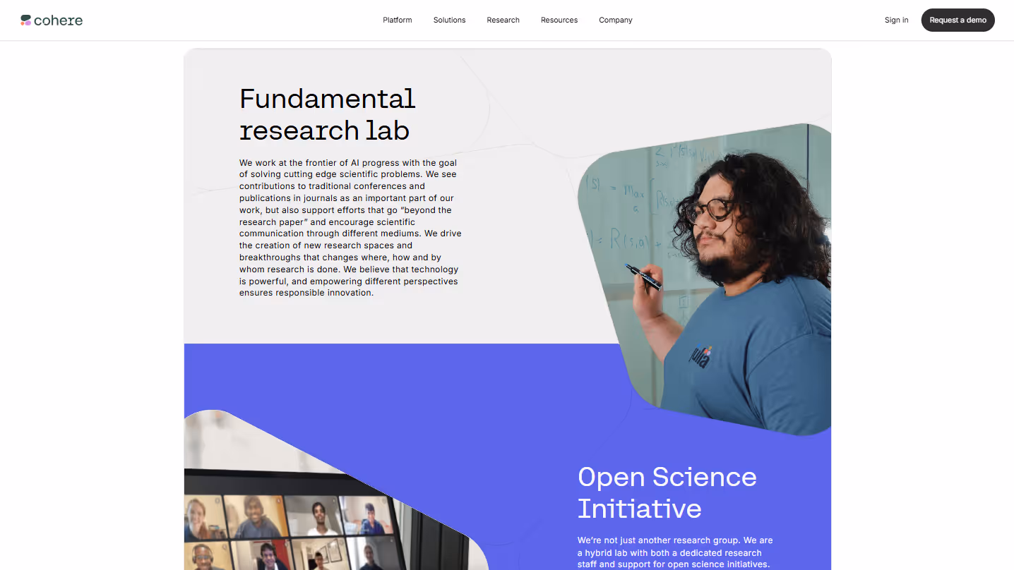
17. Research & Resources Pages
Example: Cohere.com/research
Research pages establish your authority while providing valuable insights that build trust and engagement - especially crucial for complex or technical products.
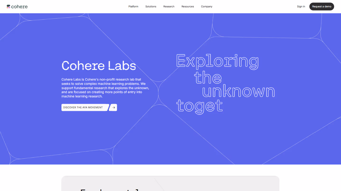
Present original research in accessible formats. Transform complex findings into scannable articles, visual summaries, and key takeaways that don't require specialized knowledge to understand.
Include downloadable reports and white papers. These high-value assets serve dual purposes: providing depth for interested readers and capturing leads when gated appropriately.
Feature thought leadership content from team experts. Bylined articles and research from your specialists build credibility and give your company a human face of expertise.
Publish industry benchmarks and trend analyses. Comparative data helps prospects understand performance standards and positions your company as an industry authority with unique insights.
Include interactive data visualizations when possible. Engagement increases significantly when users can manipulate and explore data rather than just viewing static charts.
Connect research directly to practical applications of your product. Abstract concepts become more compelling when prospects see how findings translate to specific use cases.
Offer sign-up options for research newsletters or updates. This creates an ongoing relationship with prospects interested in your thinking, nurturing them toward eventual purchase decisions.
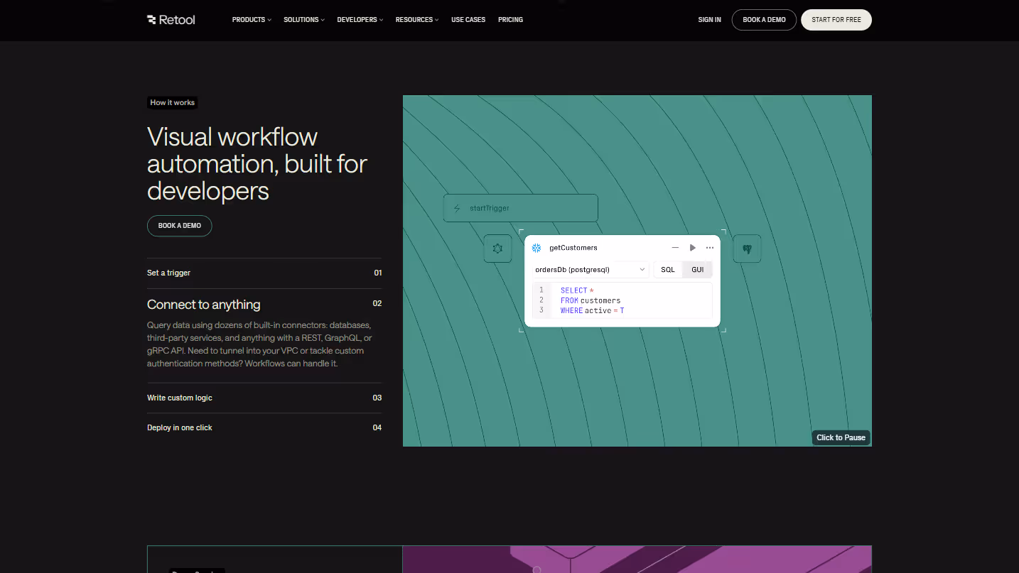
18. Workflow Pages
Example: Retool.com/workflows
Workflow pages help prospects visualize how your product fits into their daily operations - bridging the gap between features and practical application.
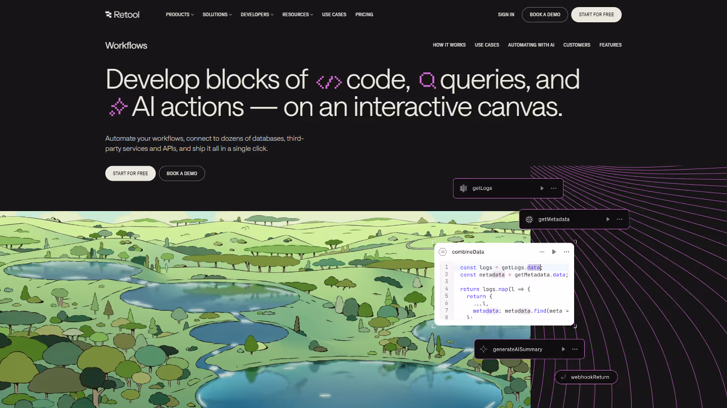
Provide visual representations of workflow processes. Flowcharts, process diagrams, and visual sequences help users understand complex processes at a glance better than text descriptions alone.
Include step-by-step guides for common workflows. Breaking processes into clear, sequential steps makes adoption seem manageable and helps prospects envision themselves using your product.
Showcase automation capabilities with concrete examples. Demonstrate specifically which manual tasks your solution eliminates, ideally with before/after comparisons that highlight efficiency gains.
Demonstrate time savings and efficiency improvements with specific metrics. "Reduces reporting time from 5 hours to 30 minutes" is more compelling than vague promises of "saving time."
Include template libraries for quick implementation. Ready-to-use templates lower the activation energy required to get started and provide immediate value to new users.
Show integration points with other tools and systems. Illustrate how your product connects with the existing tech stack, reducing concerns about disruption to established workflows.
Feature customer examples of workflow implementations. Real-world usage stories from similar companies help prospects see practical applications in their specific context.
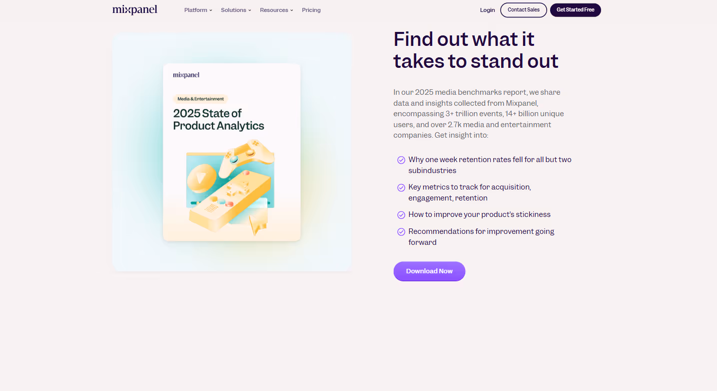
19. Analytics & Reports Pages
Example: Mixpanel.com/m/benchmarks-report-2025-media-entertainment
Analytics and reports pages showcase your data expertise while generating qualified leads through high-value content marketing.
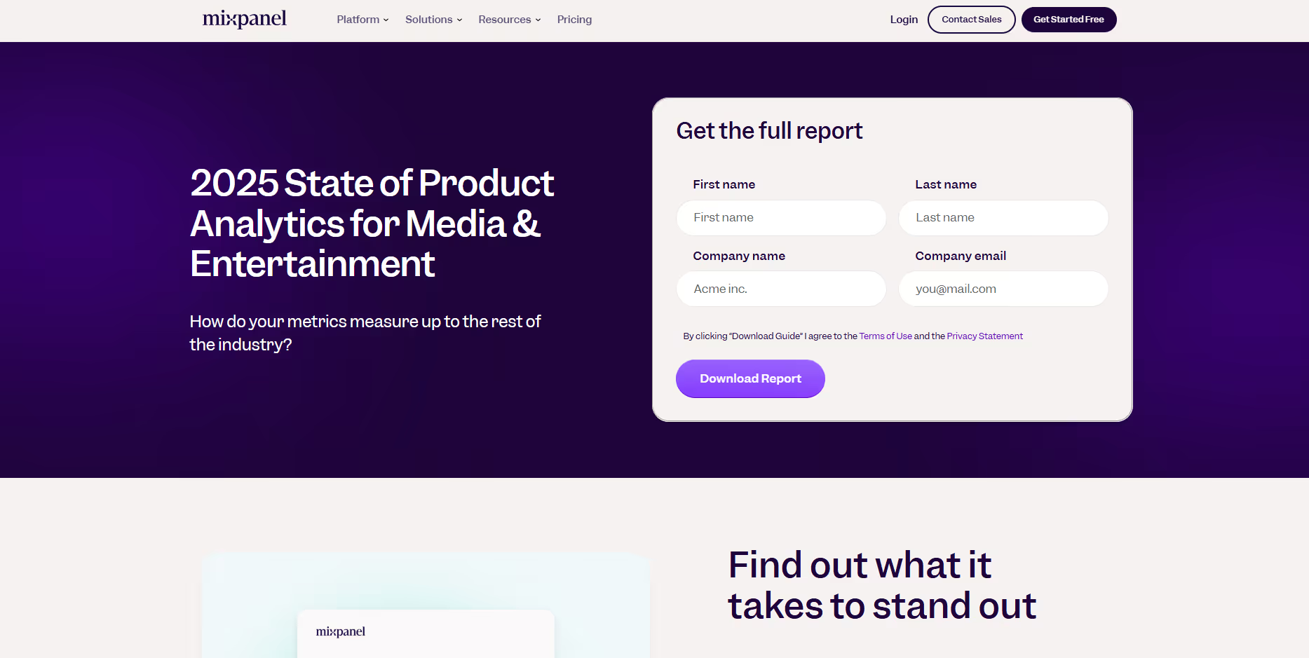
Create valuable, data-driven content relevant to your audience. Industry benchmarks, trend analyses, and research findings should address specific questions your target customers are asking.
Include visual data representations that communicate insights at a glance. Well-designed charts, graphs, and infographics transform complex data into accessible, shareable insights.
Provide actionable recommendations alongside the data. Raw statistics have limited value—translate findings into specific tactics and strategies prospects can implement.
Make reports downloadable in exchange for contact information. High-quality reports justify the "cost" of an email address, creating qualified leads with demonstrated interest in your expertise.
Include methodology information to establish credibility. Briefly explaining your data sources, sample sizes, and analysis approach builds trust in your findings.
Update reports regularly with fresh data. Outdated statistics undermine credibility, while current information signals ongoing investment in providing value.
Create follow-up content that builds on report insights. Webinars, blog posts, and email series that expand on key findings extend engagement and nurture prospects through their decision journey.
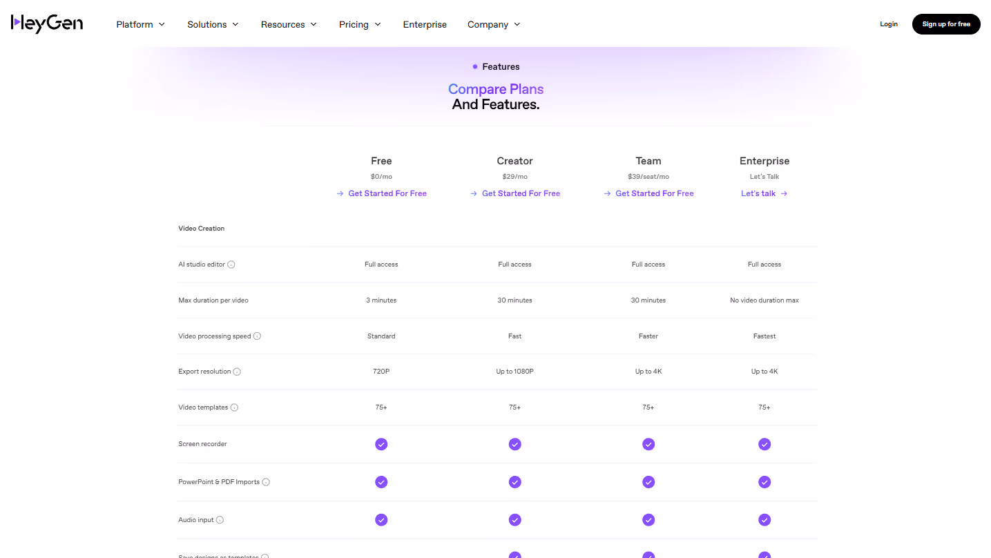
20. Pricing Pages
Example: Heygen.com/pricing
Pricing pages are perhaps the most scrutinized part of your website. They require careful balance between clarity, strategic positioning, and transparency.
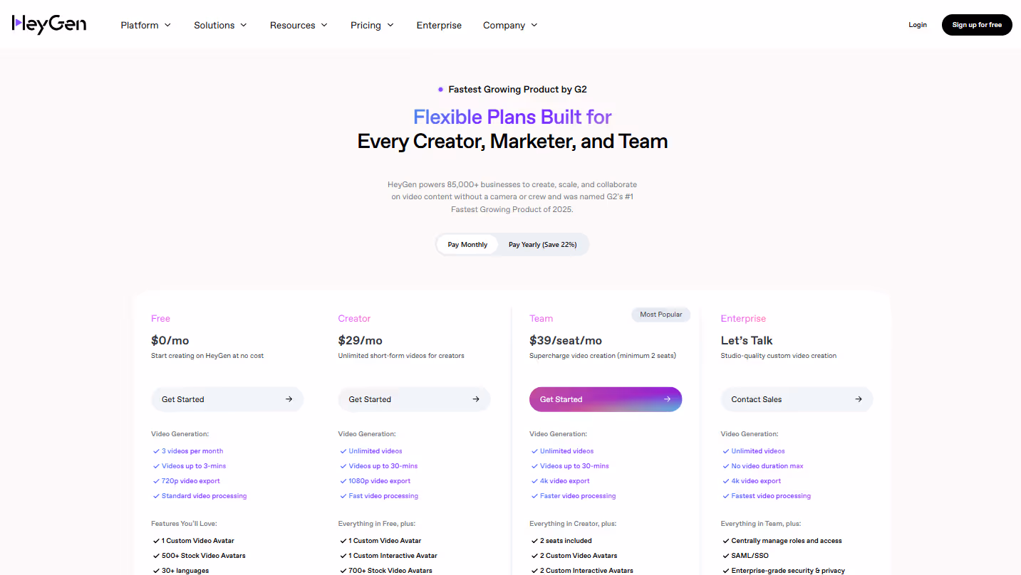
Present pricing tiers clearly with visual distinction. Use color, sizing, or positioning to differentiate plans and guide attention toward your preferred option (typically the middle tier).
Highlight the best value or most popular option. This provides a helpful anchor for undecided prospects and leverages social proof—people tend to feel comfortable choosing what others have selected.
Include feature comparison across plans with scannable format. Make it easy to see what's included in each tier without requiring excessive scrolling or clicking for essential information.
Be transparent about limitations and usage caps. Hidden restrictions damage trust far more than upfront clarity about what each tier doesn't include or where usage limits exist.
Add a FAQ section addressing common pricing questions. Proactively answer questions about contract terms, payment options, and upgrade processes to prevent abandonment due to uncertainty.
Include customer testimonials specifically about ROI and value. Quotes that address the "worth it" question directly help justify the investment for hesitant prospects.
Offer flexible options that match different customer needs. Monthly/annual billing, user-based/usage-based models, or industry-specific pricing demonstrate adaptability to varied requirements.
Provide clear upgrade/downgrade information to reduce purchase friction. Knowing they won't be locked in makes prospects more comfortable committing to an initial choice.
Making It All Work
Starting with 20 page types might feel overwhelming. You don't need to implement all of these at once. Instead:
- Prioritize based on your customer journey: Focus first on pages that address your specific buyer's most critical decision points. Where do they get stuck? What information do they need to move forward?
- Test and iterate: Use A/B testing to optimize page elements for conversion. Sometimes small changes (button text, form length, headline adjustments) can dramatically improve results.
- Ensure mobile responsiveness: All page types must perform flawlessly on mobile devices. Many B2B decision-makers review options on their phones before deeper evaluation.
- Maintain brand consistency: While each page serves a different purpose, maintain visual and tonal consistency throughout. A disjointed experience damages trust.
- Optimize loading speed: Conversion rates plummet with slow-loading pages. Every second counts – especially for prospects who aren't fully sold on your solution yet.
- Create clear conversion paths: Every page should have a logical next step for visitors. Don't leave them wondering what to do next.
- Use analytics: Track performance metrics for each page type to continuously improve. Data reveals what's working and what needs attention.
Remember, the most effective SaaS websites aren't just collections of pages – they're carefully crafted conversion paths that guide visitors toward becoming customers. Each page should have a clear purpose and lead naturally to the next step in the journey.
What high-converting page types have worked for your SaaS business? I'd love to hear about your experiences in the comments.
You ask, we answer
Keen to work with us but still have questions? We’ve gathered the most popular ones here. And if you’d like to ask us anything more specific, we’re here to help. Reach out to us.

Integration pages demonstrate how your SaaS product fits into existing tech stacks by organizing integrations by workflow category and showing practical value for each connection, addressing compatibility concerns before they become deal-breakers.
Persona-specific pages speak directly to individual roles like marketers or developers, addressing their unique pain points and using language they use daily, making your product feel tailored to their specific needs and workflows.
Use case pages bridge the gap between features and outcomes by showing step-by-step examples of how your product solves real problems, with searchable filters that help visitors quickly find scenarios relevant to their needs.
ROI calculators transform abstract value propositions into concrete numbers that prospects can use to justify purchases internally, with transparent methodology and downloadable results that serve as sales enablement tools.
Effective lead generation landing pages have singular focus with minimal navigation, address specific pain points in headlines, keep forms ruthlessly minimal, and use action-oriented CTAs beyond generic "Submit" buttons.
Product tour pages give prospects a taste of the user experience through videos, animations, and interactive elements without requiring commitment, helping them envision using your product in their daily work like a test drive.
Enterprise pages should highlight enterprise-specific features like SSO and advanced security, address scalability and compliance concerns directly, feature recognizable customer logos, and detail dedicated support and implementation services.
Security pages address the final hurdle for many B2B purchases by displaying certifications prominently, balancing technical details with plain language, being transparent about data locations, and providing downloadable security documentation for formal reviews.
Workflow pages use visual representations like flowcharts and diagrams to help prospects visualize how your product fits into their daily operations, bridging features to real-world use and demonstrating time savings with specific metrics.
Effective pricing pages present tiers clearly with visual distinction, highlight the most popular option, include scannable feature comparisons, maintain transparency about limitations, and provide clear upgrade/downgrade information to reduce commitment anxiety.
Blog
A bit of insights for you


Congratulations to Mike Grabowski and the team on securing investment from Viking Global Investors at PLN 500M valuation

Our client Proteine Resources just closed €9.5M in EIC Accelerator funding - truly impressive achievement in Europe's most competitive funding program.
Congrats to the Mysite.ai team on proving that great execution beats great ideas every time.

Learn more