

It’s shiny. It’s futuristic. It’s everywhere in Apple’s new UI. And now, designers are racing to bring the Liquid Glass effect to the web. But there is a catch: most browsers (and dev teams) aren’t ready.
What is the Liquid Glass Effect?
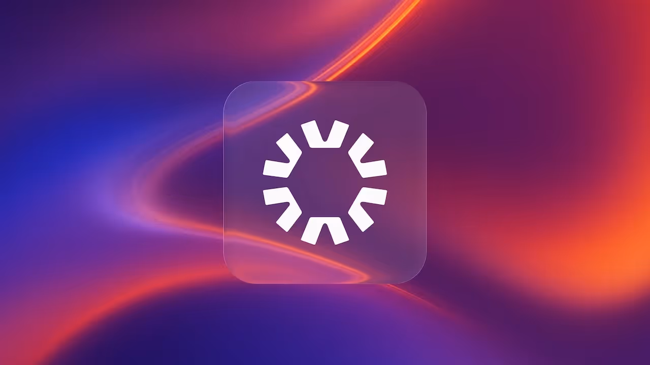
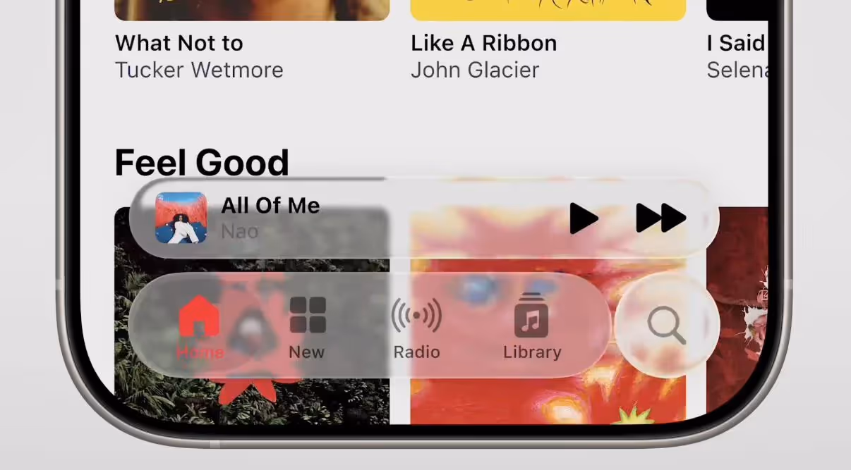
Liquid Glass is Apple’s latest design language – a step beyond standard glassmorphism. Instead of a simple blurred background with transparency, you get real light distortion. It behaves like looking through a lens, not a smudge.
Core features include:
- Specular highlights – reflections that react to movement.
- Real-time distortion – live warping of background.
- Adaptive transparency – the effect shifts based on context.
This isn’t just for looks. Liquid Glass helps separate UI elements from content while keeping visual continuity. The problem? It’s heavy on performance and hard to implement on the web.
Figma Jumps on the Hype Train – But Why Now?
In July 2025, Figma launched native support for the glass effect (in beta). That’s no accident – it’s a strategic response to Apple’s design shift. Figma had to keep up with the trends Apple was setting.
But there’s another reason: pressure from the community. As designers scrambled to mimic Apple’s effect, plugins with names like “Liquid Glass” started flooding the marketplace. Figma had to step in and take control. The timing also lines up technically. New tools like light, refraction, frost, and prism give designers more control than ever over glass parameters.
Does it look cool? Yes. But don’t confuse mockups with production reality.
Reality vs. Hype
1. The Design-to-Dev Gap
Designers love it. Developers... not so much.
Right now, there’s no standard, performant way to recreate Liquid Glass in the browser. You can hack it with SVG filters or WebGL, but:
- It breaks in Safari.
- It’s heavy to render.
- It rarely looks like the design file.
So until there’s native CSS support (which isn’t even close), most developers simply won’t be able to ship these effects reliably. We wouldn't recommend experimenting with it, especially for client-facing work.
2. Performance Hell
Each glass element needs real-time computation. Stack a few of them and your site starts choking. And especially on mobile, every millisecond matters. Too much glass means:
- Slower page loads
- Stuttering scroll and animations
- Faster battery drain (goodbye, user retention)
It's a steep price to pay for a pretty look.
3. Accessibility Nightmare
Text over glass is unpredictable. Contrast shifts based on the background, and that breaks WCAG rules. You simply can’t guarantee readability.
Our advice: don’t use it for anything with text. Stick to icons, buttons, and purely decorative elements.
How to Fake It (If You Must)
There are two reasonable ways to simulate Liquid Glass on the web right now. None are perfect, but each has its place - especially if you’re aiming for concept prototypes, landing pages, or decorative UI.
1. CSS + SVG filters
This is the simplest and most browser-friendly approach. By layering semi-transparent elements and applying backdrop blur and SVG distortion filters, you can mimic a light version of the glass effect — enough to suggest the look without taxing performance.
Pros:
- Lightweight and performant.
- Easy to implement with HTML/CSS.
- Works across most modern browsers.
Cons:
- Doesn’t capture real distortion or refraction.
- Lacks depth and realism.
- Limited to 2D usage and basic animations.
Best for:
- Buttons, badges, or small UI accents.
- Decorative glass “panes” behind icons or CTAs.
- Prototypes that hint at the visual style.
Examples:
2. WebGL with Fragment Shaders
For serious realism, you’ll need to move into WebGL territory. Using fragment shaders, you can distort background content in real time, simulate light refraction, and create the illusion of true "liquid" depth, much closer to what you see in Apple’s UI.
Pros:
- Highly realistic visual effects.
- Supports real-time distortion and lighting.
- Much closer to Apple’s native version.
Cons:
- Heavy on performance.
- Not beginner-friendly – requires JavaScript, shaders, and math.
- Can introduce accessibility issues.
- May fail on low-powered devices or older browsers.
Best for:
- Experimental sites, microsites, or single-page demos.
- High-end product or campaign landing pages.
- Web experiences built for desktop (with fallback options).
Example:
Both options work across most modern browsers, but neither is perfect.
The Bigger Picture: Spatial Design & VisionOS
Here’s the twist - Liquid Glass isn’t made for websites.
It’s built for spatial computing. In 3D interfaces, glass effects aren’t just pretty - they’re useful. They help separate floating UI from immersive content, build visual hierarchy, and add context without blocking the view. VisionOS already uses this everywhere. Every UI layer is liquid glass. Because you don’t want buttons or menus floating awkwardly in your face. You want interfaces that feel integrated, light, and intuitive. This is where Liquid Glass delivers. This isn’t just a trend - it’s the foundation of future interfaces.

Bottom Line
The web may not be ready – but spatial platforms are already building with the Liquid Glass. And that’s where the real design frontier is forming. Most dev teams in 2025 won’t be able to implement these designs. But that doesn’t mean you shouldn’t explore them. Spatial computing is coming fast. Knowing how to design with Liquid Glass could matter a lot in 2–3 years. Until then, use it with caution. Avoid text. Test everything on real devices.
Because if a design looks great but breaks performance or usability – it’s just not a good design.
Curious how to push creative boundaries without sacrificing performance? Talk to us.
We’re a team of designers and developers who build fast, functional websites for leading B2B tech teams.
Blog
A bit of insights for you

.avif)

Congratulations to Mike Grabowski and the team on securing investment from Viking Global Investors at PLN 500M valuation

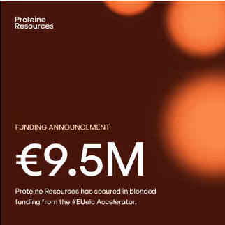
Our client Proteine Resources just closed €9.5M in EIC Accelerator funding - truly impressive achievement in Europe's most competitive funding program.
Congrats to the Mysite.ai team on proving that great execution beats great ideas every time.

Learn more