
























A well-designed website serves as a critical asset for SaaS companies to communicate value, build trust, and drive conversions.
Ten of the best SaaS websites in 2026, from Ramp to Scale AI, share four things: a value proposition you grasp in seconds, product shown in context, specific social proof and a short path to conversion. Almost every category leader has rebuilt around an AI-first story in the past year. The web design choices behind each are broken down below, with a checklist for auditing your own site.
Best SaaS websites in 2026 (and the web design choices behind them)
A SaaS website is the hardest-working asset most software companies own. It carries the value proposition, builds trust and moves visitors toward a demo, often before anyone speaks to sales. When the web design is right, that work happens quietly on every page.
Plenty of SaaS websites follow the same template. A smaller group treats web design as a conversion problem rather than decoration, and the gap shows in how fast a visitor understands the product and how confidently they act. So what separates a SaaS website people remember from one they forget? Rarely just visuals, though those help. The best pair design craft with conversion strategy, so the web design earns its keep only when it is wired into how visitors actually move toward signing up.
Below are eleven SaaS websites worth studying, with the web design and messaging choices behind each. Read them and one pattern jumps out: almost every category leader has rebuilt its homepage around an AI-first story in the past year.
What makes an effective SaaS website?
An effective SaaS website makes the product understandable in seconds and gives the visitor a reason to trust it. Every web design decision serves one of those two jobs.
In practice that means:
- Clear communication of product value. Within a few seconds a visitor should know what problem the product solves and why it matters to them.
- Features framed as outcomes. The strongest SaaS websites translate capability into a result that speaks to a real pain point rather than listing features.
- Credible social proof. Logos, testimonials and usage numbers do the trust work that copy alone cannot.
- Intuitive navigation. A visitor should never feel lost or unsure of the next step, which is as much an information-architecture decision as a web design one.
- Product demonstration in context. Showing the product through video, an interactive demo or well-placed screenshots lands harder than describing it.
The best SaaS websites - our top 10
1. Ramp (financial operations)
Ramp's states its value in 4 words: "Time is money. Save both." In a category built on complexity, that plainness is the point.
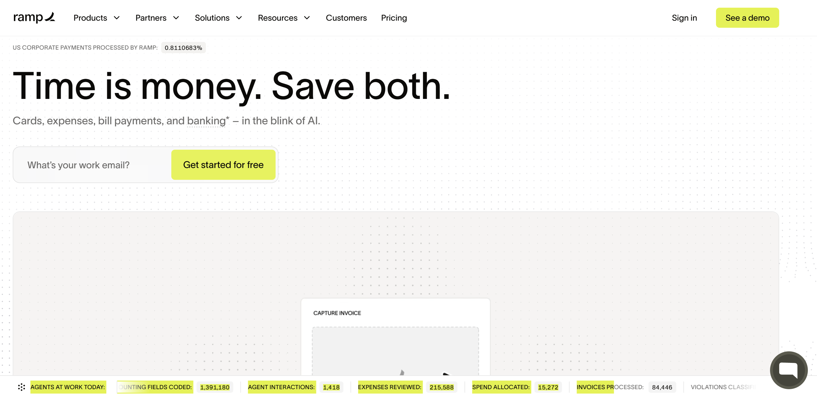
What sets Ramp apart is how it shows the platform rather than describing it. Instead of a feature list, the site puts the dashboard in context, the kind of product-led homepage layout that does the persuading before a single CTA. The social proof is hard to miss too, with “Join 70,000 of the world’s most ambitious companies growing 3.2x faster than the average American business” placed where you cannot avoid it, which nudges a prospect toward the obvious conclusion that this many teams are unlikely to be wrong.
2. Webflow (website building)
Webflow'shomepage reads "Make your website a growth engine," with a subhead that spells out the job in 3 parts: build your brand, rank in AI search, drive real revenue. That is a deliberate move away from "website builder" toward the site as a revenue tool, and the AEO and MCP features on the hero cards show where the platform is heading.
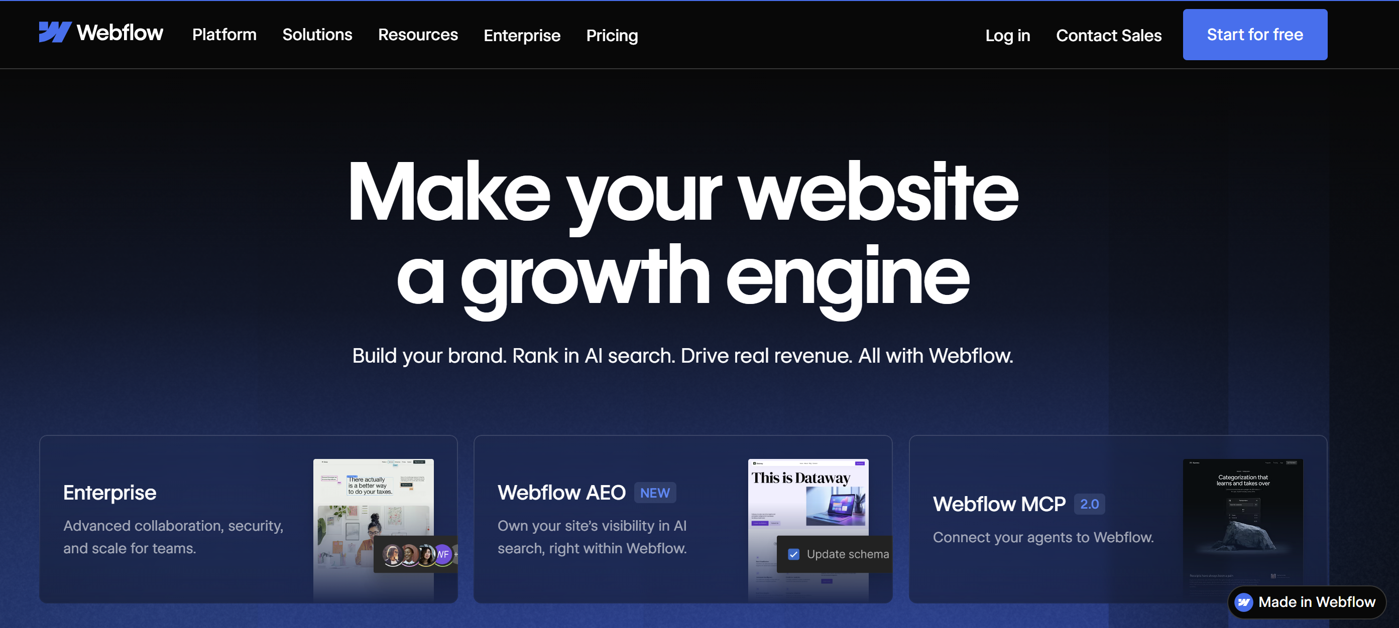
The site is structured to speak to several audiences at once. Designer, developer or marketer, the navigation routes you to content built for your job, and the homepage itself is proof of what the platform can produce. That is the same reason building a marketing site on Webflow lets you ship the interactions the page is selling rather than mocking them up in a slide. If you are weighing the platform against the usual alternative, the trade-offs sit in the six practical differences between Webflow and WordPress for a growing site.
3. Surfer SEO (content optimization)
In a market filled with SEO tools, Surfer's website makes a direct claim: "Be the answer in Google, everywhere buyers search," and the "AI visibility platform" label above it show a product that now sells visibility across AI answer engines, not just classic rankings.
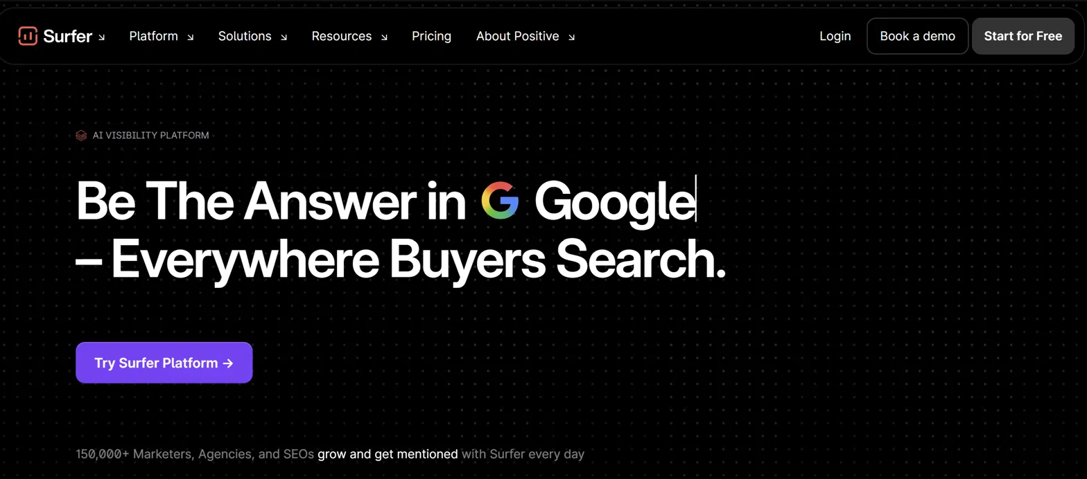
The web design pairs a stark black canvas with the concrete proof content teams care about, and the line about 150,000+ marketers, agencies and SEOs growing with it every day does the credibility work early. The best touch is how the product is framed as the thing that gets you cited by AI, which is exactly the shift smart content teams are planning for. It is the same reason structuring a page so machines can extract a clean answer now matters as much as the keyword work underneath it.
4. Clay (data enrichment)
Clay's website immediately captures attention with its vibrant, nature-inspired illustrations. It opens with playful, claymation-style 3D scenery and a plain headline: "Build systems to grow revenue," backed by a line about infrastructure to get any data, run agentic workflows and launch GTM plays
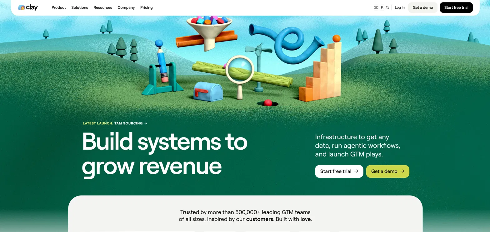
Their visual approach stands apart from typical SaaS design conventions, using organic elements that feel refreshing and memorable in a space often dominated by abstract shapes and gradients. This design choice communicates creativity while still maintaining professional credibility.
Beneath the eye-catching header, the web design stands apart from typical SaaS convention, using tactile, handmade elements that feel fresh in a space dominated by abstract shapes and gradients. It signals creativity without giving up professional credibility. The social proof is specific and large, citing more than 500,000 GTM teams and the line "inspired by our customers, built with love," which keeps a big number feeling human. Distinctive identity, clear messaging and substantial proof are what make this one of the more memorable SaaS websites around, and it is a good reminder that personality in web design can be a conversion asset rather than a risk.
5. Lattice (HR platform)
Lattice's "People Intelligence, Powered by AI," and the subhead frames the product around improving performance with better context, timely coaching and action in the flow of work. The old "the HR platform people love" line has given way to an AI-first story, matching the way the product itself has narrowed toward performance management.
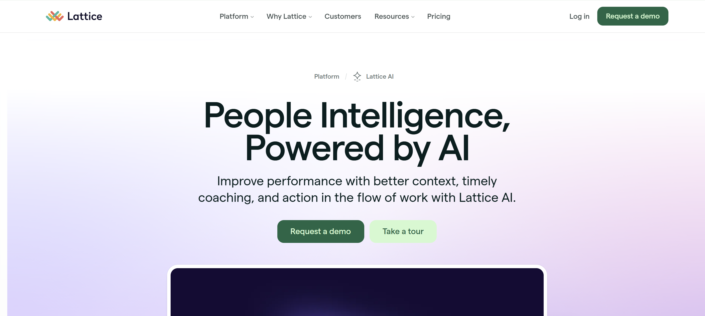
The web design keeps a soft, human feel, a pale gradient and rounded green buttons, so an AI headline still reads as people-first rather than cold. The interface preview beneath the fold shows real dashboards rather than abstract concepts, letting an HR leader picture the platform in their own organisation, and the two clear actions ("request a demo" and "take a tour") give a hesitant visitor a lower-commitment way in. It is a good example of how a soft, human visual language can carry a hard AI message without feeling cold, which keeps a comprehensive platform approachable rather than overwhelming.
6. OpenPhone (business communications)
OpenPhone presents a straightforward value proposition: "Never lose a customer to a missed call," with the supporting line describing a shared business phone and inbox for every call, text and customer, even after hours.
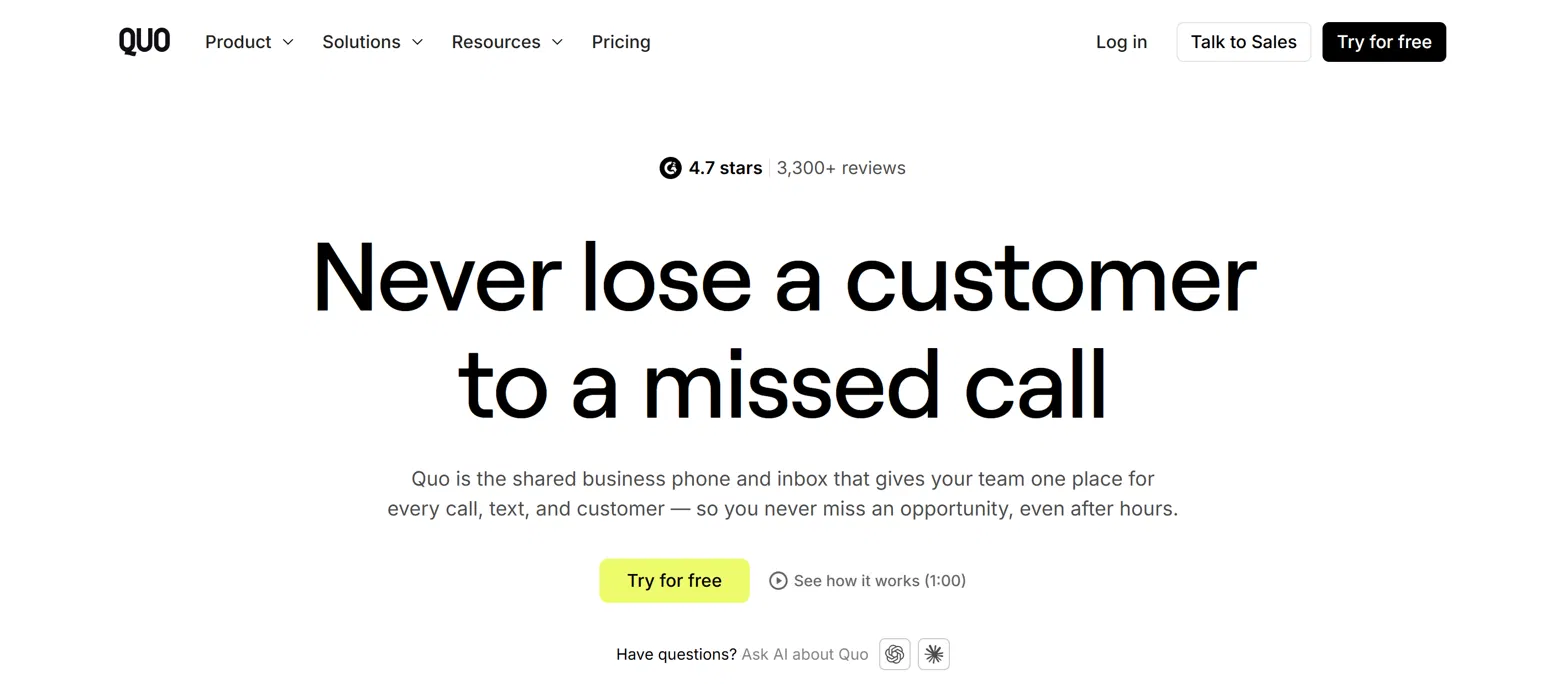
The web design is bright and spare, letting one oversized headline and a single primary action ("Try for free") carry the page, with a 4.7-star, 3,300+ review badge sitting right above the fold for quick validation. The call-to-action hierarchy is the standout, with one obvious next step and secondary options that stay accessible without creating decision paralysis. It is a tidy lesson in how a ruthlessly simple layout can outperform a busy one when the message is sharp, and in how a rename this big only works when the migration is handled without dropping the traffic and equity built up under the old brand.
7. Lemlist (sales engagement)
Lemlist's website tackles a common pain point head-on with their headline: "The AI outbound platform for relevant outreach at every scale," and the subhead promises AI agents that research, personalise and engage prospects across multichannel campaigns. The tabbed strip beneath the fold ("let AI handle it," "find and enrich leads," "spot buying intent") walks a visitor through the workflow rather than listing features.
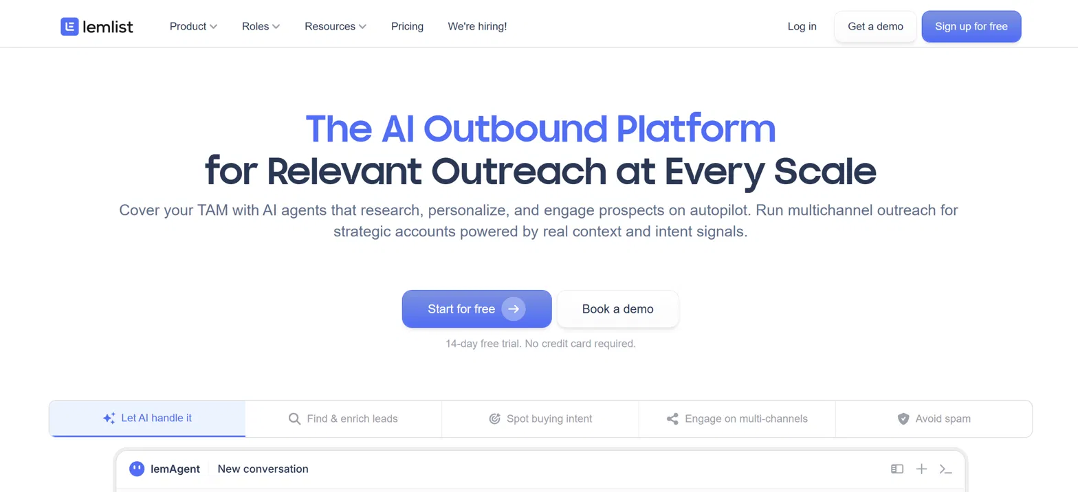
The web design visualises the whole outreach motion as one connected journey, which makes an abstract idea concrete. Each capability ties to a specific outcome such as better deliverability or higher reply rates, so the benefit is never vague. It is a clean example of how showing the workflow instead of the feature list keeps a complex product easy to grasp, a principle that holds on any screen size.
8. Victor (AI evaluation)
Viktor is one we know from the inside, because our team designed and built the website.
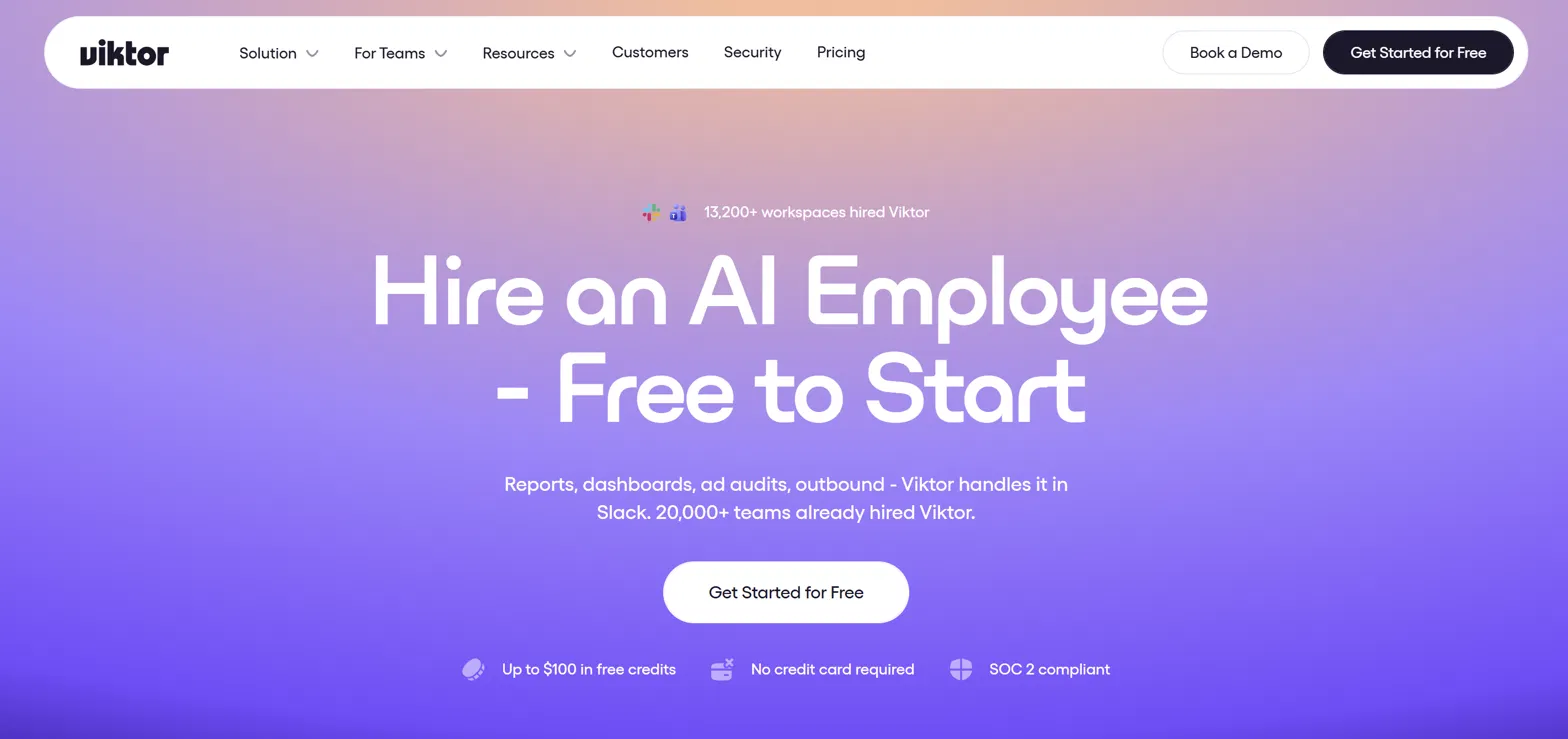
The homepage leads with a striking line, "Hire an AI employee, free to start," and a subhead that makes the product concrete straight away: reports, dashboards, ad audits and outbound, all handled inside Slack, with 20,000+ teams already on board. The web design uses a warm gradient and a single clear action to keep an ambitious idea approachable, while trust markers ("up to $100 in free credits," "no credit card required," "SOC 2 compliant") sit right under the CTA to remove hesitation at the moment of decision. What makes it work is the balance of a big, memorable promise with immediate proof and specificity, so a visitor grasps what Viktor does and why to trust it within seconds
9. Amplemarket (sales intelligence)
Amplemarket's website immediately captures attention with its future-forward headline: "Step into the future of sales: human + AI," with a subhead about empowering reps, uncovering opportunities and growing revenue on one AI platform. The Duo Copilot interface peeking up from the fold shows the product doing real work.
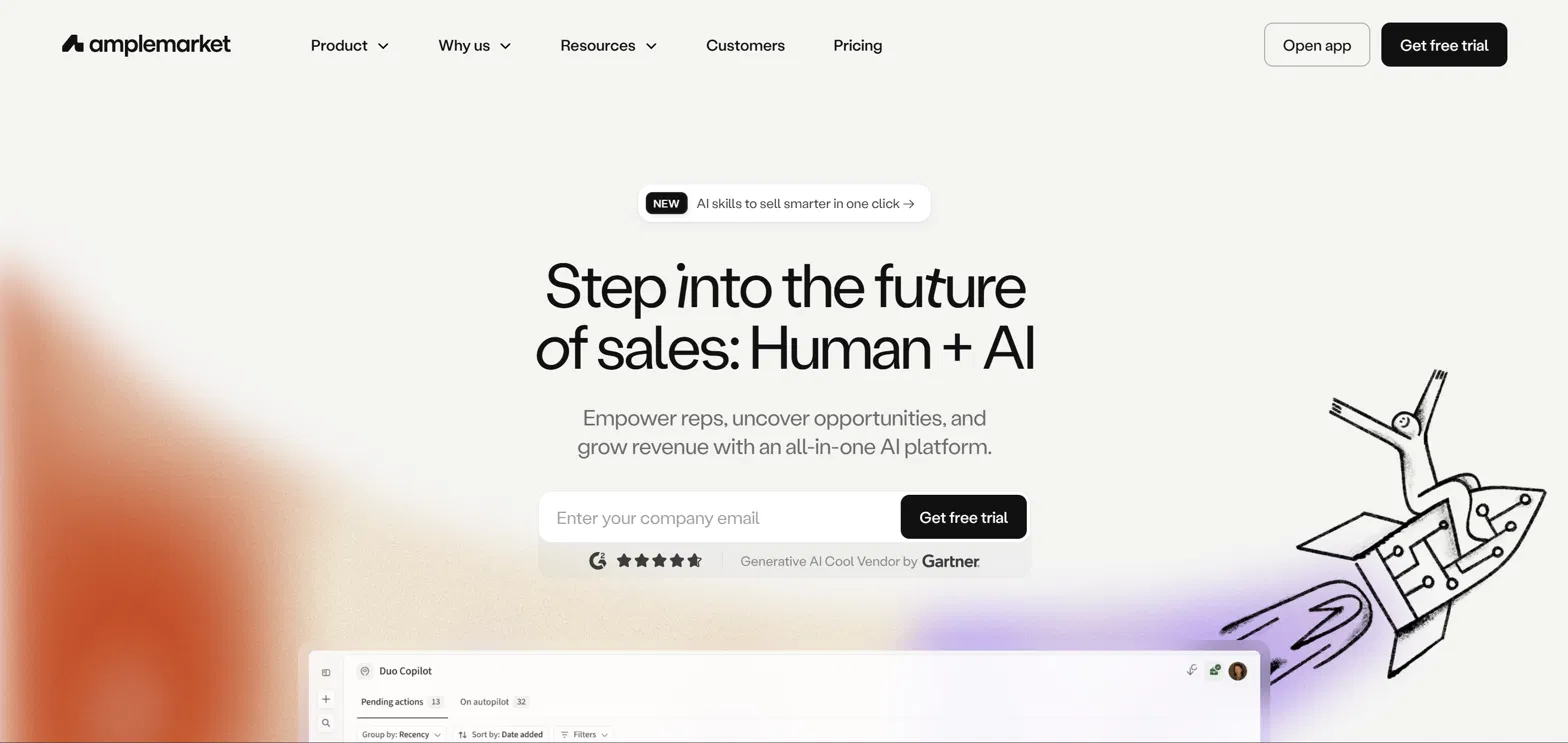
The web design keeps the AI story warm and human, pairing a hand-drawn rocket illustration with a G2 rating and a Gartner Cool Vendor badge for instant credibility. Features are framed in terms of the sales activity they improve, and the live Duo Copilot panel embedded in the page shows real product state rather than a static mockup, which only works when the marketing site is wired to the data and tools behind it. It is a strong example of a bold claim backed by proof in the same eyeline.
10. Scale AI (machine learning)
Scale AI leads with weight and restraint: "The world's most important decisions need reliable AI systems," set over full-bleed footage of an offshore rig, which signals the calibre of problem the company works on before you read a word of product copy.
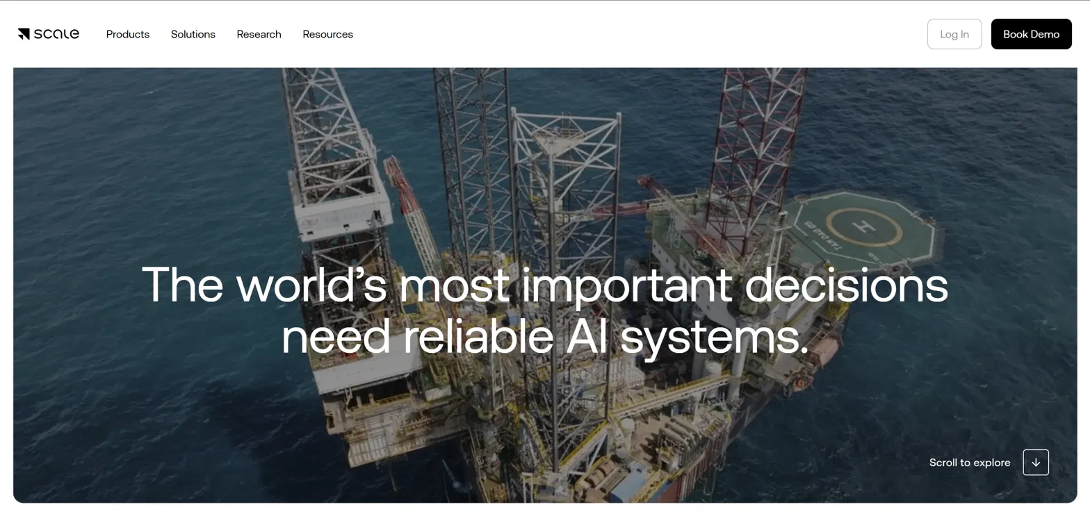
The web design trusts a single sentence and a strong image to do the positioning, then invites you to "scroll to explore" into the detail. It demonstrates expertise rather than claiming it, through research, documentation and technical specs that earn credibility with engineers and data scientists, while the enterprise and public-sector framing tells buyers this is industrial-strength rather than consumer AI. It is a masterclass in how a confident hero can say less and mean more when the brand has the proof to back it, though a site this reliant on heavy video and a single strong image only stays fast and on-message with the kind of ongoing upkeep that keeps performance from sliding after launch.
Common elements of effective SaaS website design
Looking across these standout SaaS websites, several web design patterns emerge that any SaaS company can learn from.
- Clear value communication
- Direct explanation of capabilities that focuses on outcomes, not features
- Emphasis on practical benefits rather than technical specifications
- Case studies that demonstrate real-world application, which is why a 176% conversion lift documented end to end does the trust-building a testimonial cannot
- Effective product demonstration
- Strategic screenshot placement that shows the product in context
- Clear feature presentation that connects to specific user needs
- Performance metrics that validate product claims
- Professional trust building
- Specific social proof, not just "many customers" but "20,000+ teams"
- Customer testimonials tied to measurable results
- Security credentials prominently displayed
- Intuitive navigation
- Clear call-to-action placement that guides the user journey
- Logical information structure that anticipates user questions
- Simplified user paths that reduce friction in the conversion process, where web design and information architecture do most of the quiet work
How to apply this to your own SaaS website
When evaluating your own SaaS website, focus on these key areas.
Value proposition
- Is your capability statement immediately clear to first-time visitors?
- Does your benefit communication speak to specific pain points?
- Can visitors quickly find use cases relevant to their situation?
Trust building
- Is your social proof specific and credible?
- Are your performance metrics clearly presented?
- Is security and compliance information readily accessible?
Product demonstration
- Do your feature showcases connect to practical applications?
- Are your use cases realistic and relatable?
- Do visitors get a clear sense of the user experience?
Conversion optimisation
- Are your CTAs strategically placed throughout the user journey?
- Is your pricing structure transparent and easy to understand?
- Have you simplified conversion paths to minimise abandonment?
If a redesign is on the table, it helps to know first whether your site needs a rebuild or a round of iteration, and if you do rebuild, how to do it without losing the search rankings you already have. When you want a partner for that work, a build that treats conversion as an architecture problem rather than a coat of paint is where we start.
What the best SaaS websites have in common
The most effective SaaS websites in 2026 succeed by balancing professional web design with clear communication of value. They understand their audience's needs and present solutions in a way that feels relevant, credible and compelling.
Consider these examples as reference points for your own website development, but adapt the principles to your specific product and audience. Regular testing and refinement keep a SaaS website meeting user needs and business objectives over time. What these websites accomplish goes beyond visual appeal, building the understanding and trust that turn visitors into customers.
Want a SaaS website that converts like the ones above? Book a call with Grafit.