




























Growth design for viktor.com (opens in a new tab), from viral launch to $75M Series A
Grafit is our end-to-end web team delivering websites growth, CRO, and landing pages. They are always data-driven. What I love.


It all started with  one post.
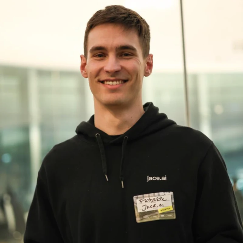
On 12 February 2026, Fryd Wiatrowski introduced Viktor to the world. Three hours later, projected ARR had crossed $1M, and by the end of the day over a million people had seen the post.
The website wasn’t built for that kind of attention.
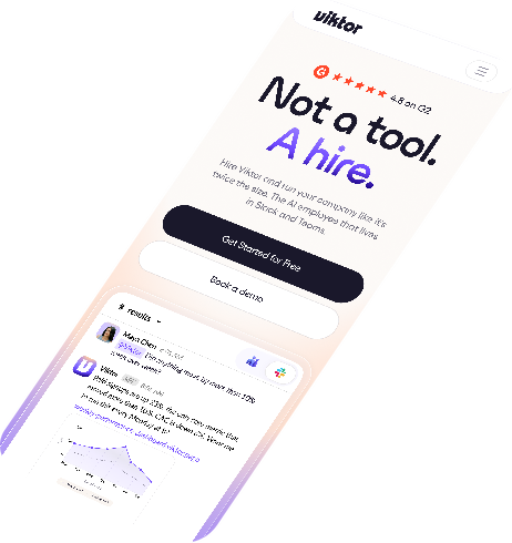
We’d made that landing page for a quick launch, and suddenly a million people were arriving at once, curious about what an AI hire even was.
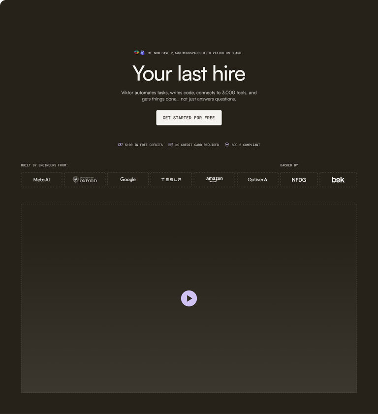



So we rebuilt it within days.
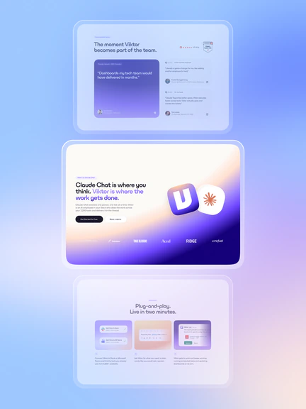
Creating a website that could carry the momentum.
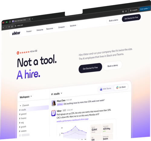
We rebuilt it again in days for the $75M news.
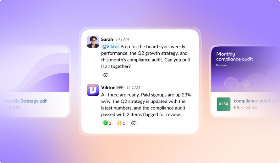
Three months later Viktor closed their Series A, but the site they had wasn’t the one they wanted the world to see. We delivered a full redesign, fifteen new pages and sixty assets just in time for the big announcement.


Viktor keeps on growing, we keep on shipping.
Viktor hit $50M in six months, and growth at that pace means the website is never done. Every week we’re optimizing the site, running A/B tests and building new landing pages for paid campaigns.

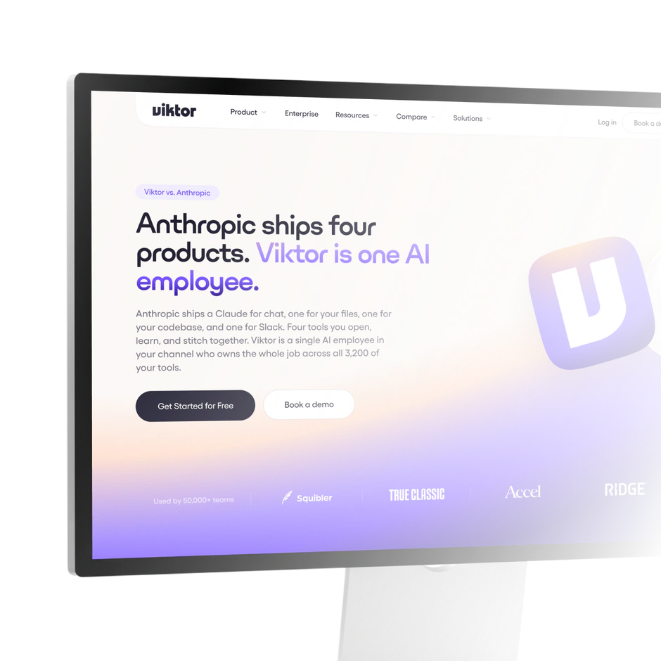





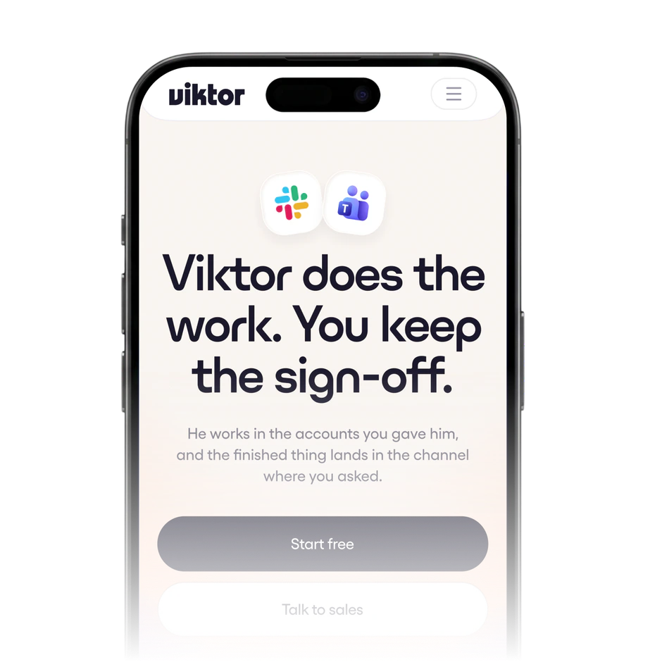
Meet Grafit and Viktor


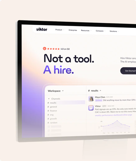


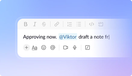
What we had to get right

A new category
Nobody had a reference point for an AI employee. The site had to explain a new category in seconds, without dumbing the product down.
Team adoption
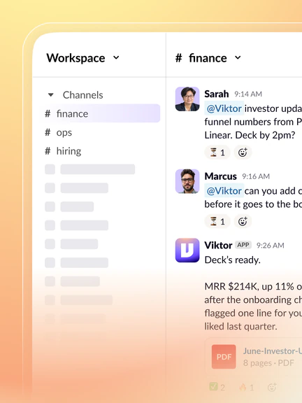
Viktor measures success in workspaces where a whole team uses it daily. Every page, experiment and ad has to pull toward that, not toward traffic or trials.
Quality at speed
Viktor ships weekly, so design has to keep up, hold a category-leader standard, and still let their team build pages themselves from a component system.
Idea, ship,
data, repeat.
We work fast and iterate based on data. Everything runs as one system, continuously boosting growth and getting the most out of the website and landing pages.
-
Idea
-
Insight
-
Live
-
Results
-
Ship

“Grafit has been with us from the very beginning, adapting as our team grew, consistently delivering value, and proving to be partner we need as a fast-growing startup.”



Full-funnel design
We design the ad, the page it leads to, and the booking form at the end as one connected system. So whatever made someone click on the ad is still there when they land on the page, in the same words and the same look.
-
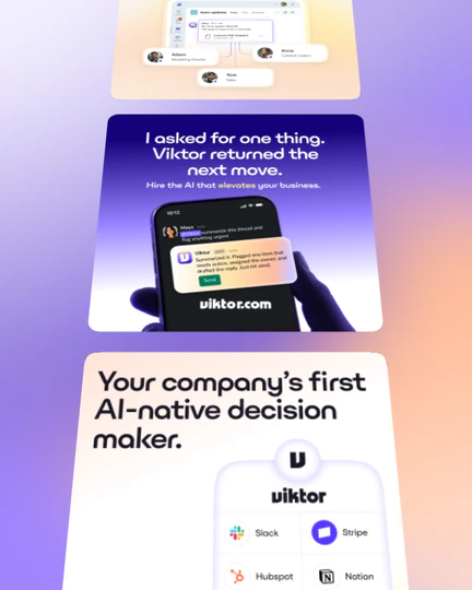
Creative ads
Ad creatives that stop the scroll and make the promise.
-
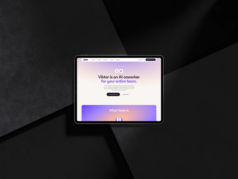
Landing pages
Landing pages where that promise gets delivered, built from shared, reusable components.
-
Conversion
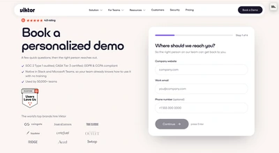
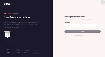
Booking flow designed so nobody drops out at the form.


Website growth, on repeat
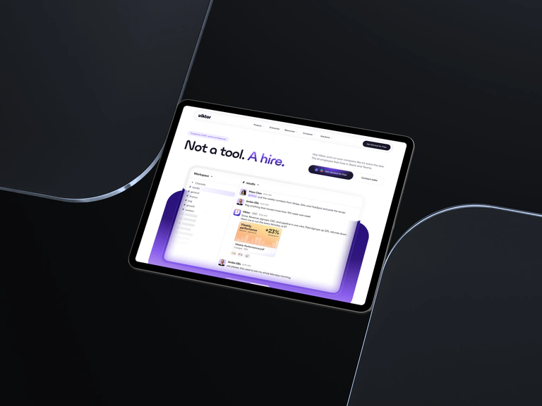
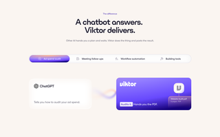
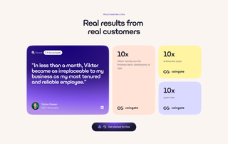
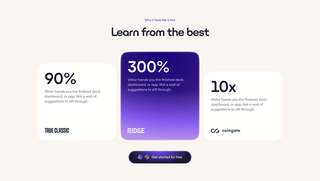
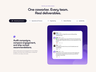
Every page is a hypothesis. We ship it, measure it, and build the next version on what worked. Click through to see how the site evolved.
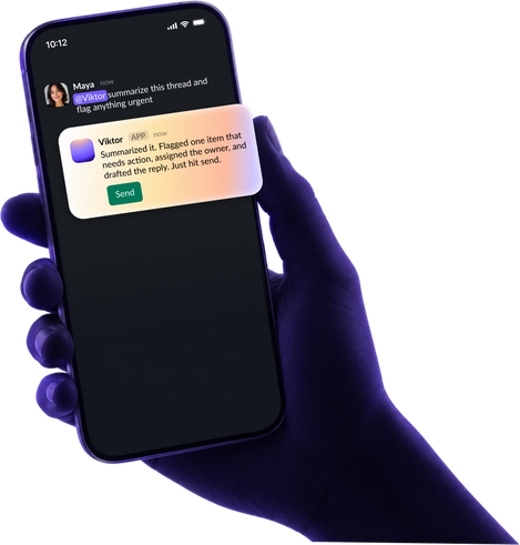
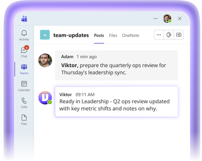
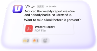
Ad creatives at volume
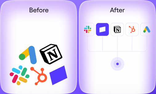
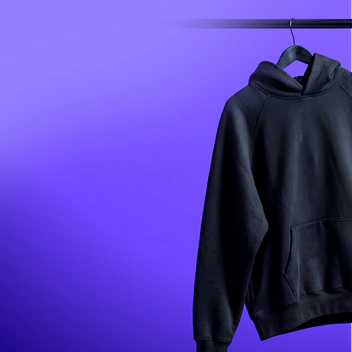
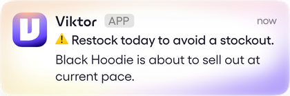
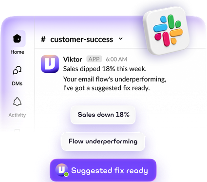
Viktor’s team sends the angle, we design, the ads go out, and the data helps us iterate the next round. Because we work in SaaS and know the product inside out, we can turn around a lot of use-case-specific ads quickly.






















The results
The sales form converts better, fewer visitors bounce, and a finished design now goes live in about 48 hours.
Who made it happen
Great projects are never a solo act. This one took expertise, patience and a healthy dose of stubbornness from both sides.











We’ve become Viktor’s growth design partner days ago, and we keep shipping.


Looking for a long-term growth partner?
Let’s talk