
























Most B2B case studies get written, published, and forgotten in a resources tab nobody visits. The case studies that convert are built into the buyer journey instead of sitting next to it. These 10 best practices keep showing up across the strongest B2B case study examples in 2026
Why most B2B case studies never convert
Most B2B case studies are built without a clear reader in mind, so they end up in a resources tab the buyer never has a reason to visit.
The case study gets all of its attention before it goes live and almost none of it after. The team spends on average 6 weeks producing, reviewing and approving it, ships it, and moves to the next project. The buyer who would have benefited from reading it lands on the website months later, never finds it, and leaves never knowing it existed.
The companies that get conversion out of B2B case studies have stopped thinking of them as articles and started thinking of them as part of a conversion-led website and the B2B buyer journey.
How to design a B2B case study page that converts
The 10 patterns below are what those companies are doing differently in 2026, with examples from Clay, Ramp, Verbatim, Unify, Metronome and others.
1. Open the B2B case study with the outcome
A buyer landing on a B2B case study page wants to know one thing first: did the work deliver?
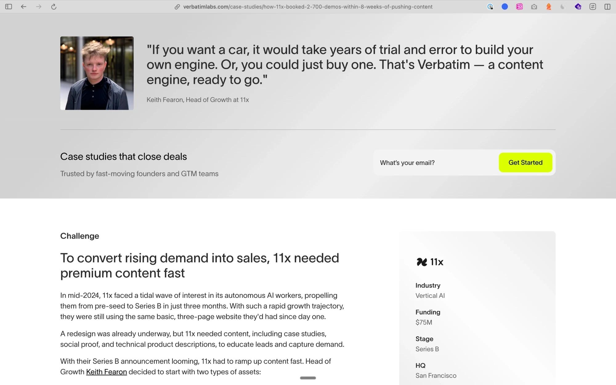
Most case studies bury the result under two paragraphs of company backstory, and most readers leave before they get there. The buyer reads about the funding round, the old website, and the internal decision to invest in content before they reach the number that would have made them stay.
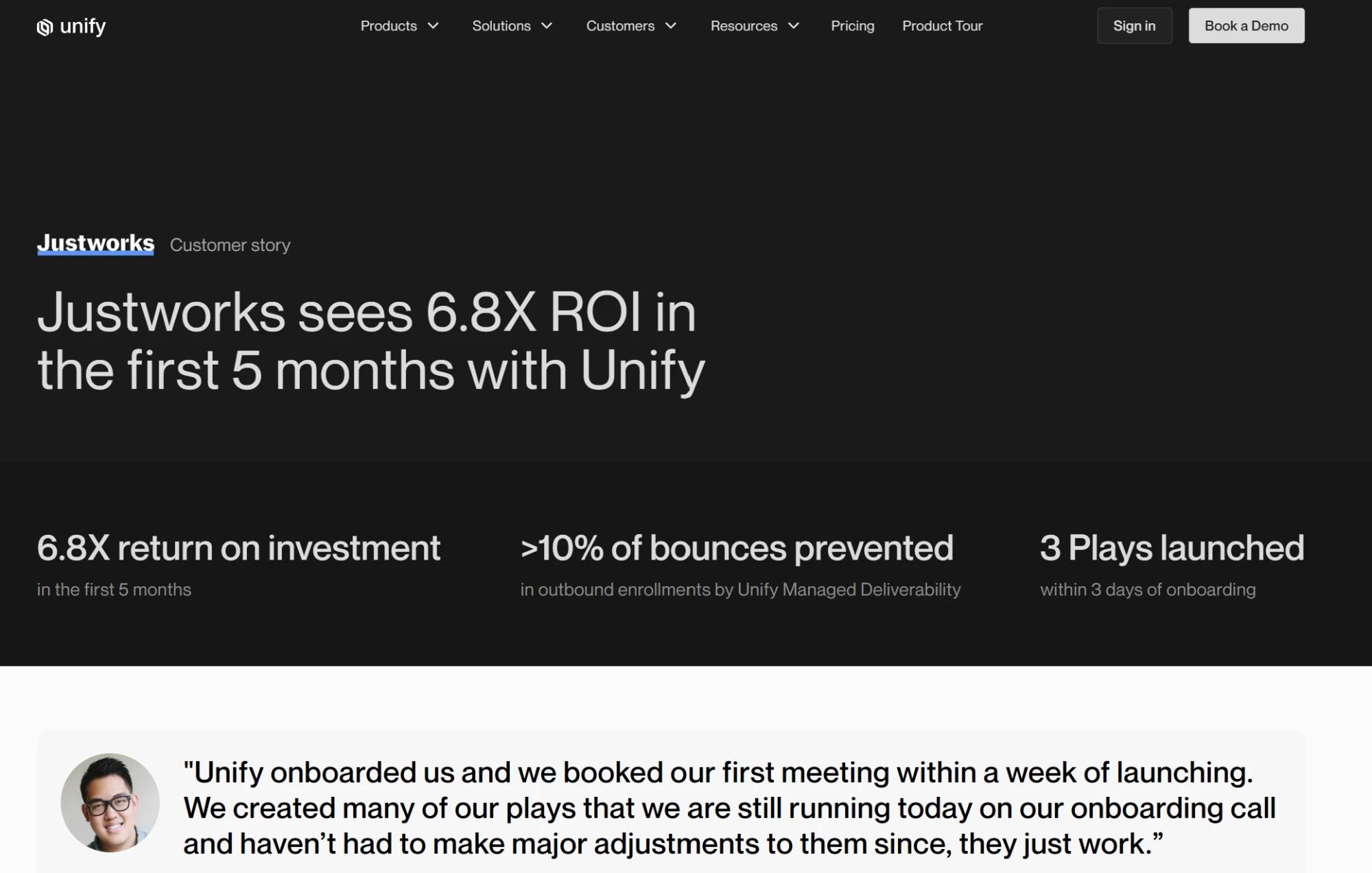
The pages that convert open with three numbers and no preamble. Unify and Justworks lead with 6.8x ROI in the first five months which is the exact number that should stop a buyer mid-scroll. The story underneath earns the number rather than circling around it.
2. Write Challenge, Solution, Results with detail at every stage
This structure is the backbone of every case study that works, because it matches how a buyer thinks through their own situation. It falls apart the moment teams write all three sections in vague terms.
Pull quotes have a job too. The good ones are the ones where a future buyer reads them and thinks "that is exactly what I am worried about”.
3. Put a CTA on the B2B case study page itself
A buyer who has just read an entire B2B case study is the warmest lead on the website. That window stays open for about 10 seconds, and most companies waste it by sending the buyer back to the homepage to figure out what to do next.
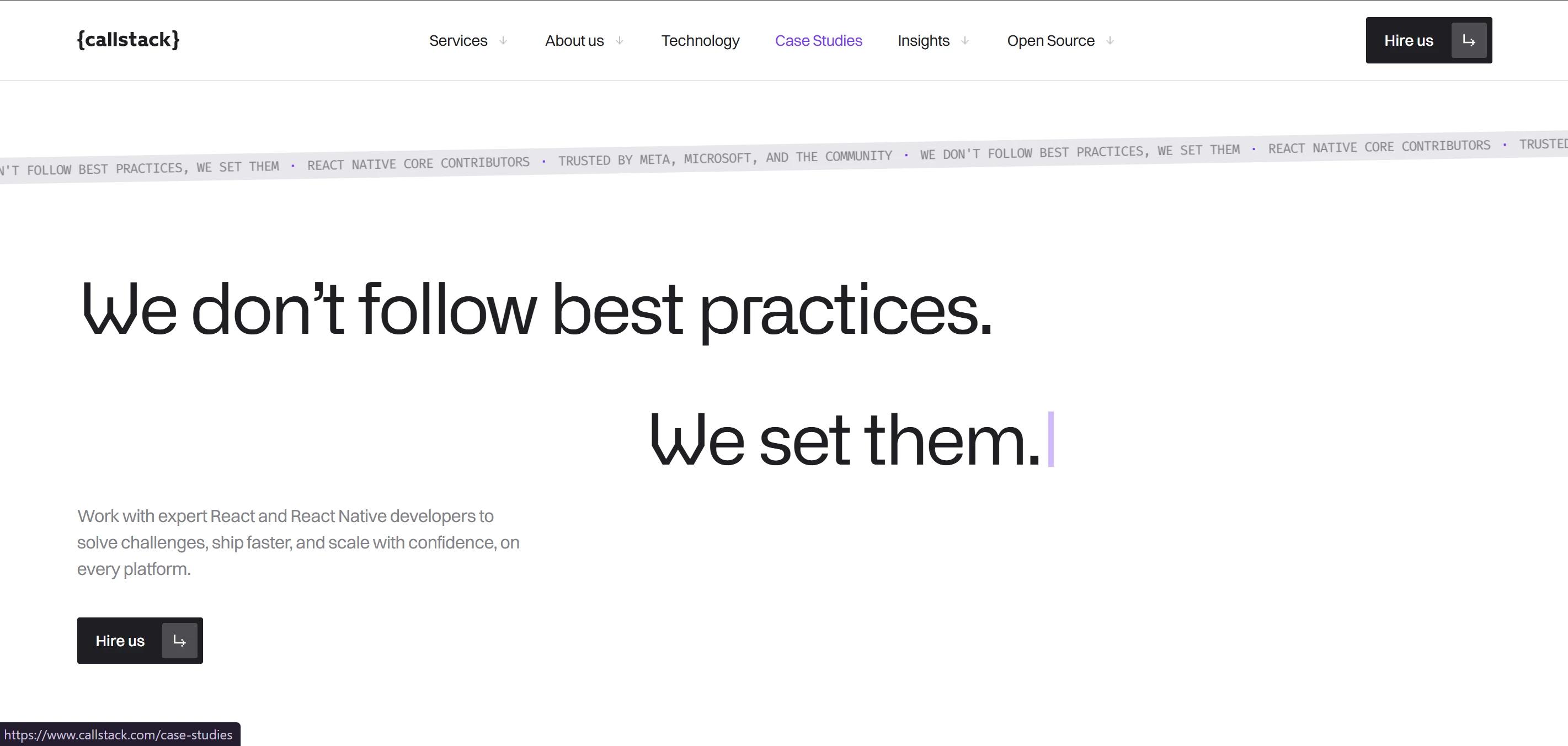
Placement matters more than the CTA itself. A "Book a demo" button at the top of the case study asks for commitment the page has not earned yet. The same button at the bottom asks for commitment the page has already earned. Callstack's case studies use a "Hire us" button at the end of every case study page, where the buyer reads the result and the next step in the same scroll.
4. Make your customer logo wall clickable
A static row of logos tells the buyer that big companies use the product. It does not tell them which problems those companies had, what changed after they signed, or whether the result is anything close to what they are hoping for. The logo wall does half the job and stops.
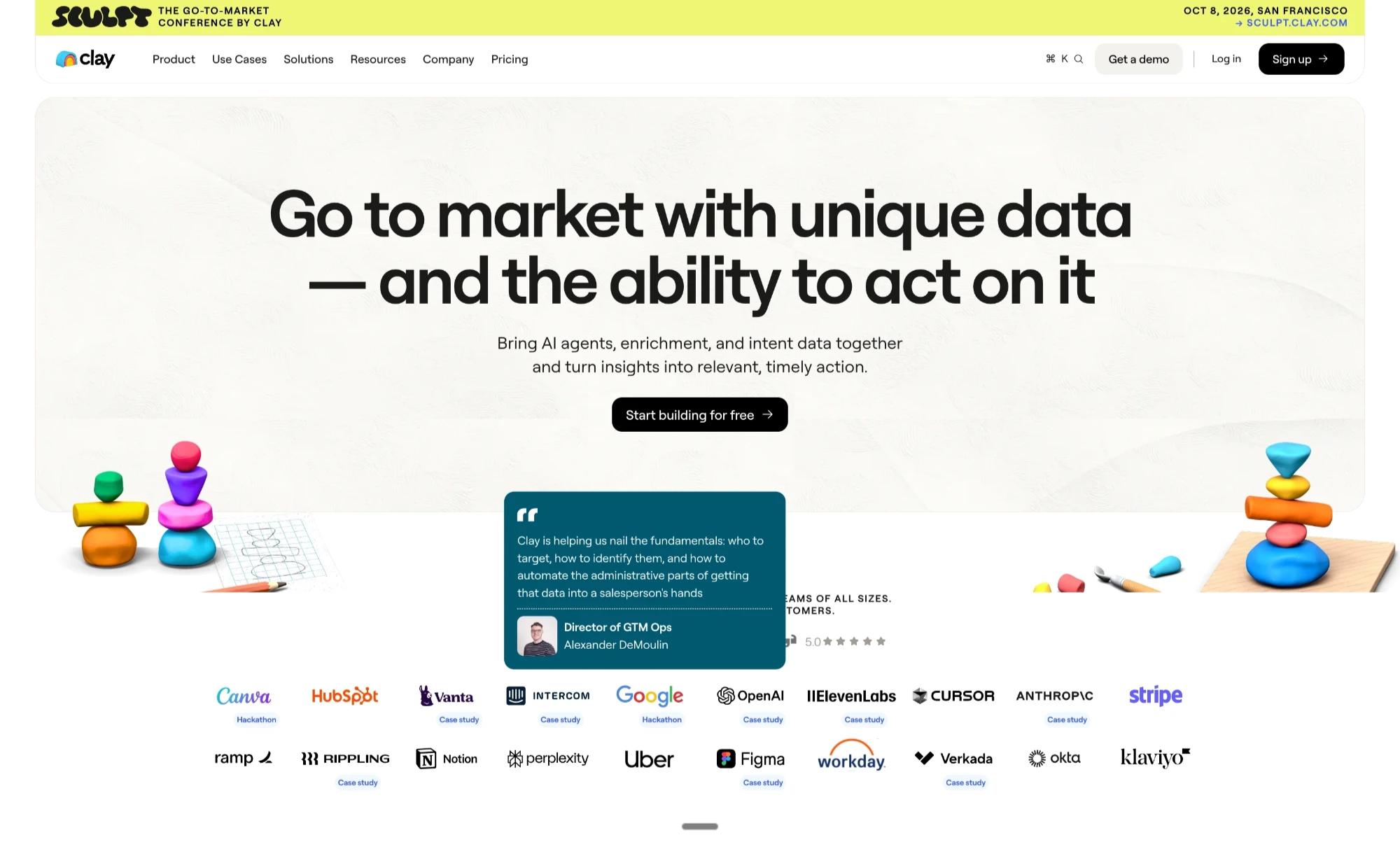
When a buyer sees a name they know and can click through to read the SaaS case study for that company, the proof becomes specific to them. Clay does this on their homepage. Credibility turns into a specific story attached to a name the buyer trusts. It is one of the most useful things a web design team can do on a B2B website, and almost nobody does it.
5. Sort B2B case studies by buyer context
Publishing ten case studies does not help anyone if the buyer has to read all ten to find the one that matches their situation. The B2B case study layouts that work let the buyer filter for themselves.
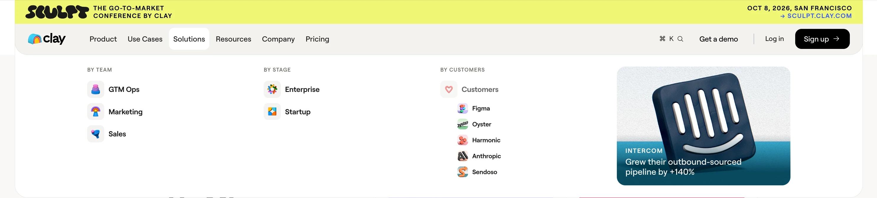
Clay does this inside the main navigation. Their Solutions dropdown is organised by who the buyer is:
- By team type (GTM Ops, Marketing, Sales)
- By company stage (Enterprise, Startup)
- By named customer
The Intercom case study card in the corner of that dropdown is doing useful work too. The buyer hovers over Solutions and sees a real result from a company they have heard of, before they have clicked anything.
6. Embed video testimonials inside product sections
A video testimonial on a dedicated testimonials page only reaches buyers who were already convinced enough to go looking for one.
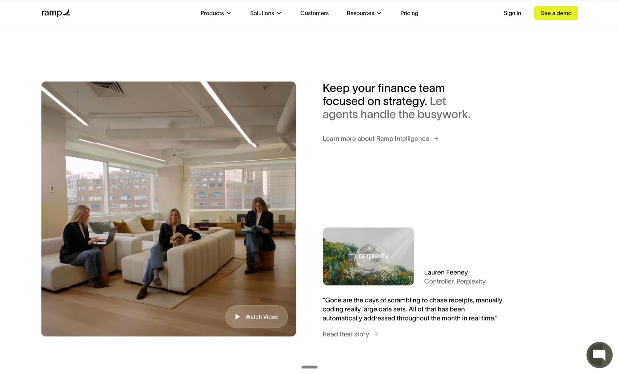
Ramp solves this by moving the video into the product section it supports. On their finance page, the claim about automating busywork sits next to a Perplexity testimonial, with a "Watch Video" thumbnail directly underneath. The buyer reads the claim and sees the proof in the same scroll, without ever deciding to go find a video.
7. Show results in a bento layout
Buyers do not all care about the same outcome. Some want to see hours saved, some want revenue, some want to know whether companies their size are already using the product. A single case study can only point at one of those.
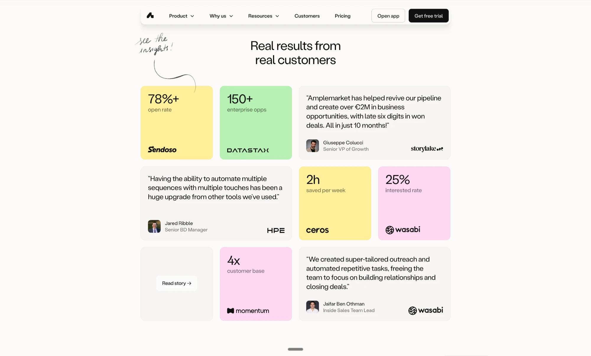
A bento layout for results gives all of them something to read without forcing anyone to open five different B2B case studies. Amplemarket does this on their homepage with a grid that mixes stat cards (78% open rate, 150+ enterprise opps, 2h saved per week) with full quote cards. The mix means at least one tile will land for any buyer who reaches the page, without making them open five separate case studies to find it.
8. Mix polished B2B case studies with raw social proof
Formal B2B case studies are believable, and buyers also know that legal and marketing reviewed every word. That review process puts a limit on how natural the proof can sound.
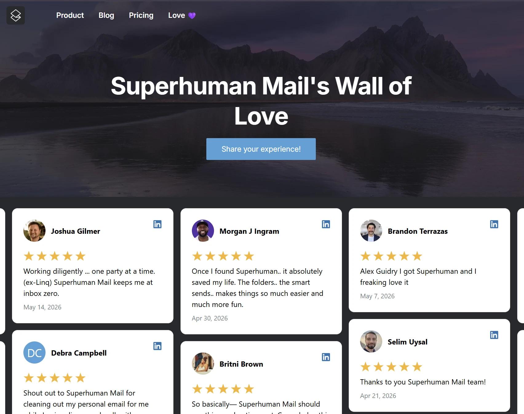
Raw social proof works the other way, because nobody approved them, so the buyer reads them as real. Superhuman's Wall of Love stitches together customer tweets with photos, sitting alongside the formal testimonials on the site. The polished case study and the raw tweet do different jobs on the page, and most buyers need both before they decide.
9. Pair B2B case study proof with feature claims on the same page
Social proof works hardest when it shows up at the moment the buyer is reading the claim it supports. Anywhere else, the buyer has to remember the claim, find the proof, and connect the two on their own.
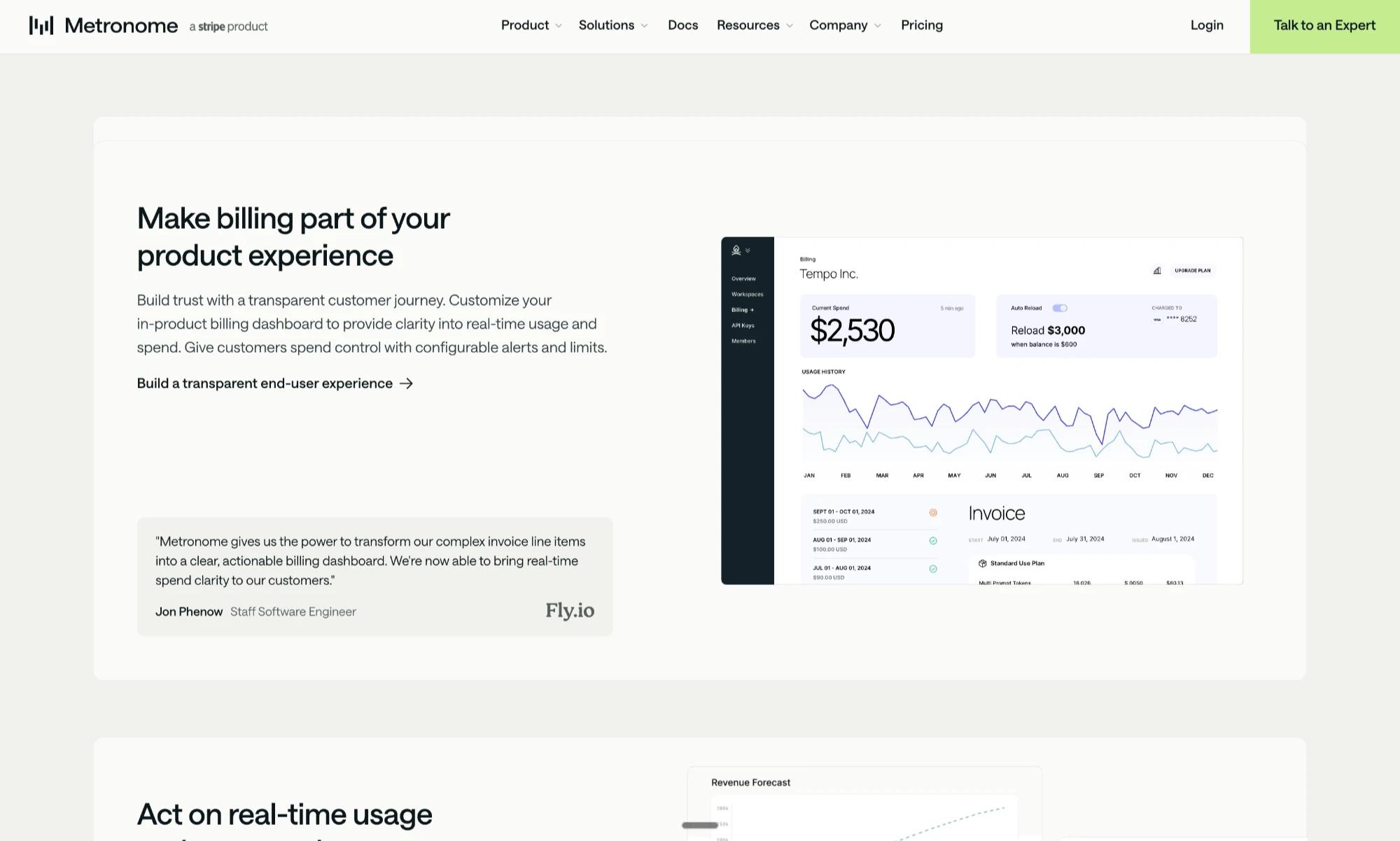
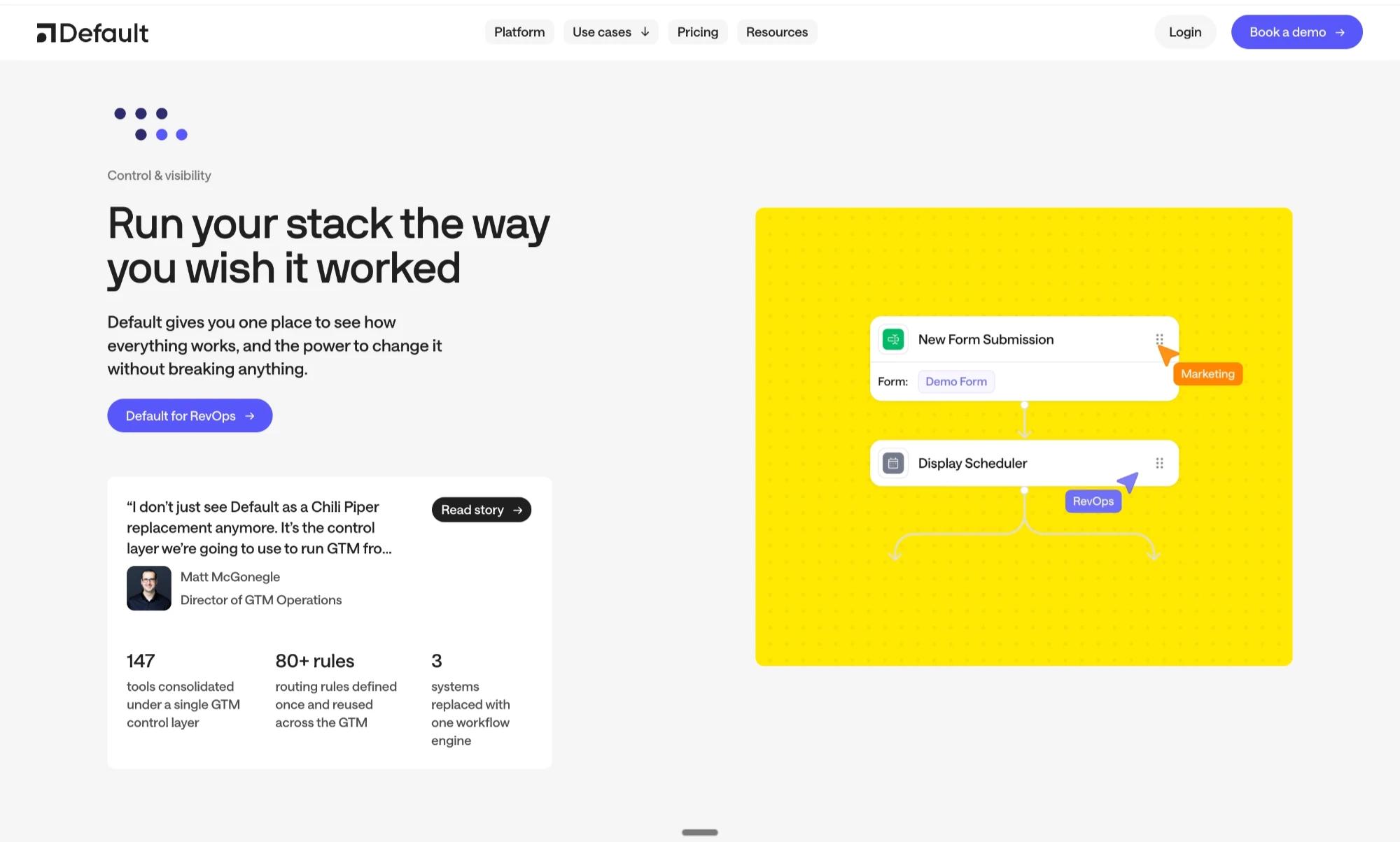
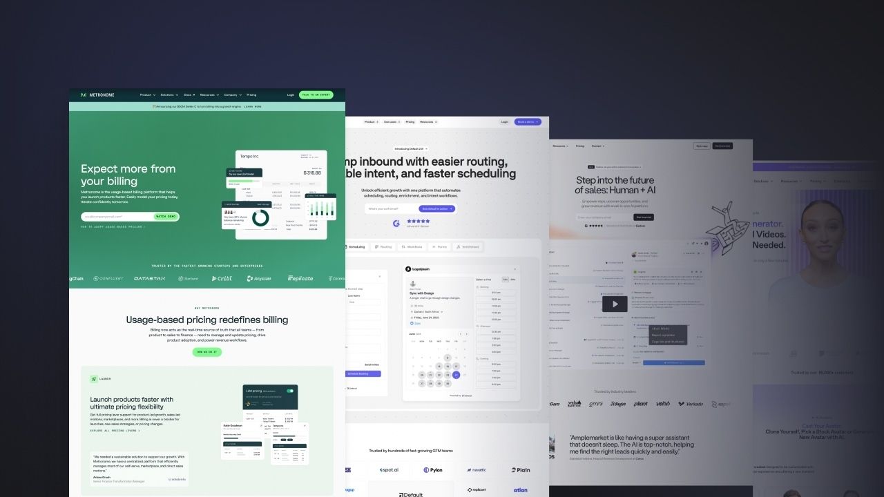
The pattern is feature description, customer quote, specific metric, CTA, product visual, stacked inside one section. Metronome does this on their billing transparency feature, where the Fly.io quote sits directly under the claim. The placement is doing work the copy alone cannot, and it is the structural decision a strong content strategy is built around.
10. Match the testimonial job title to your B2B buyer
The name under a testimonial matters less than the job title sitting next to it. The job title is what tells a future buyer whether the story is for them.
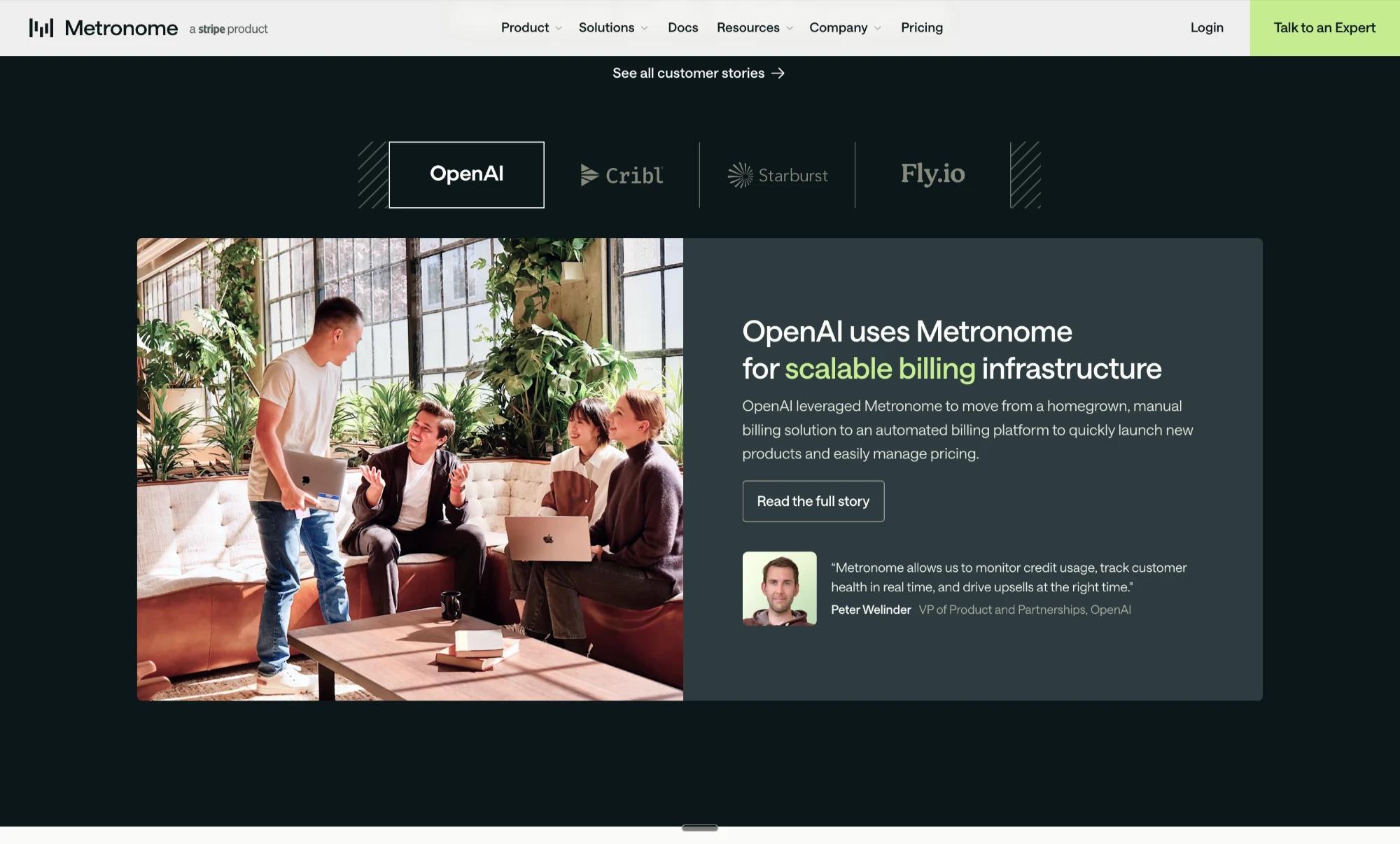
When you are picking which customer stories to turn into B2B case studies, this is where B2B copywriting starts, with the decision about who the story is actually being told to. If the buyer you sell to is a VP of Finance, the case study that converts features another VP of Finance. The job title is the signal. If it does not match, the buyer assumes the story is about someone whose problems look different from theirs.
Final note: how to make B2B case study pages drive conversion
Most of the work in a B2B case study happens before the writing starts. It is the decision about where the page belongs on the site, what claim it is backing up, and what the buyer is supposed to do after they finish reading.
A buyer journey is not a single page. It is the sequence of moments where a buyer needs the right proof at the right time. Case studies that convert sit inside that sequence rather than next to it, which is the kind of work we do at Grafit when we design B2B websites.