


























A strong case study makes the result easy to understand before the reader gets into the details.
TL;DR
- Effective B2B case studies quickly answer whether the provider understands the problem, what they did, and whether the result justified investment.
- Lead with the customer and primary outcome, then surface two or three connected metrics with a clear timeframe near the top.
- Explain the customer context, challenge, implementation decisions, and outcomes so specialists can verify how the work produced each result.
- Place screenshots, quotes, videos, and customer stories beside relevant claims, while supporting skimming through familiar sections, navigation, and prominent metric cards.
- Distribute case studies where buyers evaluate related features, use search-focused headings, and finish with a next step that follows naturally from the story.
- Put the customer and main result in the headline.
- Show two or three proof points near the top.
- Explain how the work produced the result.
- Place quotes and visuals beside the claims they support.
- End with a next step related to the story.
What makes a good B2B case study
A strong B2B case study helps a potential customer answer three questions.
- Do you understand my problem?
- What did you do?
- Did the work produce a result worth paying for?
The best case study examples make those answers easy to find. They lead with a specific outcome, explain the customer's starting point and show the decisions behind the result. The page should work for a buyer scanning the headline and metrics, as well as a specialist checking the implementation.
We assessed how clearly each page presents the result, whether the evidence holds up, how easy the story is to follow and what happens when the reader reaches the end.
A B2B case study template you can reuse
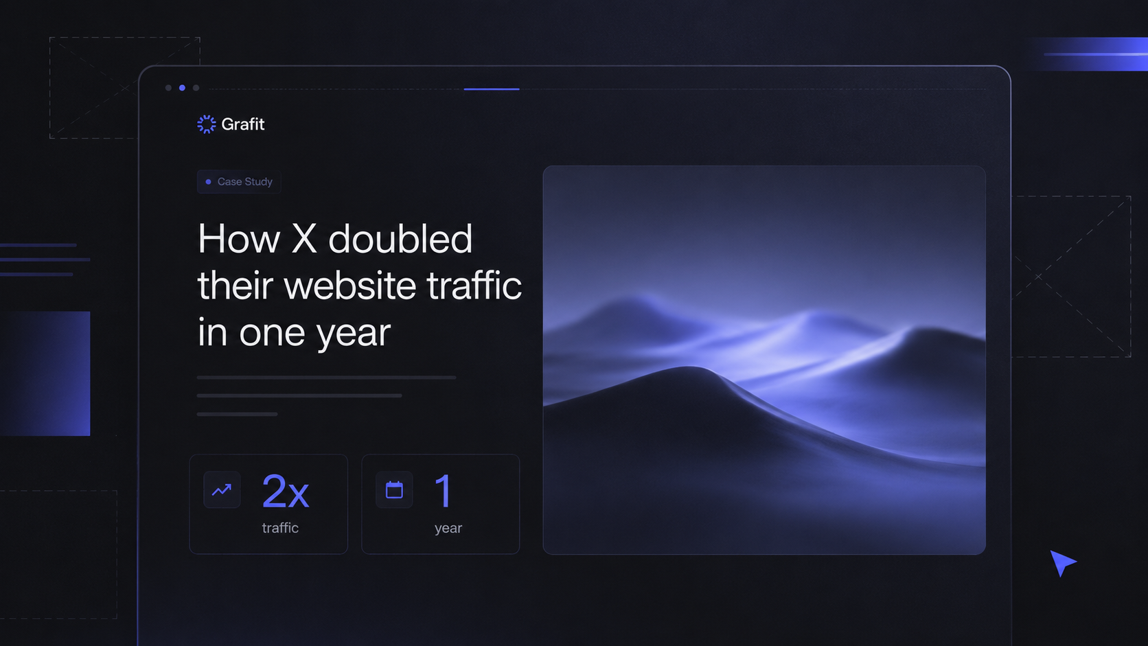
A useful B2B case study follows a familiar sequence of customer context, challenge, solution and results, so readers can find what they need while comparing providers or building an internal case.
Each section has to be specific. The challenge shows what was at stake, the solution explains the decisions that shaped the work, and the results say what changed and over what period. What decides conversion, though, is placement: most case studies get all their attention before launch and none after, so they sit in a resources tab the buyer never visits.
For SEO and AEO, write headings that answer a clear question or name a specific part of the project. Product names, figures, and customer details give search engines enough context to understand who achieved the result and how.
Run your own case study page against this table before you publish the next one, or treat it as a starting point for a full CRO audit.
10 B2B and SaaS case study examples worth studying
Each example handles a different part of the case study page well. Together, they show how copy, visual hierarchy, product screenshots and page structure can turn customer results into useful sales proof. If you want the placement mechanics behind these pages, where a case study sits in the buyer journey decides whether it converts more than the writing does.
1. Lead the B2B case study with results for every buyer
HubSpot places three commercial outcomes directly below the hero.

- 6 times higher pricing → gives leadership a clear growth result.
- 50% lower customer acquisition cost → gives marketing a clear efficiency result.
- Up to $300,000 in annual staffing savings → gives operations a cost argument.
This works because each number supports a different part of the buying decision. The circular metric graphics are large, isolated and easy to compare, so the reader understands the scale of the result before reading the full story.
The copy then traces all three outcomes back to one problem. Make Influence had customer data split across its platform, Pipedrive and ActiveCampaign, and unifying it let the team define its ICP, score accounts and expand into new markets.
2. Address the migration risk inside the case study
The Shopify and Russell Hendrix case study leads with a 43% increase in B2B online order volume and quickly adds the wider impact.
- 24% increase in revenue
- 9% increase in average order value
- 5 times faster order processing than the previous ERP workflow
The strongest part of the story is the objection it handles. Russell Hendrix had spent a decade heavily customizing its previous platform, and every new feature had started to mean another development project. The team worried that moving to another specialist B2B system would put them in the same position several years later.
Shopify includes that concern directly in the story, then explains how native catalogs took over infrastructure work for more than 300 customer groups with separate pricing and product access.
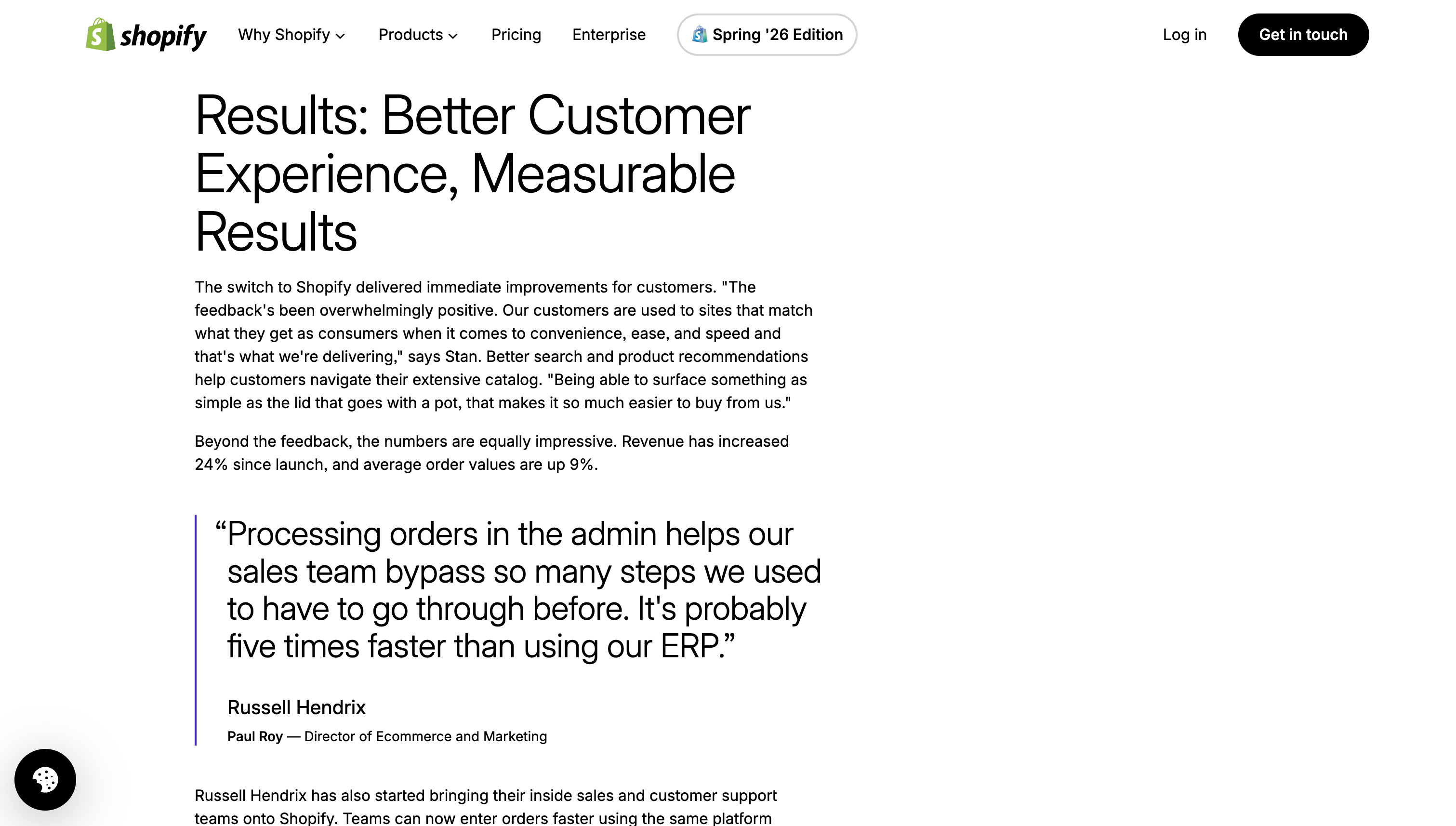
The results section also uses a large customer quote about faster order processing. Placing the quote beside the numbers gives the operational result a clear human explanation.
3. Put the case study proof next to the feature claim
Ramp moves the customer proof into the product section it supports, rather than parking it on a separate testimonials page only convinced buyers go looking for.
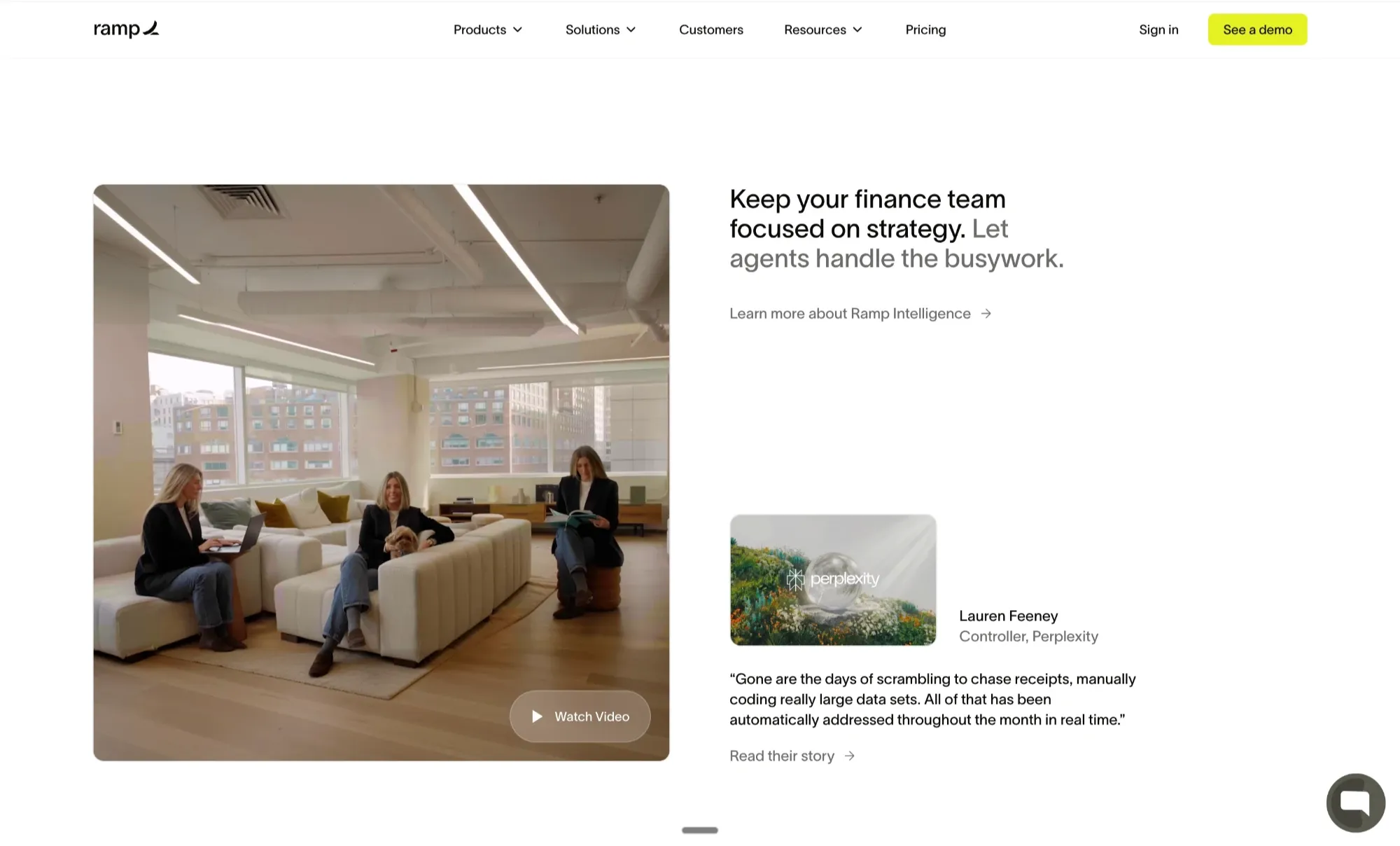
On its finance page, the claim about automating routine work sits beside a Perplexity story about running a 10-person finance team on Ramp, with a video thumbnail directly underneath. The buyer reads the claim and sees the proof in the same scroll, without ever deciding to go and find a testimonial.
4. Make the case study page part of the proof
Webflow's Maven case study gives readers a large amount of useful context before the main story begins.
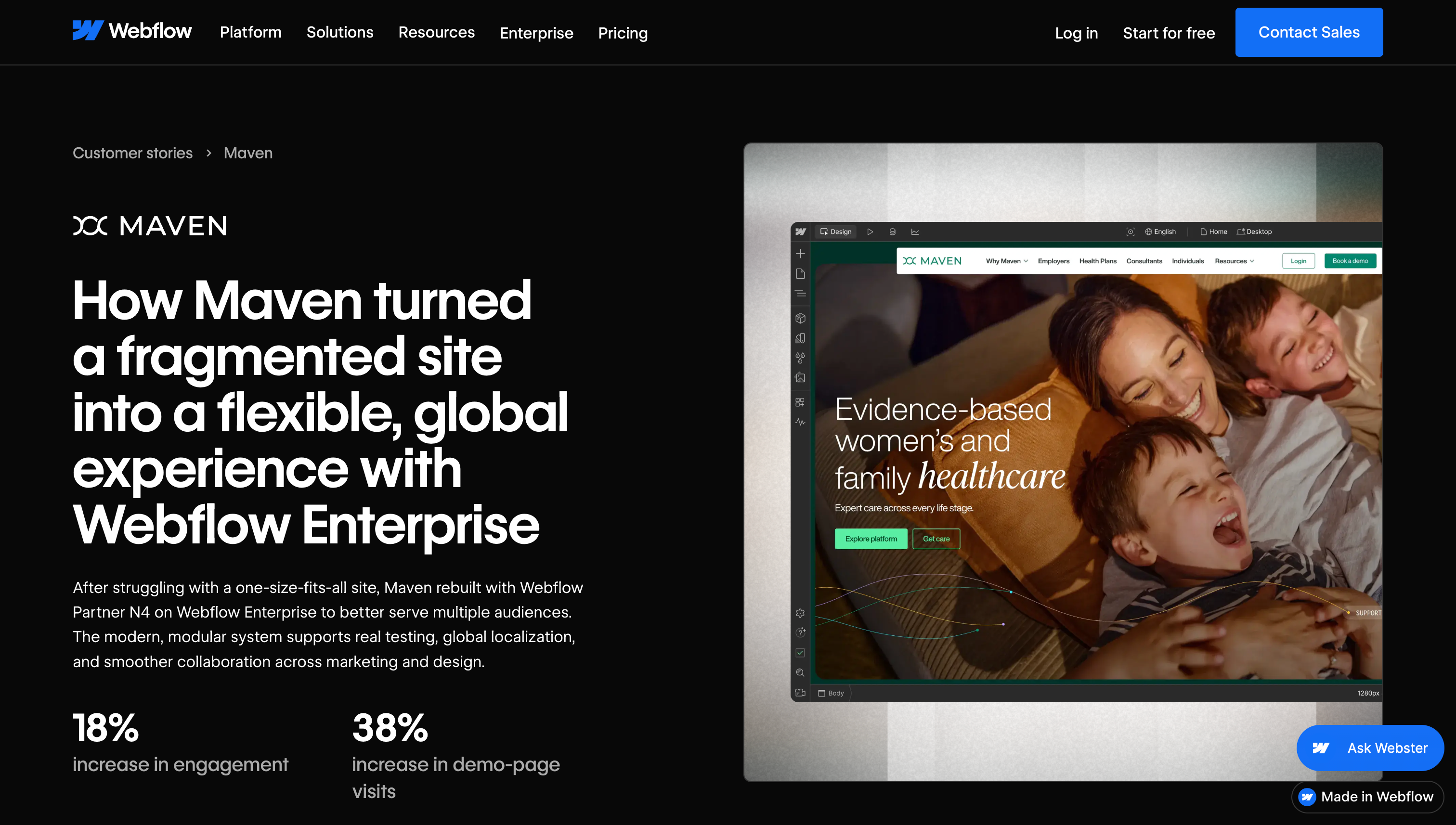
- An outcome-led headline
- 18% increase in engagement
- 38% increase in demo-page visits
- Customer size, market and industry
- An anchored "In this story" navigation
The page looks and behaves like a polished website project, which supports the claim that Webflow helped Maven create a stronger digital experience, the same bar we hold our own Webflow builds to. The hero includes a large view of the Maven website, so readers immediately see the work behind the story.
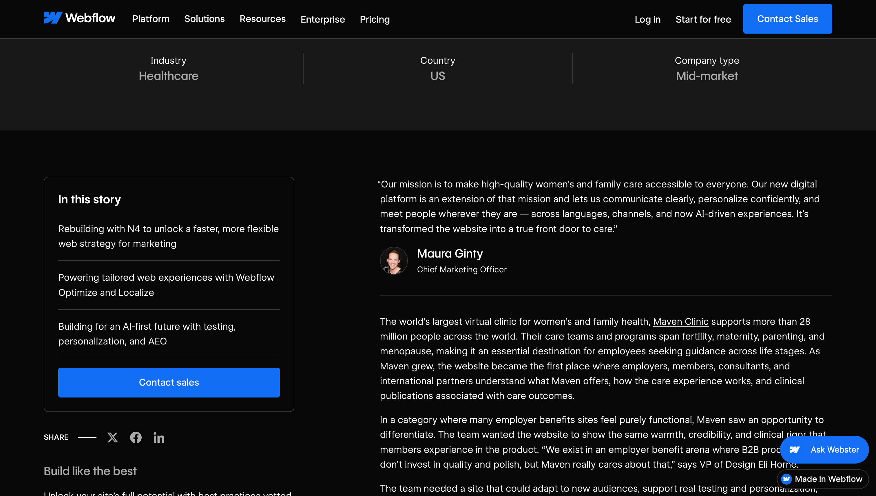
The table of contents is visible at the beginning of the article and divides the project into three specific areas. Readers can move directly to the rebuild, personalization and localization, or AEO sections.
5. Place evidence beside the claim
Notion and Heidi open with two prominent results, more than 260 hours saved each month and less than 24 hours from concept to a customer-facing prototype. The story breaks that monthly total into two sourced pieces, 200 hours from faster knowledge retrieval and 60 hours from AI Agents handling routine work, so the headline number holds up under a closer look.
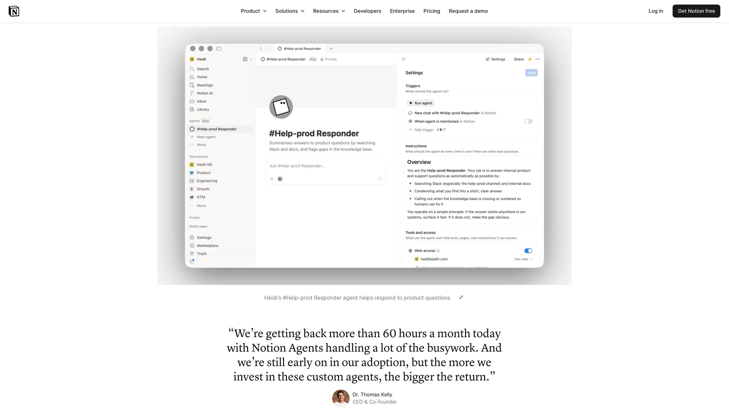
Screenshots of Heidi's own workspace sit directly beside the workflow they support, rather than acting as decoration between blocks of copy. Quotes from Heidi's CEO reinforce the same point from different parts of the business.
6. Use a familiar case study structure
Loom and Intercom uses one of the simplest layouts on this list, just Overview, Challenges, Solution and Results, which makes the story easy to scan for a buyer who only wants the proof.
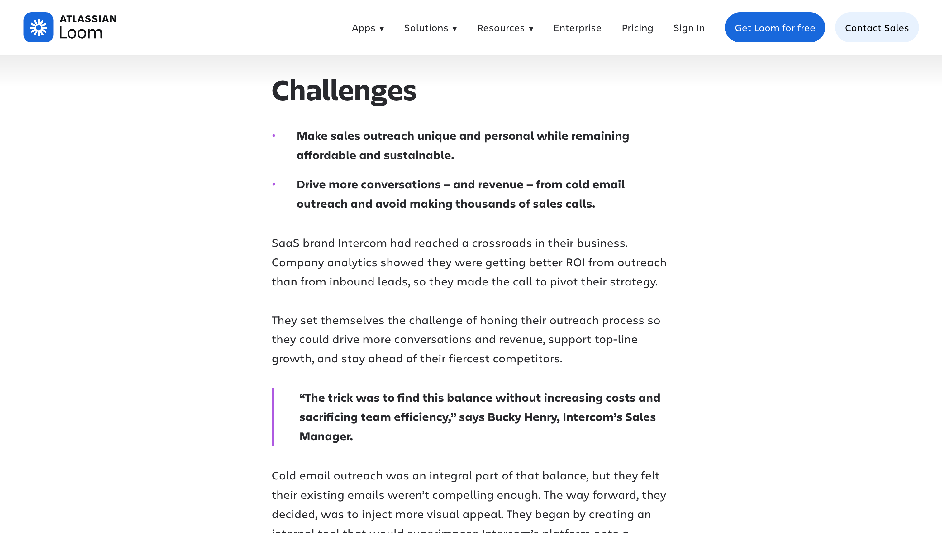
Each section is broken into short bullet points and pull quotes instead of long paragraphs, so a reader scanning for proof does not have to wade through dense text to find it.
7. Let the B2B case study support different reading habits
Dock and Nectar offers several ways to read the same story, including a detailed table of contents that splits the workflow into demo follow-up, buying consensus, forecasting and sales onboarding, so a sales leader can jump straight to their own problem.
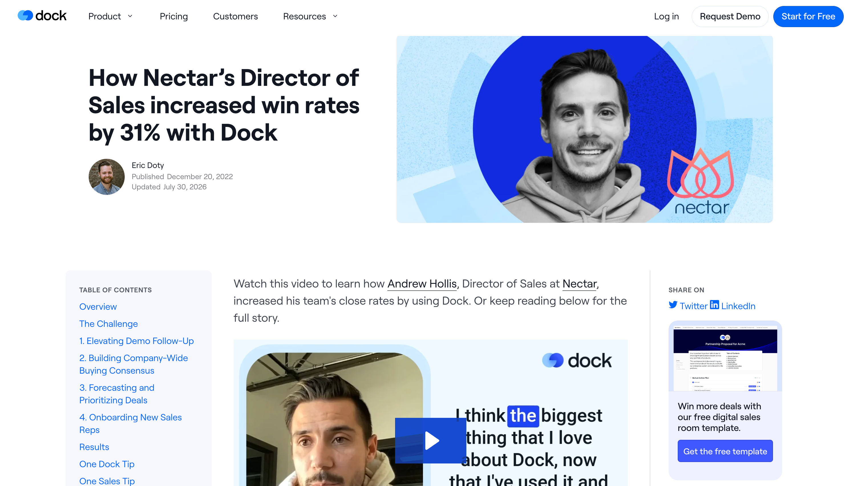
The page also includes short video clips of Andrew Hollis, Director of Sales at Nectar, walking through the workflow himself, which gives the case study a human factor that text alone would not carry.
8. Make ROI visually unavoidable
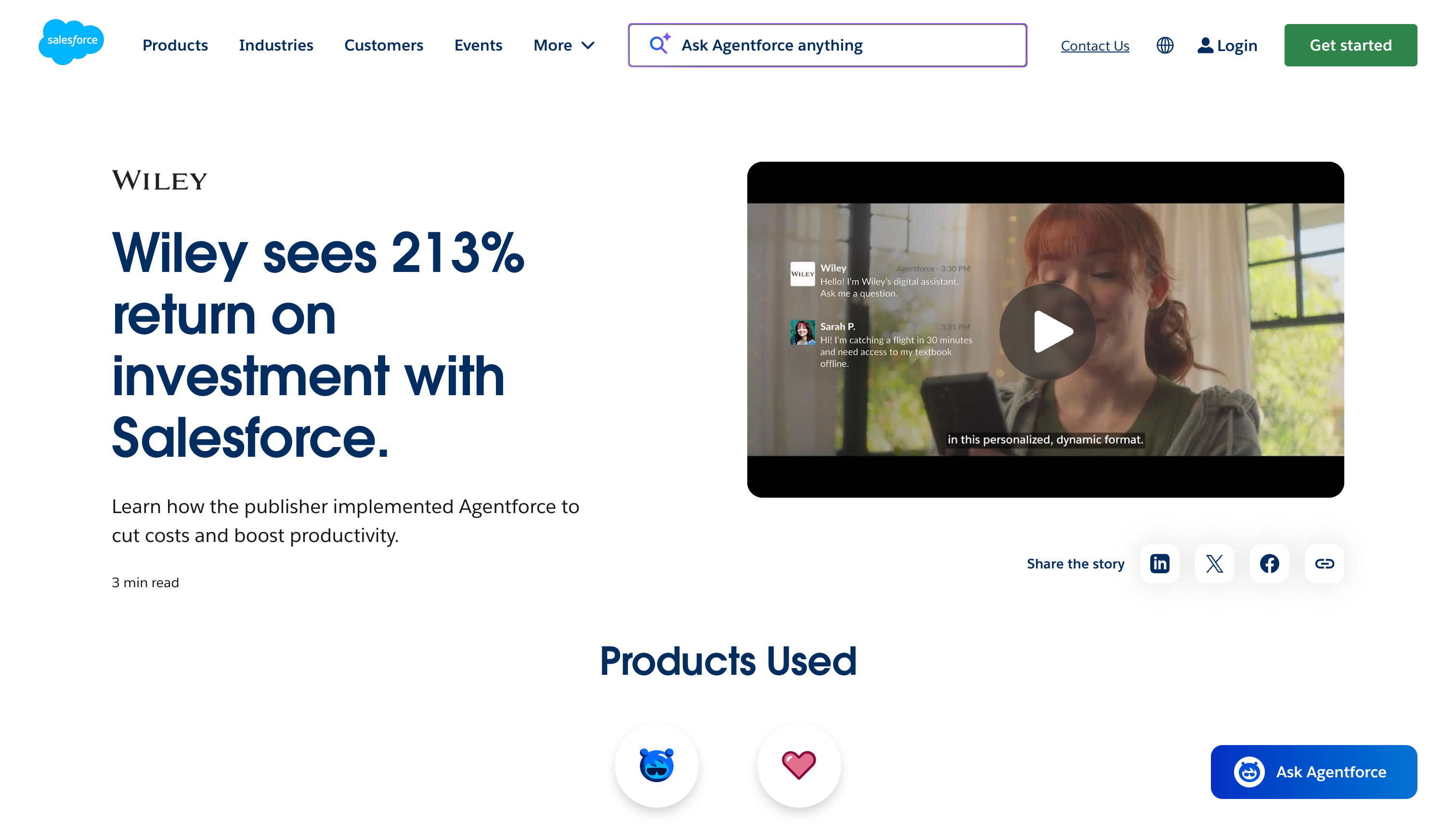
Salesforce and Wiley describes the Wiley story as a three-minute read and puts 213% ROI directly in the H1, with product labels beneath the headline showing exactly which parts of Salesforce were involved.
Near the end, three oversized metric cards repeat the main proof, more than 40% higher case resolution, 213% ROI, and $230,000 in annual savings, so a fast reader cannot miss them.
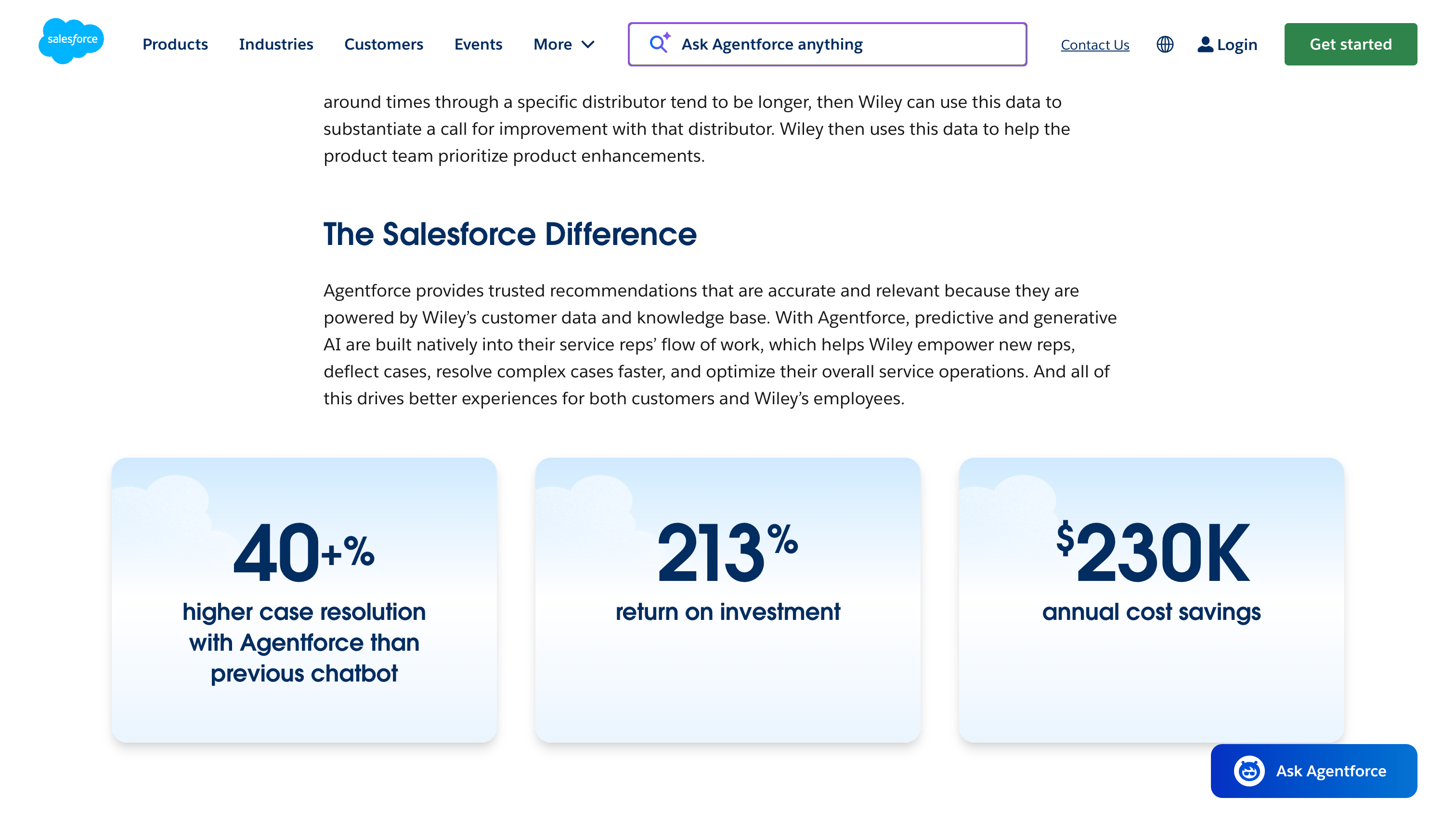
The wording stays precise. The 213% ROI is tied to the Service Cloud implementation, while the 40% case-resolution jump is credited specifically to Agentforce.
9. Structure the case study around search intent
Clearscope and Pipedrive headings do the real SEO work here. Instead of generic labels, they name specific tasks like Clearscope's grading system and the Outline Builder, phrases content teams are already searching for.
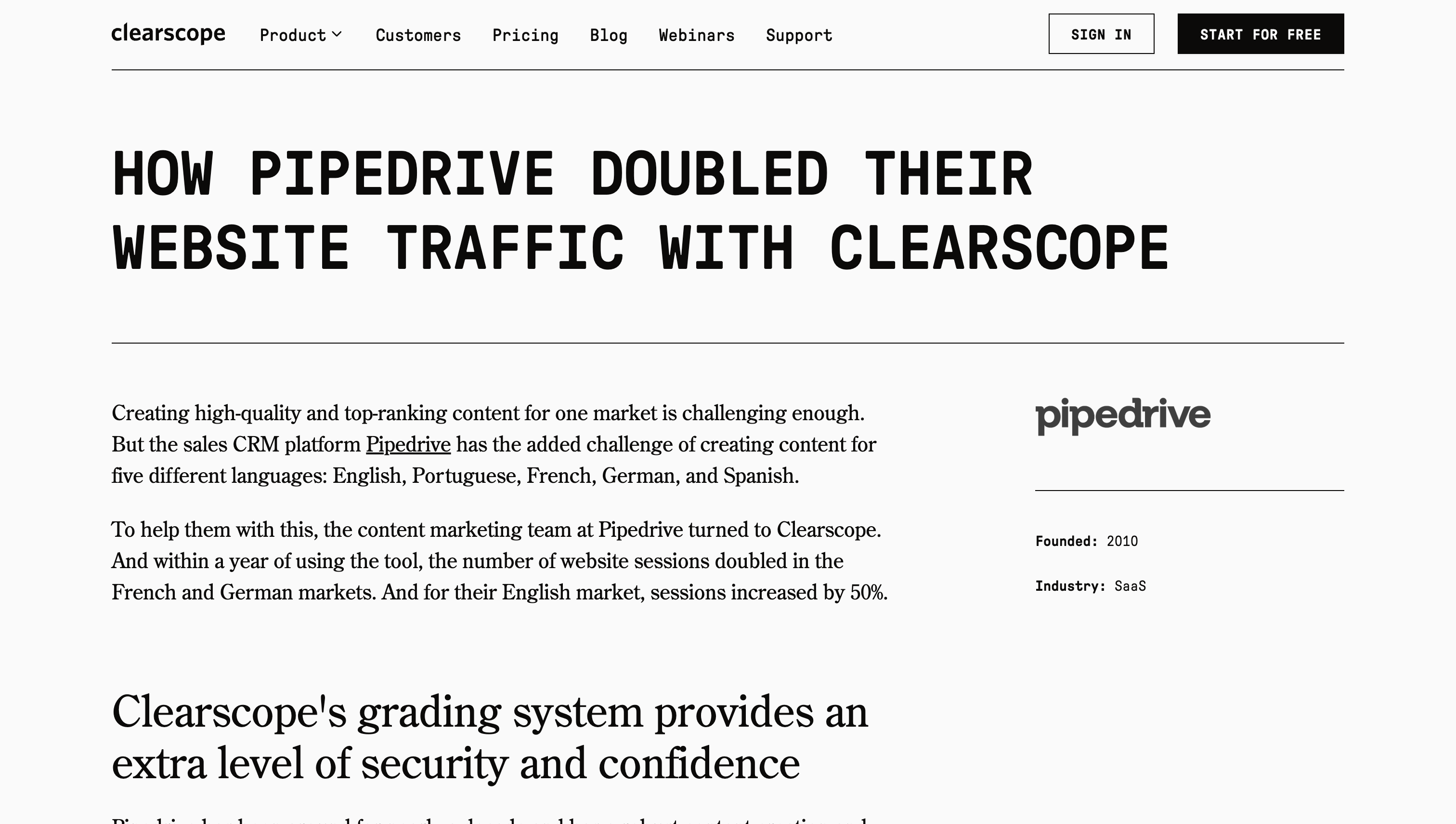
The numbers are also broken down by market rather than blended into one average. Sessions doubled in France and Germany within a year, while English sessions grew 50%, and that breakdown reads as more honest than one global figure.
10. Turn the case study into a sales page
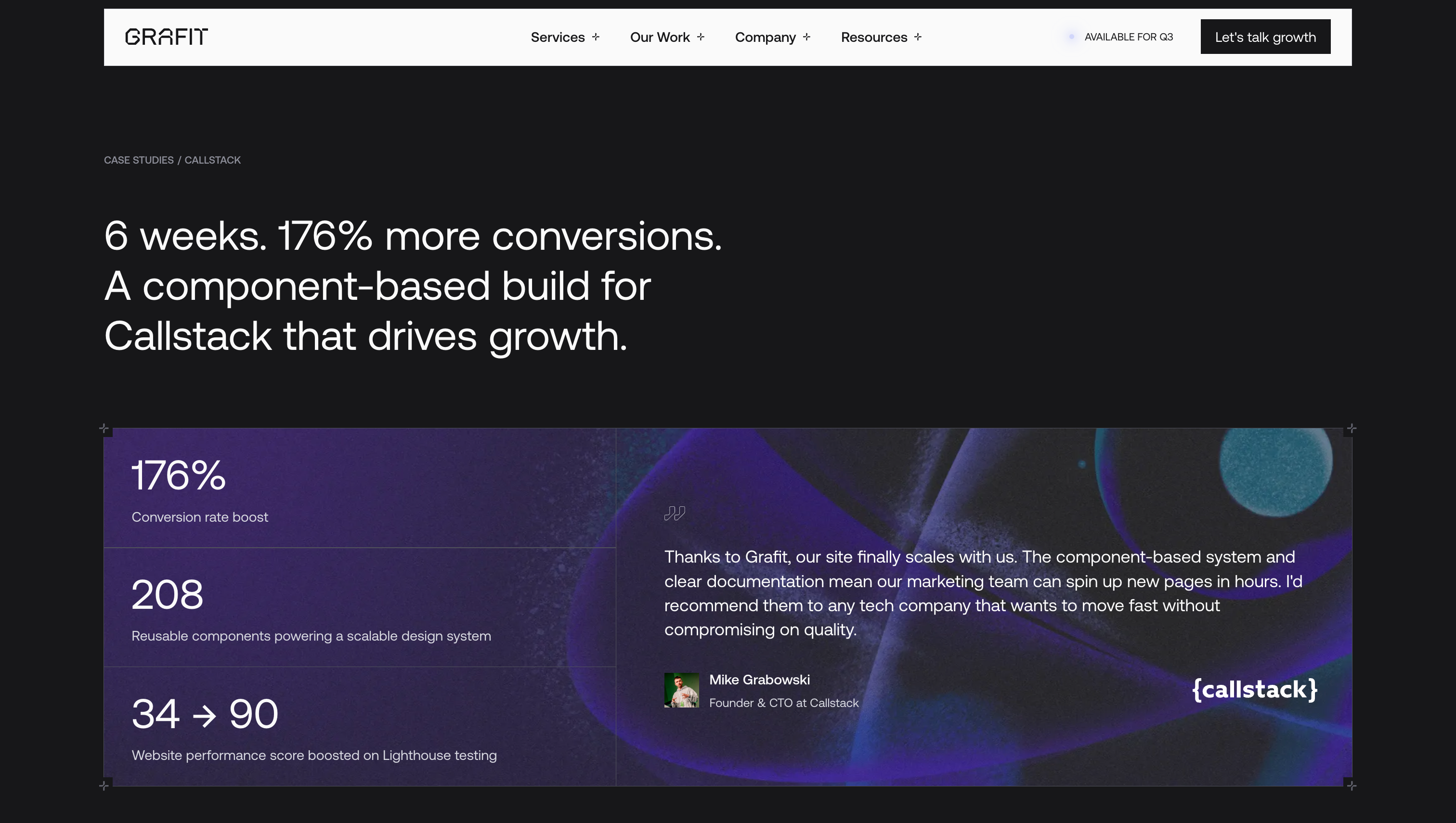
Grafit's Callstack case study, which pairs a 6-week delivery with a 176% conversion increase, opens with a complete commercial summary and a Lighthouse score that rose from 34 to 90, paired with a customer quote.
The icons next to each step are a nice touch too. They make the page easier to scan and help the reader build a visual association with each phase instead of reading through plain text.
Turn your next case study into your best-converting page
We builds B2B SaaS websites that put customer proof where buyers are already deciding, which is what separates a case study that converts from one that is published then forgotten.