


A SaaS product launch video has two jobs. Resolve one problem on screen in under 90 seconds, and look like it belongs to the brand that made it.
The anatomy of a great product demo video
A SaaS launch video has roughly 10 seconds to justify itself. Most do not make it. The logo plays, a voiceover lists features but the viewer is already gone. The reason is almost never the production budget. It is that the brief skipped the only three questions that matter:
- What the video is for?
- Who is supposed to watch it?
- Where it lives once it is live?
This is what separates a launch video that does the work from one that gets shipped, posted once on LinkedIn on Tuesday and forgotten by Friday. The examples below come from launches we study closely while working on motion and video for B2B SaaS teams.
Product video vs explainer video
The first question we ask on every video brief: is this a product video or an explainer?
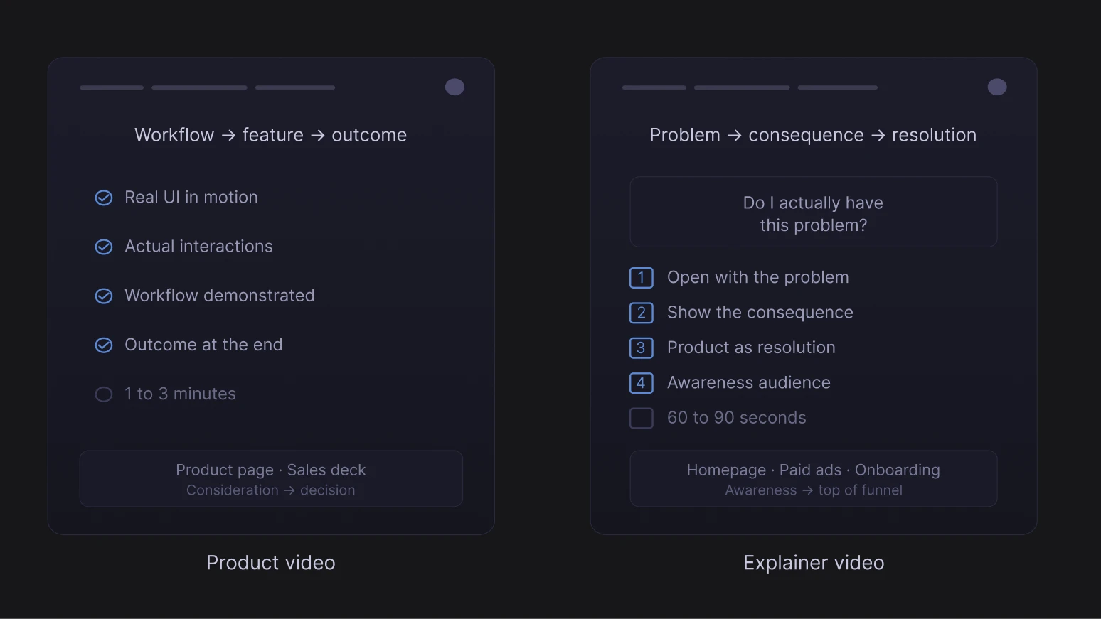
- A product video is about the interface. You are showing the thing in motion: what it feels like to use. That is what lives on your product page, in your sales deck, in your app store preview. Anywhere the viewer already has context and wants to see the product work.
- An explainer starts one step back. You are not showing the product yet. You are building the case for why it needs to exist. Problem, consequence, resolution. That is what works on a landing page, in an onboarding flow, as a paid ad. The product shows up as the answer.
The trap is trying to do both in one. You end up with something too long for a product page and too feature-heavy for an ad. Pick one before you write a word of script.
How to make a SaaS product demo video worth watching
The first 10 seconds of a product demo video
Most video briefs spend pages on aesthetic references and three sentences on what the opening should actually do. That is backwards. A viewer does not come to a product video with patience. They come with a problem, or they come because someone told them to watch. The first 10 seconds are a test.
Superhuman's introduction opens on a question: "What would you do with an extra two hours every day?" Then Superhuman is introduced as the fastest email experience ever made. They are selling the outcome (time back in your day) before they ever sell the tool. The product arrives as the delivery vehicle for something the viewer wants.
Profound takes a different approach. It opens on a retro CRT monitor and walks through how internet search worked 35 years ago. But this is not for aesthetic. It is a visual argument that your current tools belong in a museum. That historical contrast earns attention before the product ever enters the frame.
How to structure a SaaS product walkthrough
Once you have the viewer's attention, resolve the problem in the most direct sequence possible. One job-to-be-done, fully resolved, then stop.
Ramp shows one loop: book a flight, auto-match the receipt, enforce the policy. Showing one complete loop, end-to-end, answers that fear more convincingly. The difference between a feature list and a single resolved walkthrough is what each signals to an anxious buyer: the first says "this can do a lot," the second says "it is actually this simple."
Rippling category problem is that this sounds too ambitious to believe. The video answers that scepticism directly: fast cuts between three fully resolved use cases (Onboarding, Expenses, Devices), each completed in seconds. "We replace three systems" is a claim. Watching three systems get replaced in 30 seconds is evidence. The scepticism is outpaced.
Linear's launch videos for Linear for Agents and the Linear Method push minimal even further. UI footage, ambient sound only, no narration, sharp typography on screen. For an audience that builds software for a living, that absence of voiceover is the point. The video signals that the product does not need to be sold, it needs to be seen.
SaaS video style and brand consistency
The video does not exist in isolation from the product and the website. When the visual style of the video is inconsistent with the brand identity, the viewer picks it up immediately.
Cursor 2.0's launch video is a minimal white background, a 3D cube, no voiceover. For developer buyers, the aesthetic itself is a trust signal. Strong B2B positioning is less about the words on the page and more about context, what you stand for. Cursor's minimal production signals "we are one of you."
Dovetail 3.0's video, with its yellow background and playful illustration, is not just an aesthetic choice. Research and insights work is perceived in most organisations as slow, manual, and specialist-only. The video's visual tone argues directly against that perception before the product appears. By the time the UI enters the frame, the viewer has already started to update their mental model of what the category can feel like.
Miro's manifesto-style video is retention marketing in the form of a strategic announcement. Miro's existing user base already uses the product for diagrams and sticky notes. The message is not "use Miro." It is "the product you already use has become something bigger." Asking someone to update a mental model requires a different emotional register than asking someone to form a new one.
If the video looks wrong next to the website, there is no visual system holding them together. It happens when the video agency, the product team, and marketing each make independent calls. Sort the brand system before production starts. What makes a good SaaS brand identity covers six components that hold it together.
Motion design in product demo videos
Animation has one job: guide the viewer's eye to what matters. When motion exists to demonstrate craft, it competes with the product for the viewer's focus.
Airtable shows an AI assistant operating directly inside the product UI rather than describing the capability from outside it. In a market flooded with "AI-powered" claims, that distinction is the whole argument. Every product claims to have AI. Most show it in a slide deck or a capability list. Showing AI working inside the interface converts a claim into a demonstration, and the difference between those two things is the difference between having to persuade and not having to persuade.
ElevenLabs Scribe v2 uses subtle grid animation on a grey palette: precise, technical, nothing wasted. Developer buyers are expert at reading production intent. Flash, warmth, and consumer polish all signal "aimed at a non-technical audience." A minimal aesthetic that matches the precision of the product does audience targeting work in the first two seconds, before the copy has said anything.
Live action vs animation in B2B SaaS video
The choice is not about budget. It is about what each format can actually do.
- Animation is better suited to software. A camera cannot show data moving between systems, an automated workflow running in real time, or the invisible logic of a product. Animation can.
- Live action does something different. A real human face triggers trust at a neurological level. That is why live action works when the competitive advantage is the feeling of working with your company, not just the logic of what your product does.
Mailchimp's 2023 global campaign used live action on a red background with warm, informal human energy throughout. This was a competitive strategy made visible. Mailchimp was up against Klaviyo, which had won on feature depth and ecommerce sophistication for the same SMB audience. When you cannot win on features, the question becomes what else the buyer cares about. For a small business owner choosing an email tool they will use weekly without a dedicated ops team, approachability and warmth are functional requirements, not style choices. Live action delivers them in a way that motion graphics cannot.
Google Workspace's Google Vids uses polished live-action production, and that choice is itself part of the argument. A video creation tool's launch video is a proof of concept. The production quality answers "can this produce something professional?" before the demo starts
How to distribute your SaaS product launch video
Making the video is 20% of the work. Distribution is the other 80%. It almost always gets the leftover budget and the last 10% of the team's attention.
Homepage placement above the fold
Above the fold is the only spot on the homepage that earns a video. The first frame has to communicate category and outcome before the viewer decides whether to stay.
The same logic that drives the highest-converting SaaS website pages applies here, and at Grafit the homepage video is part of the Webflow build, so autoplay, captioning and load performance get decided once.
How to post a launch video on LinkedIn that gets reach
The five things that move a launch video on LinkedIn:
Native uploads win because LinkedIn buries outbound links. Founders pull more reach than company pages, every time. Show up in the comments in the first hour, or the launch announcement is over before it started.
Product Hunt, cutting a launch video for autoplay
The video is the most-watched asset on launch day. It autoplays in the gallery, the audience is scrolling through ten launches in five minutes, and most viewers never unmute.
A video that looks like the team made it usually outperforms one that looks like an agency packaged it, even when the agency version is technically better, which echoes what YC partners say about overproduced startup websites.
The launch video email that gets clicked
A clickable video thumbnail beats a text-only launch email in almost every B2B audience. The body copy is not the announcement, the video is.
Subject lines that win in B2B inboxes are specific, not clever. Vague openers get archived before the thumbnail loads.
Paid ads, repurposed from the organic winner
The launch video becomes the best paid asset only after organic has proven the message lands. Run the full video organically first, watch the view-through rates, the comments and the sales team's reactions. The moment that actually hooks people is rarely the moment you expected.
Same shoot, full quarter of media. Once paid traffic starts flowing, the conversion layer is where most SaaS teams leave money on the floor, and the launch video is rarely the cause of the leak.
Make a SaaS launch video that earns its homepage placement
A launch video does its job when the brand, the homepage and the script speak the same language, decided in the same room, not stitched together two weeks before the announcement. That is what Jace.ai saw when their new website launched and conversions jumped 300% in the first month, with users finally understanding the product in three seconds.
If you are thinking about a launch and the brief is not there yet, let's talk.