
























Most B2B SaaS founders spend six months choosing a marketing stack and six minutes choosing the button that books their demos. That is where a surprising amount of pipeline quietly leaks. The button sits between a curious buyer and a booked call, so on a high-performing website it earns the same care as any other part of the funnel. Our team treats website button design as a small system rather than a widget: hierarchy, copy, placement, supporting context and interaction states.
Why the CTA button carries your conversion number
Buttons collect the outcome of every other thing your website did well. If the message landed, the pricing made sense, and the case study built confidence, then the CTA is where confidence turns into a calendar invite. When the button is quiet, confidence drains before it books.
Because most B2B SaaS sites run on modest traffic, every visitor is worth optimising for. Fixing a headline lifts the whole funnel by a few tenths of a percent. Fixing the button lifts the last and most valuable step in it, which is why button experiments tend to compound on a high-performing website.
What makes a CTA button effective on a B2B SaaS website?
An effective CTA is easy to notice, understand and use. Its hierarchy, copy, placement, supporting information and interaction states should all point the visitor towards the same next step. The 6 sections below work through each one in turn.
1. How should CTA hierarchy work on a B2B SaaS website?
Most B2B SaaS pages need more than one button, so they need a visual order that answers a single question at a glance.
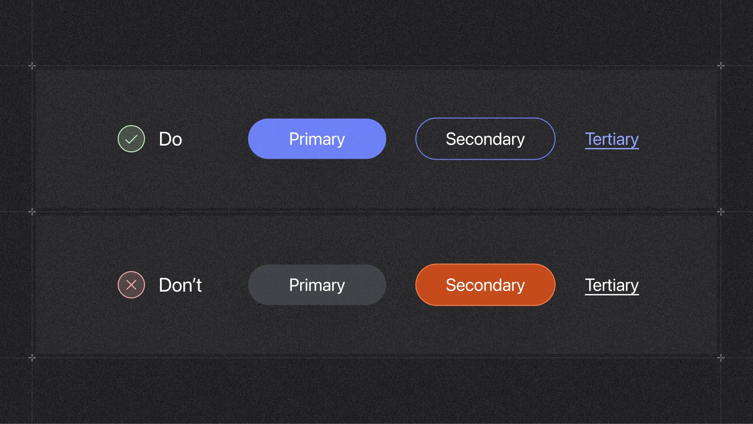
Rules that hold on almost every B2B website :
- One primary per decision point. Two primary-style buttons on one screen push the reader towards the safer, lower-commitment option.
- Demote the secondary to an outline or ghost style so it never carries the same weight.
- Keep the primary inline, in the content. Inline CTAs pull 121% more clicks than the same offer parked in a sidebar.
The most common mistake we see on B2B homepages is two primary-style buttons sharing the same screen. When both shout, the reader picks the safer path, which is usually the low-commitment one. Keep one primary per decision point, the same rule that runs through every high-converting SaaS page. Style your secondary as an outline or ghost button, never at the same visual weight as the primary.
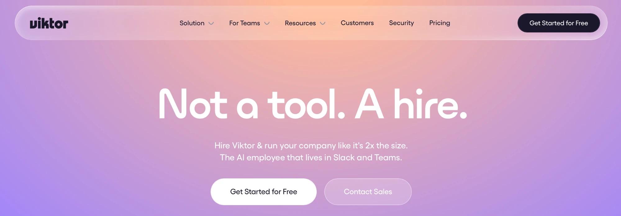
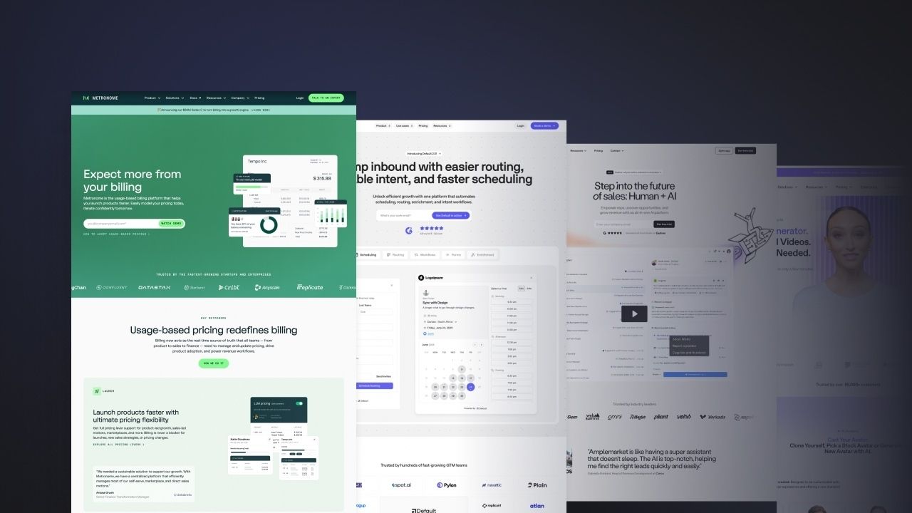
On viktor.com, the primary CTA sits above the fold on every landing page in an accent that reads as one insistent visual promise. Notice the copy, the padding around the label, and the way the secondary CTA never competes for attention.
2. What should a B2B SaaS CTA button say?
Design gets attention, and the label earns the click. A good-looking button gets noticed. The words on it decide whether anyone clicks. "Submit", "Contact us" and "Learn more" all describe work you're asking the visitor to do. The ones that convert describe what the visitor walks away with, because people move toward a clear payoff faster than a vague one.
Two rules cover most of it. Name the payoff, and fit the label to the moment it appears in. Both come from treating the label as one line of a high-converting page, written in the same voice as the headline and the body around it. Seen that way, button copy belongs inside your wider content strategy, and a warmer, more human label, the kind that matches the rest of the page, tends to convert better.
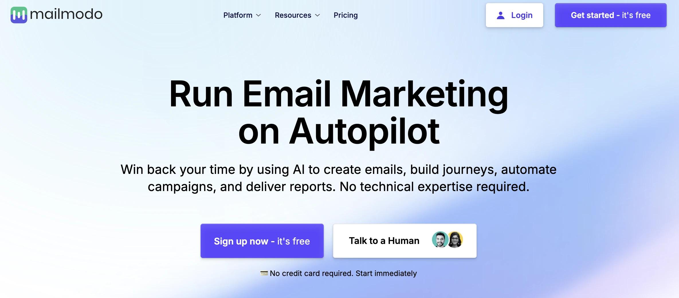
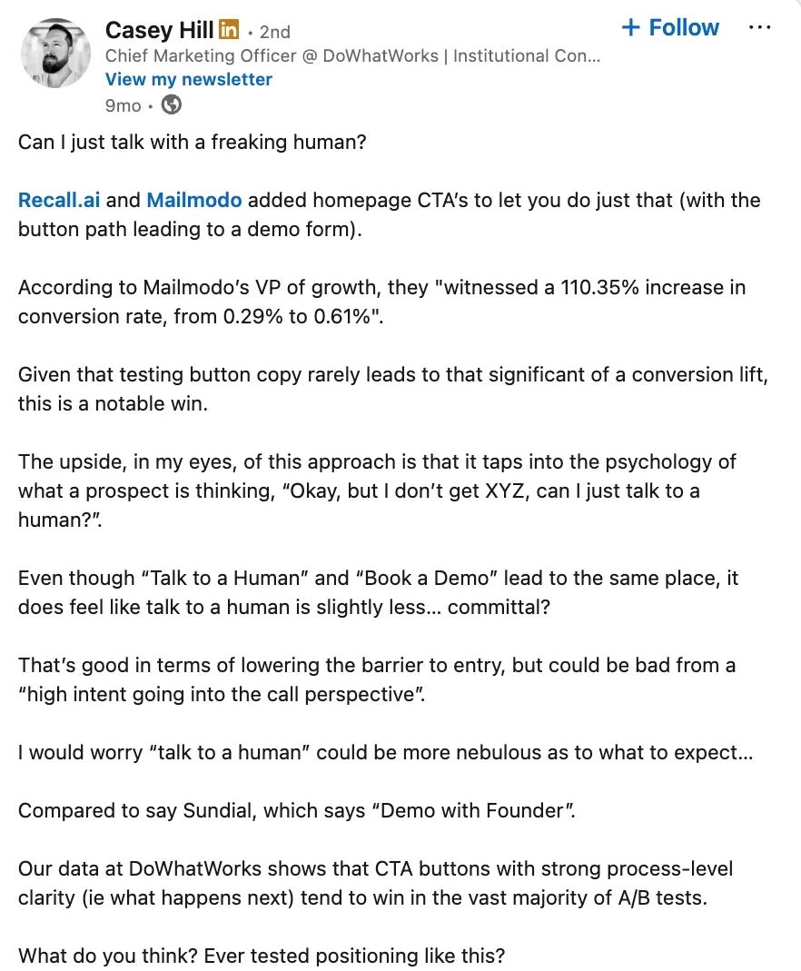
When Mailmodo changed "Book a demo" to "Talk to a Human", it more than doubled its conversion rate, because the button sounded like a person rather than a process.
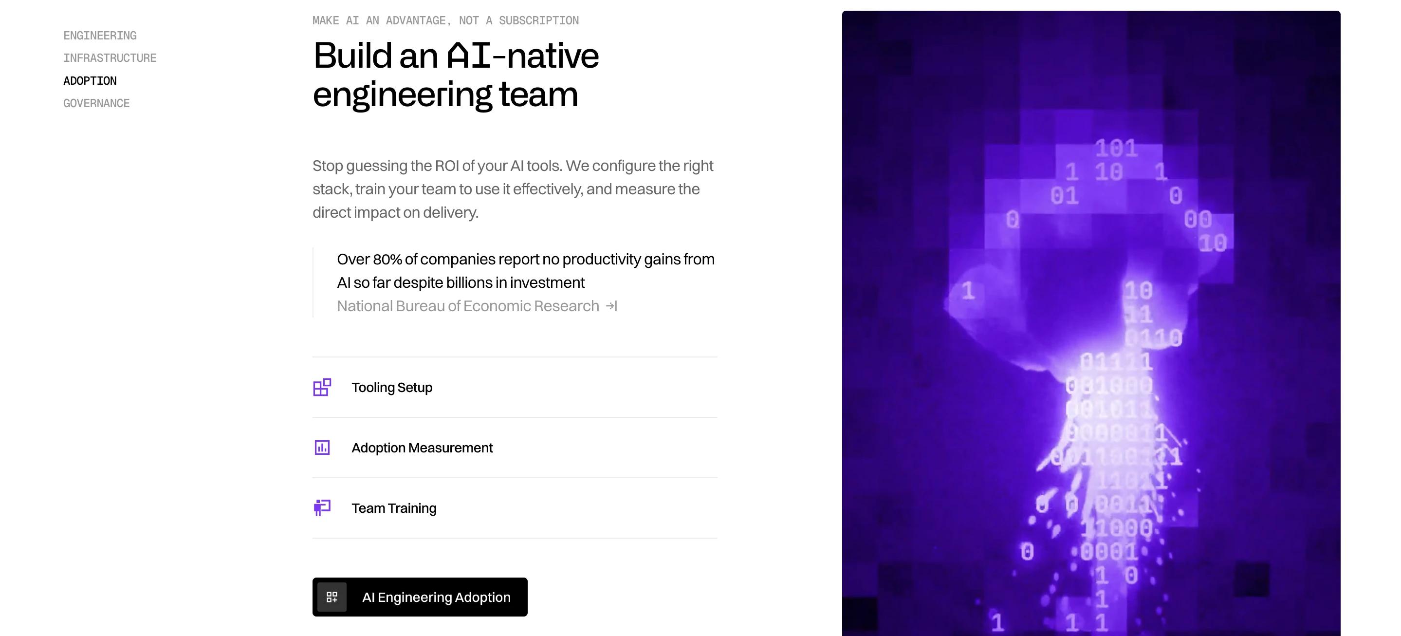
Callstack's homepage ties its main CTA to a row of tabs (Engineering, Infrastructure, Adoption, Governance), so the moment a visitor picks their track the button rewrites itself to match, and a single page ends up speaking to four buyers in their own language.
3. What information should support a CTA?
A short CTA label cannot answer every question about the next step. Supporting copy can clarify what happens after the click and reduce uncertainty.
Useful details might include:
- how long a demo takes
- whether a credit card is required
- when the visitor can expect a reply
- what they will receive after submitting the form
Keep this information short and specific. A line such as “30-minute call” or “We reply within one business day” is more useful than generic reassurance.
Relevant proof can also sit close to the CTA. A customer result, testimonial or security note may help when it addresses a concern connected to the action.
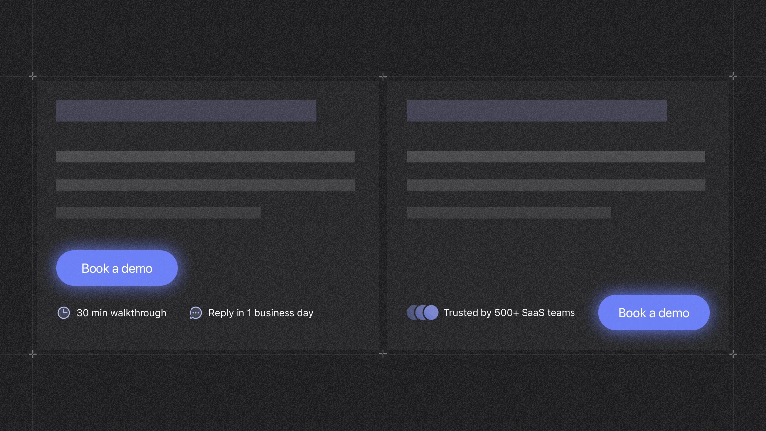
The button should remain the clearest element in the group. Supporting text adds context without competing for attention.
4. Where should CTA buttons appear on a B2B SaaS website?
A strong CTA can still be missed if it sits outside the page's reading path. People scan before they read, and two patterns tell you where attention lands:
- On text-heavy pages the eye follows an F-shaped pattern: across the top, then down the left. A left-aligned primary sits where that scan ends.
- On pages built from headings and sections, people read in a layer-cake pattern, skimming the headings and skipping the copy between. Anchor a CTA to the end of each section that earns it, so the button is the next thing the eye meets.
Above or below the fold?
Eye-tracking is clear that the top of the page holds the most attention: the strip just above the fold gets looked at roughly twice as often as the strip just below it. People do scroll, but only when the top of the page earns it. So placement tracks the type of offer:
For a considered B2B purchase, the button often converts better once benefits, proof and pricing have done the persuading. Place it where the visitor is convinced and where the decision sits: a primary directly above the pricing grid, for instance, catches people at the moment they compare.
Repeat it, and point the eye at it
- Tie each CTA to the section that motivates it. By proximity, a button read straight after benefits or pricing lands as that section's conclusion rather than a floating ask.
- Repeat the primary at every point a buyer might be ready. On long pages a sticky bar keeps it in reach without hunting, because a B2B buyer rarely commits on the first screen.
On mobile, design for the thumb
Nearly half of people browse one-handed and most taps come from the thumb, so the reachable area is the bottom third of the screen. The top corners are the hardest to reach, and they get harder as phones grow.
- Put the primary in that bottom zone. On long pages a sticky bottom bar keeps it there without forcing a grip change.
- Keep secondary or destructive actions in the mid-screen stretch zone, where they are harder to hit by accident.
- Keep any sticky CTA clear of fields and error messages, the kind of reachability that falls out of designing mobile-first rather than being retrofitted late.
- In a form, put the action directly below the last required field. Label mid-steps "Continue" and save the specific action for the end.
Fold and placement both shift with your audience and product, so measure scroll depth and A/B test one position at a time rather than assuming the hero always wins.
Most of this is manageable on a single button. Holding it consistent across a growing B2B site, through every template and breakpoint, is the harder part, and the one we take on. If that sounds like your week, let's talk growth.
5. How big should a CTA button be?
Size is where button design turns technical, and the numbers are settled enough to design against. The relevant floors:
What that means in practice:
- Treat 24px as the legal minimum and 44 to 48px as the real size for a primary, because that is what a thumb hits first time.
- Pad the hit area. The visible button can be smaller than its tappable region, so add padding rather than a bigger shape.
- Contrast beats colour. Hit at least 3:1 against the background and stop debating the exact hue: only about one colour test in seven reaches significance, while contrast reliably moves the needle.
- Do not undersize on mobile. A large share of mobile drop-off traces back to misclicks and tap targets that are too small.
6. Should a CTA be a button or a link?
Visitors arrive with expectations built from years of browsing: buttons trigger actions, links take you somewhere. Blur that line, with a <div> styled to look like a button or a <button> used to jump to another page, and you create a small, persistent confusion that adds up over an interface. It is a semantic choice, not only a visual one. A native <button> carries keyboard behaviour, screen-reader support and cross-browser handling that our developers get for free rather than rebuild from scratch in the Webflow build.
When these roles stay consistent, visitors can predict what will happen before they click, and that predictability is its own form of design quality.
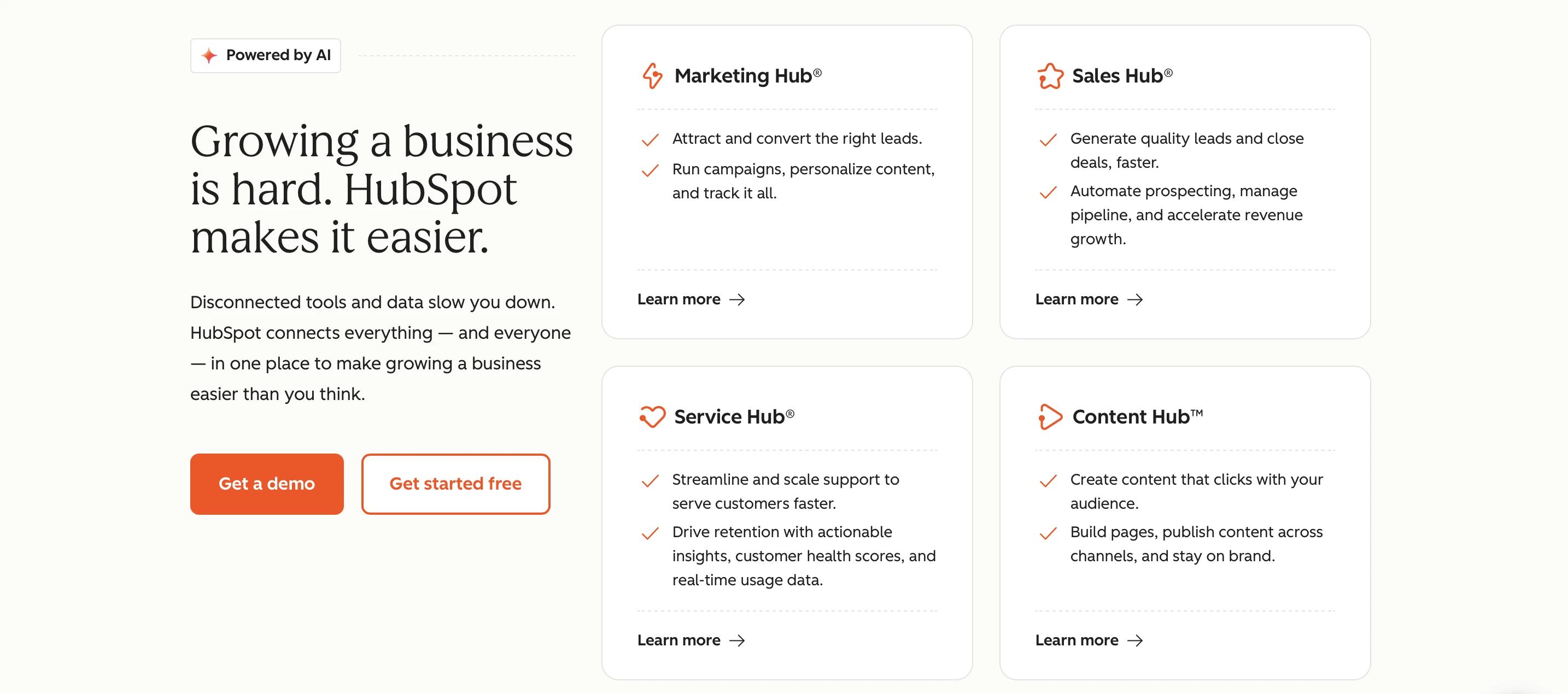
HubSpot's hero separates how a control looks from what it does. "Get a demo" (solid) and "Get started free" (outline) are styled as buttons, yet both route the visitor to another view, so both are anchors carrying button styling. "Learn more" keeps a text treatment with a directional arrow to signal navigation. Two layers are doing separate jobs:
- Styling encodes visual hierarchy: solid for the primary, outline for the secondary, text for tertiary.
- The element encodes semantics: an
<a href>navigates, a<button>triggers an in-page action.
Visual weight and underlying element are independent decisions. A control can present as a button and still be a link. Bind the element to the behaviour, not the styling, and reserve a native <button> for actions that resolve on the page.
Which CTA button mistakes cost conversions?
Most CTA problems are a failed version of one of the five decisions:
The same issues surface when we audit a site during a rebuild, which is why we check them before touching the layout in any B2B website migration.
How should you test a CTA button?
Change one thing at a time so you can read the result. This is the discipline behind any conversion rate optimisation programme, applied to a single control:
- Test one variable: label, contrast, size or placement.
- Measure the full path from click to completed form or booked demo.
- Use heatmaps and session recordings to see how visitors interact.
Do not judge a test by clicks alone. A variation can win more clicks and fewer qualified leads, which is why we weigh button tests against the same conversion metrics we review before a redesign.
Make the next step easier to click
A strong CTA carries the whole page across the line: found, understood, ranked as the main action, easy to reach, and trusted enough to click. Get those 6 decisions right, and the button earns its place on every page of a high-performing website.
The truest test of everything above is the button that comes next. If we have done our job, clicking it should feel like the obvious move. So if you are rethinking the CTAs across your B2B website