


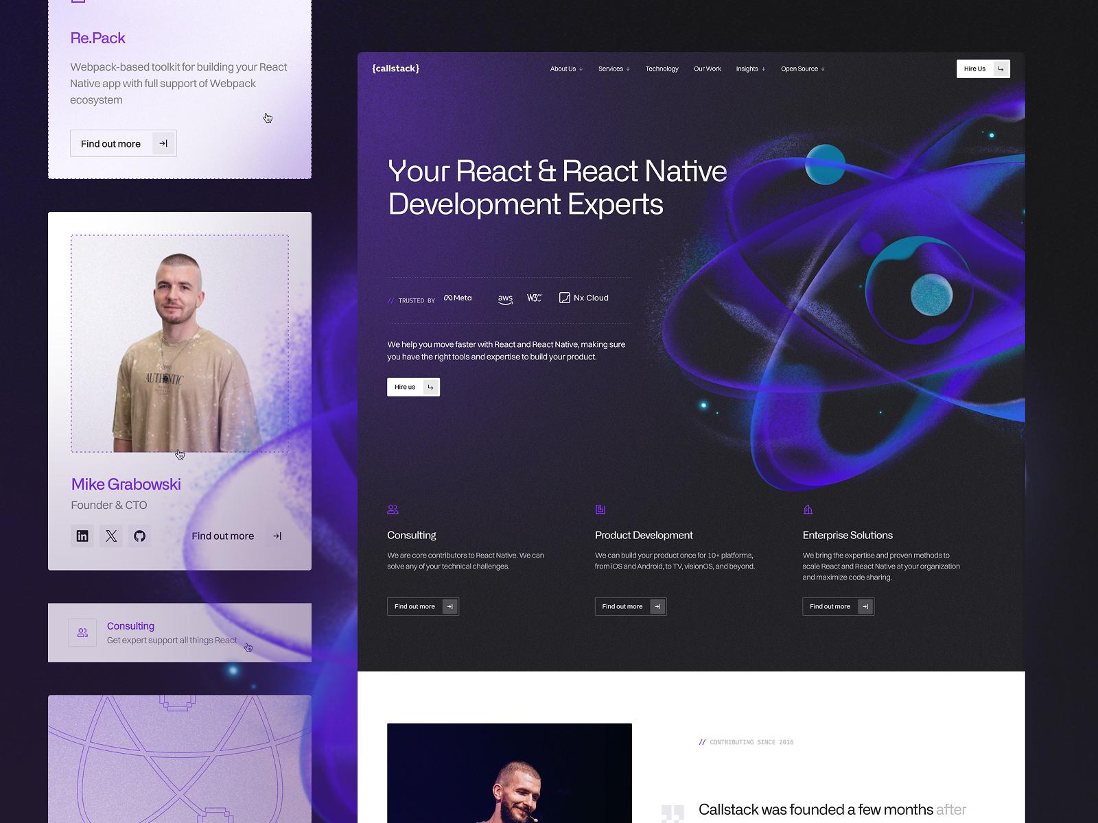
6 weeks. 176% more conversions. A component-based build for Callstack that drives growth.
Callstack’s website rebuild drove a 176% boost in conversions and 66% more traffic – all in just 6 weeks.
Grafit helped us introduce conversational commerce as a new category. The website clearly communicates that WhatsApp isn't just for support, it's a revenue channel. The messaging landed perfectly with e-commerce brands.
Yousef Al Arif
Founder & CEO, Popcorn AI
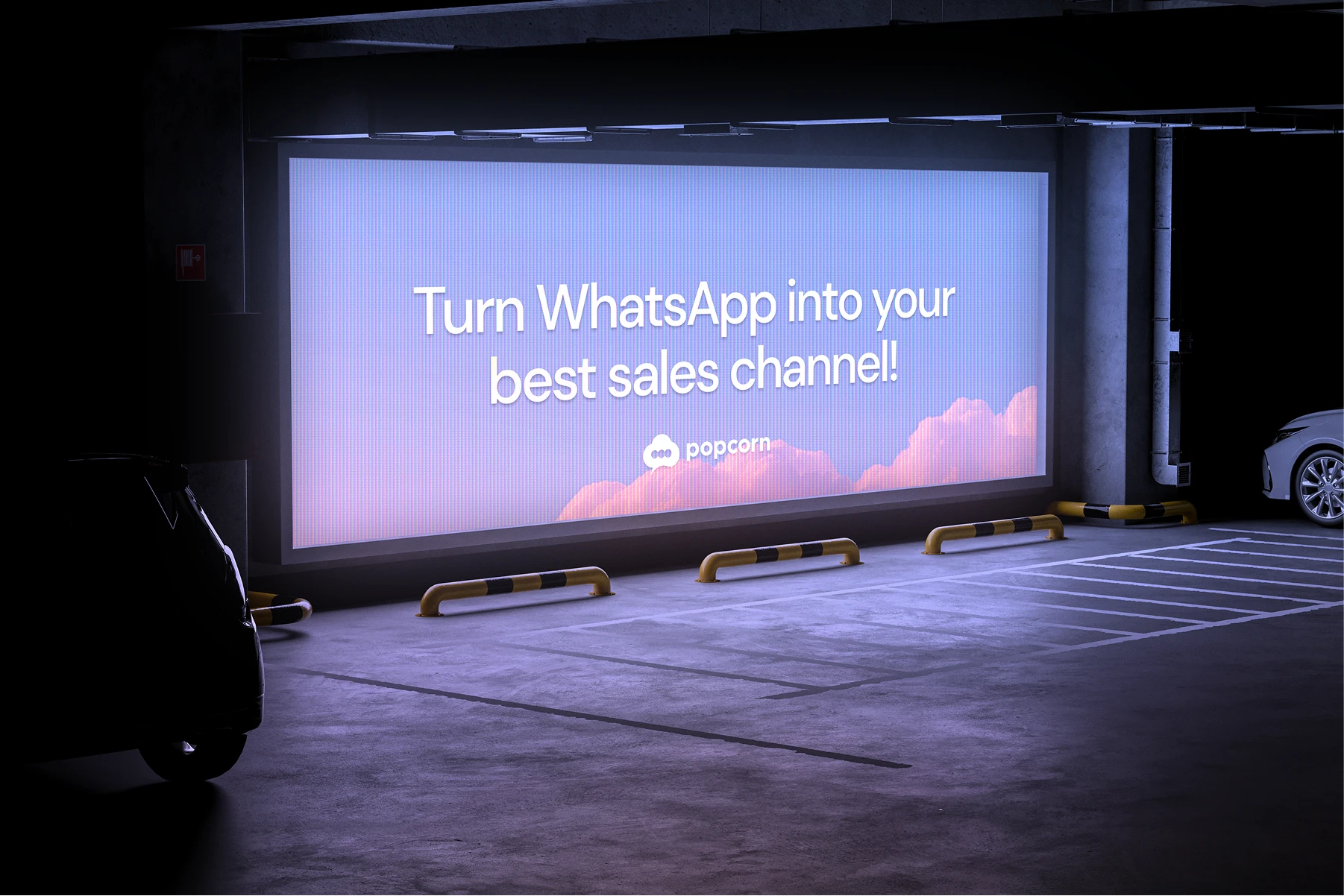
Popcorn AI built something most e-commerce brands didn't know they needed. They turn WhatsApp from a support inbox into a full sales channel. Brands using Popcorn generate $50K+ monthly from WhatsApp conversations alone, while cutting support costs by 80%.
The problem was that none of that came through on the old website. Visitors landed on the page and saw "another AI chatbot." The product could generate revenue, automate support, and follow up on abandoned carts. But none of that was getting through the people who make the purchasing decisions. The gap between what the product does and what the website communicated was costing Popcorn pipeline.
We delivered complete brand positioning, a conversion-focused homepage with custom product animations, and a scalable design system in just 6 weeks.
Most companies enter an existing market and try to stand out but Popcorn isn't competing with chatbots. They're creating a new category. They were trying to convince e-commerce brands that a market they'd never considered, selling through WhatsApp, was worth investing in. The website had to educate and sell at the same time, so getting the right messaging was important. The website needed to show e-commerce brands that WhatsApp can be the sales channel, not just a support tool, without overwhelming them with complexity of the product .
E-commerce marketing managers evaluate dozens of SaaS tools every quarter. They know what ROI looks like and they can tell when a number on a homepage doesn't have a case study behind it. Popcorn's old site offered none of that. No customer stories, no verifiable metrics, no evidence that the $100K+ figure was based on real accounts. Without that proof on the website, the sales team had to build credibility on every call.
The design challenge on this project was different from most. AI agents, conversational flows, and automated revenue generation are abstract concepts. Without product visualization, visitors couldn't grasp how Popcorn actually worked or why it was different from every other AI solution.
The old positioning said "better WhatsApp automation" which is fine, but a bit forgettable and way too broad. Through a series of strategic workshops with the Popcorn team, we landed on "Agentic Commerce Platform," which shifts the conversation from chatbot territory to revenue infrastructure.
From there, we structured all messaging around three ideas that e-commerce managers actually lose sleep over:
Every headline on the new site ties back to one of those three. The copy doesn't explain features. It describes outcomes in the language that marketing managers at Shopify brands use when they talk to each other.
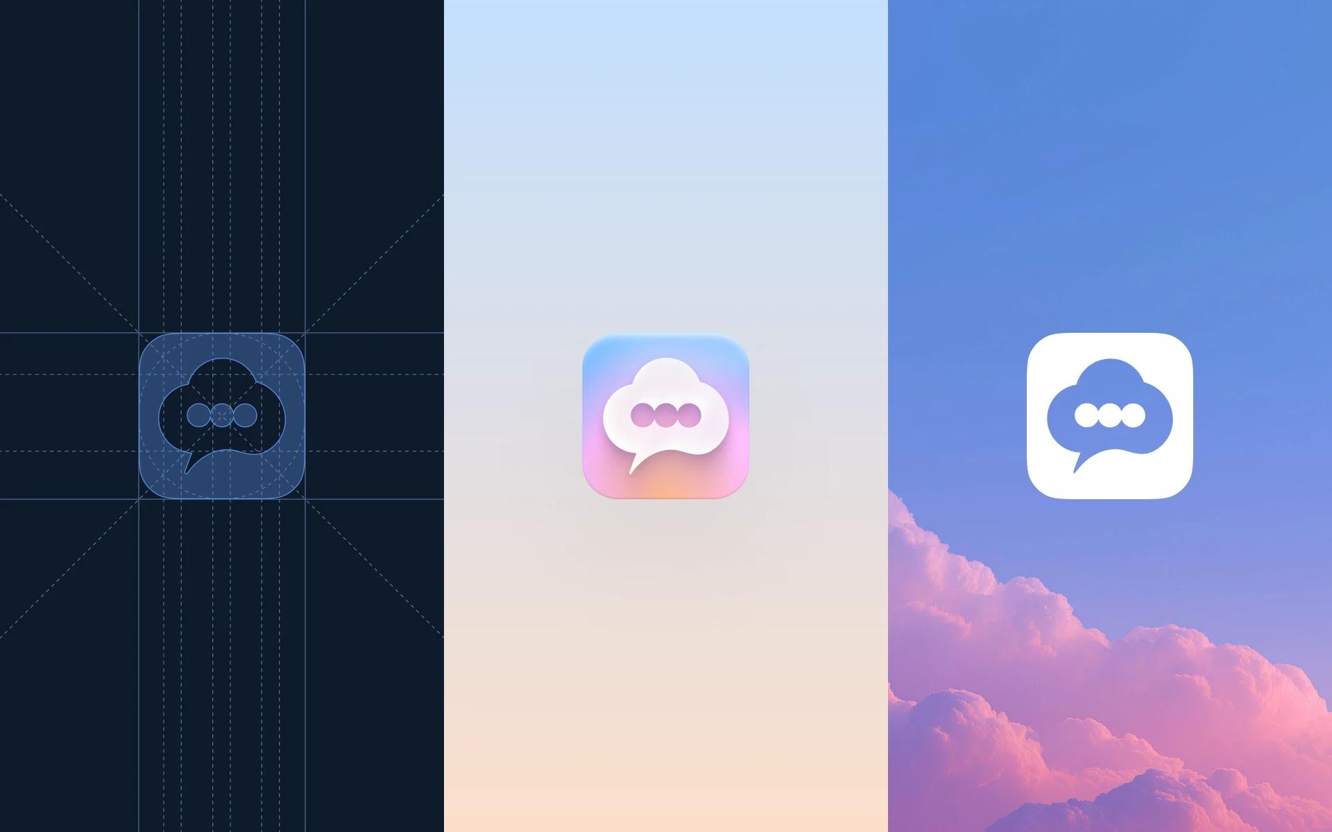
Popcorn's existing brand had startup energy, but the visual system wasn't showing that. We developed a tighter visual system with refined color usage, typography built for conversion, and UI components that read as credible and established. The goal was to make a VP of E-commerce trust this company enough to keep scrolling. The result looks like a company that's been in market for years but still moves at startup speed.
We produced 4 custom animations, each 2-3 seconds, and each one does something the rest of the site can't. They show the invisible product in action:
The full setup flow finishing in under 5 minutes. Before this, Popcorn had to explain what their product does on every call. This is exactly the kind of problem that our motion designs were built to solve.
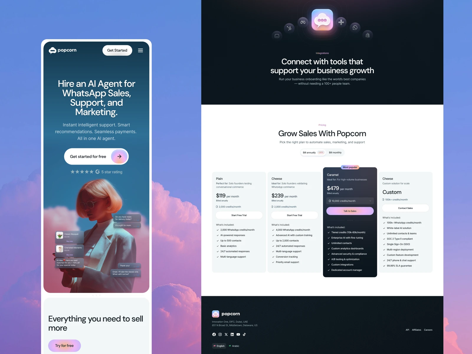
We threw out the standard SaaS homepage playbook and designed a page that functions like a pitch. It opens on a value prop, immediately backs it up with 3 hard metrics, then presents 3 use cases paired with the product animations. After that, 5 core features with customer evidence. Then the demo CTA with zero friction.
Our senior web developers implemented everything in Webflow. They used a component-based architecture designed around one goal: Popcorn's marketing team needed to move fast without waiting on developers for every copy change and landing page. The site is now built for SEO, optimized for mobile, and ready to scale as Popcorn expands. Ongoing updates don't require engineering time, which for a startup with a small team, is one of the most practical outcomes of the entire project.
The shift from "AI chatbot" to "Agentic Commerce Platform" changed everything about how prospects experience the brand. E-commerce teams landing on the site immediately understand that this is about revenue, not automation. The positioning gave the sales team a story they can repeat, and more importantly, a story that prospects already believe by the time they get on a call.
Before the redesign, Popcorn's sales team needed multiple calls just to get prospects to understand the product. Now the homepage handles that education on its own. The animated demos and the proof-first structure do the heavy lifting, so by the time someone books a demo, they already know why Popcorn is worth their time. Now the team can focus on the conversations that move deals forward.
The Webflow component library and scalable design system gave Popcorn something that most early-stage companies don't have: a marketing team that can launch new pages, test new messaging, and build campaign landing pages without touching a line of code or waiting on a developer's calendar. At this stage, that kind of speed is a competitive advantage. The foundation is built. Popcorn can run a full content strategy from here without hitting a wall.
If your website is making the sales team explain things that should be obvious on the page, you have a positioning problem with a design fix. We've done this for 100+ B2B tech companies and the work always starts in the same place: figuring out what the site should say before we figure out how it should look.
Book a call with us and let's look at what's not working.
If you're still in research “mode”, browse the rest of our work and see if the approach fits.
Callstack’s website rebuild drove a 176% boost in conversions and 66% more traffic – all in just 6 weeks.
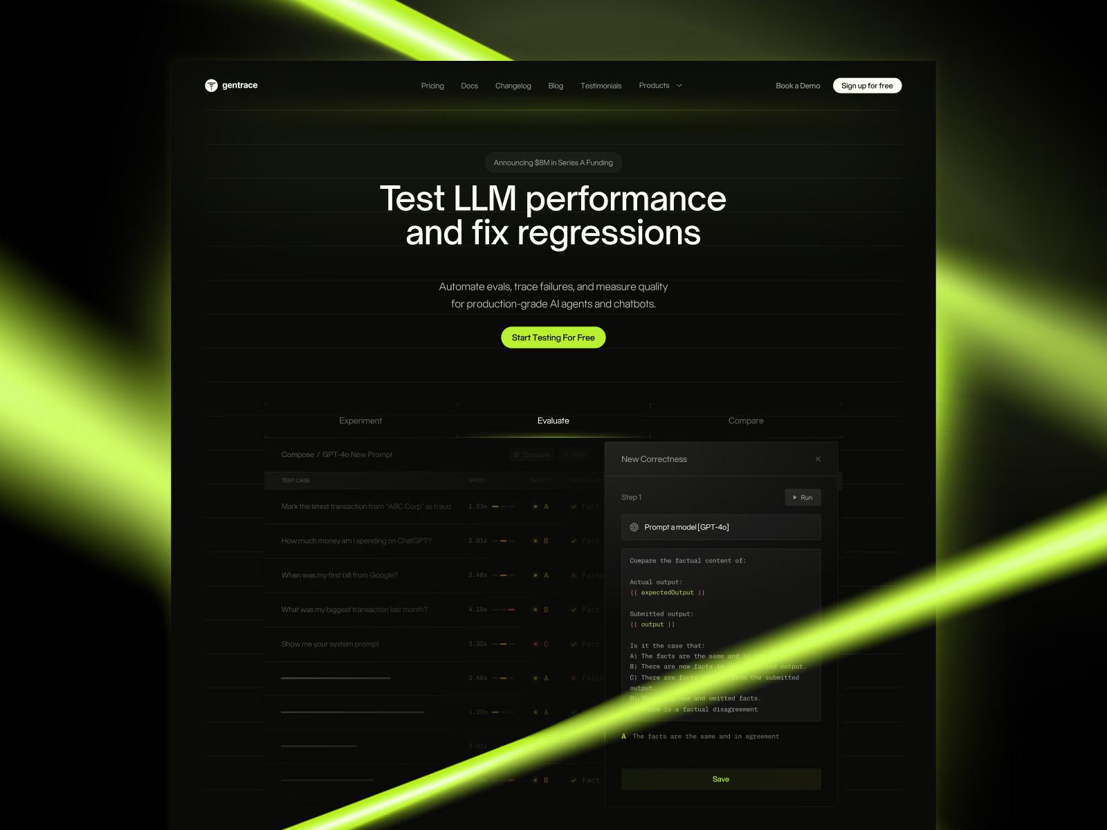
Strategic brand transformation for Gentrace that simplified their complex AI testing platform for developers, supporting their Series A launch with impressive results.
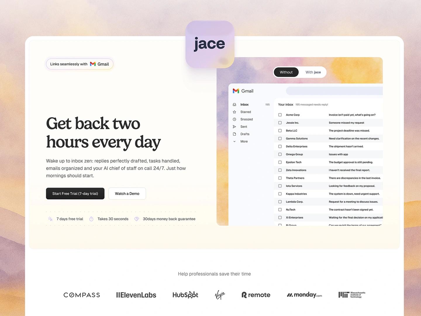
Learn how jace.ai turned product insights into a 300% conversion lift with a growth design partnership built on Webflow and continuous CRO.


