


High-performing B2B SaaS ads cluster around six visual formats and three copy rules. Format does most of the work, so it is the first variable to test.
The first half-second of any paid social impression is where B2B SaaS ad design is decided. By the time the headline shows up and the CTA loads, the visual has either earned the next two seconds or lost the impression to the next thumb-swipe.
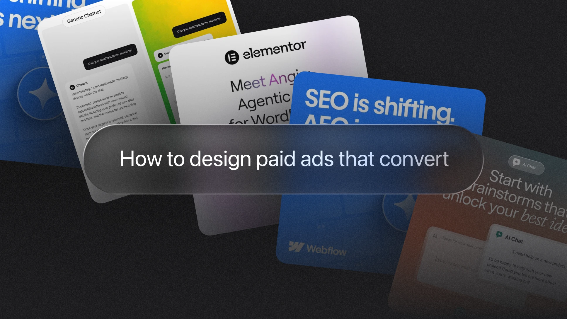
This guide breaks down the B2B SaaS ad design formats, copy rules, and briefing process that converts in 2026, with examples from Stripe, Zapier, Clay, Lovable, Intercom, Foleon, Coefficient, Walnut, Boardy, and others.
Why most B2B SaaS ads look the same
Walk through any LinkedIn feed and you will see the same ad fifteen times. Blue gradient, clean UI screenshot, "Trusted by X companies," demo CTA. None of these are wrong on their own. The problem is what happens when every advertiser does the same thing. The format is so well-worn that the algorithm reads it as wallpaper and the buyer reads it as nothing, which is partly why LinkedIn sponsored content CTR sits at 0.44 to 0.65 percent and B2B and SaaS is one of the lowest CTR industries on Meta.
The B2B SaaS brands that compound results over multiple years share one trait. Their ads do not look like their category. Stripe's typography, Clay's lavender backgrounds, Lovable's near-editorial layouts: each one is instantly recognisable in a feed of look-alikes. The same idea sits at the centre of strong B2B SaaS brand design, where the goal is to be recognised at a glance, not just remembered after a click.
The visual hierarchy that decides B2B SaaS ad performance
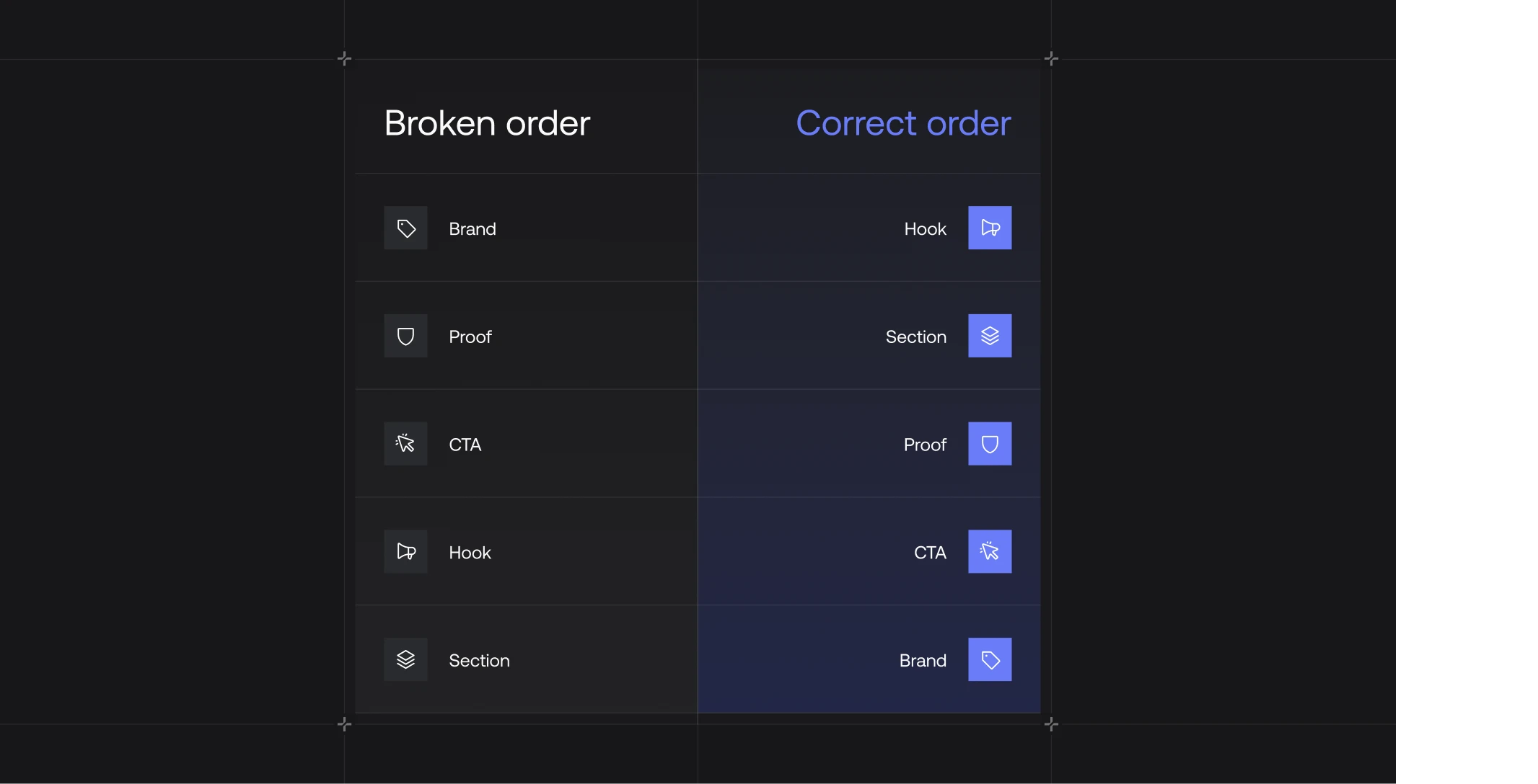
Before format, before copy, the structural decision that decides whether an ad performs is the order the eye reads it in.
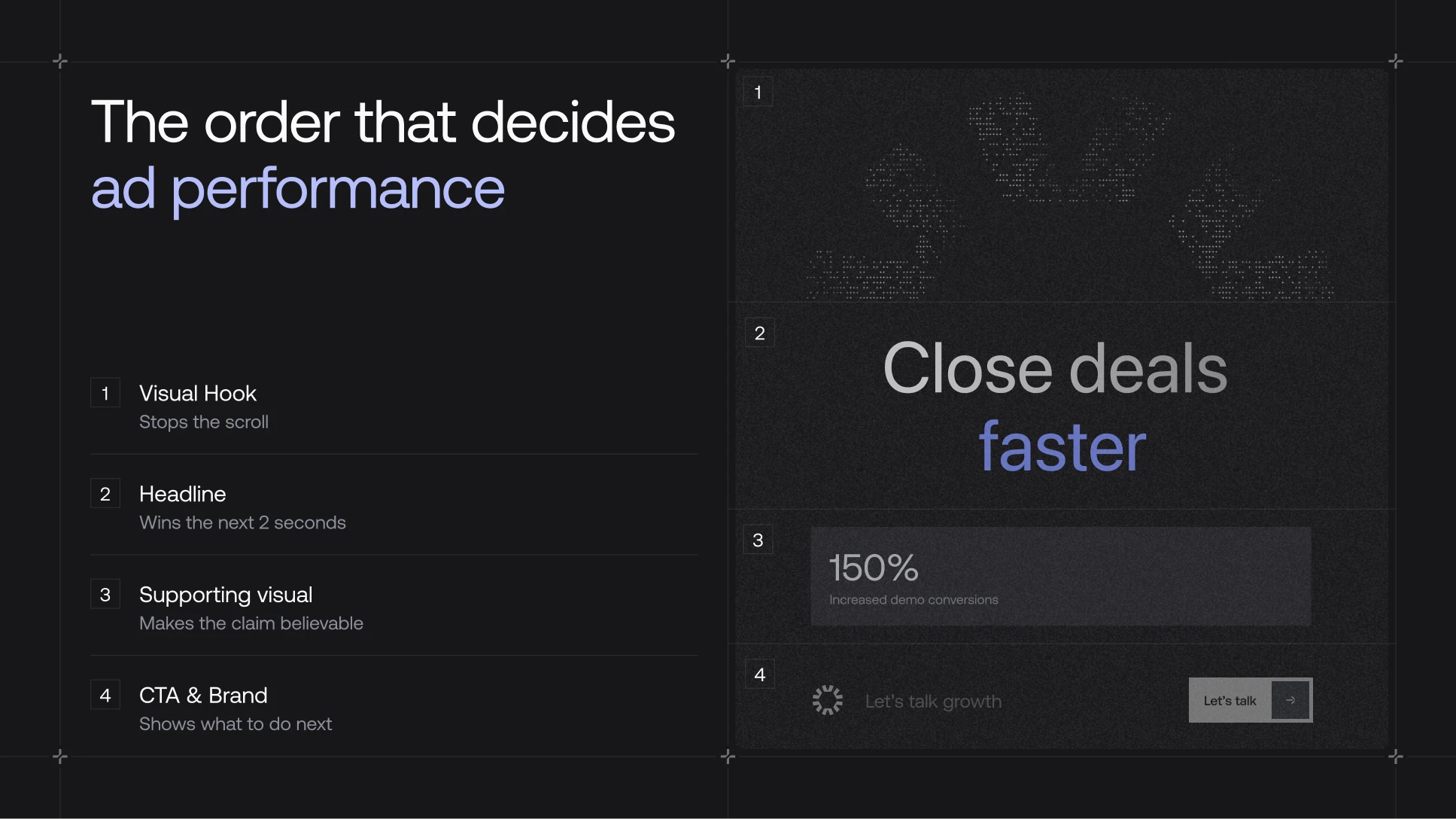
- Visual hook, the thing that stops the scroll
- Headline, the thing that earns the next two seconds
- Supporting visual, the UI, metric, or proof element that makes the headline believable
- CTA and brand, the thing that tells the reader what to do next
Common ways underperforming creative breaks the order: logo scaled too big, headline and body set at the same size, UI screenshot eating the canvas before the claim has landed, CTA fighting the headline.
Hierarchy is the first thing we look at when something isn't converting, because most weak creative breaks here before any of the other choices matter. The rest of this guide is what to look at after the hierarchy in your B2B SaaS ad design is right.
The 6 high-converting B2B SaaS ad formats in 2026
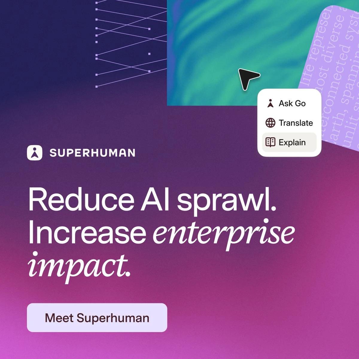
B2B SaaS ad format 1: Bold headline plus product UI
This is the most common high-performing format in SaaS, and the one that exposes a weak brief faster than any other.
A single strong claim sits in the top third of the frame. A product screenshot fills the lower half, often tilted or set inside a device frame. The logo lives in a corner at modest scale, and one primary CTA carries the action with nothing competing for the click.
What separates strong work from filler is the relationship between the headline and the screenshot. When the claim describes one thing and the UI shows another, the ad reads as a stock template.
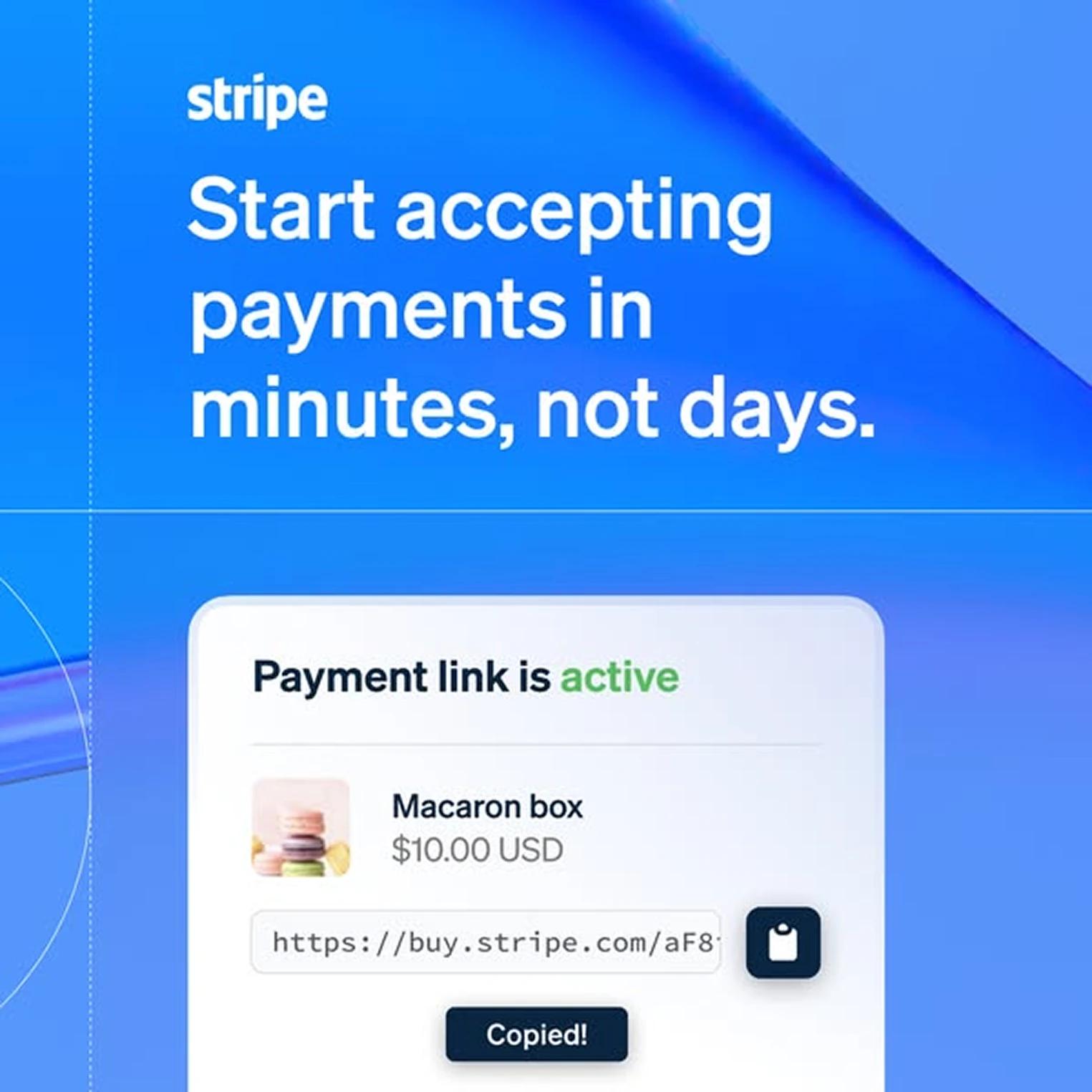
- Stripe pairs payment link UI with "accept payments in minutes, not days." The screenshot is the actual payment link flow, so the headline isn't making a claim, it's showing one
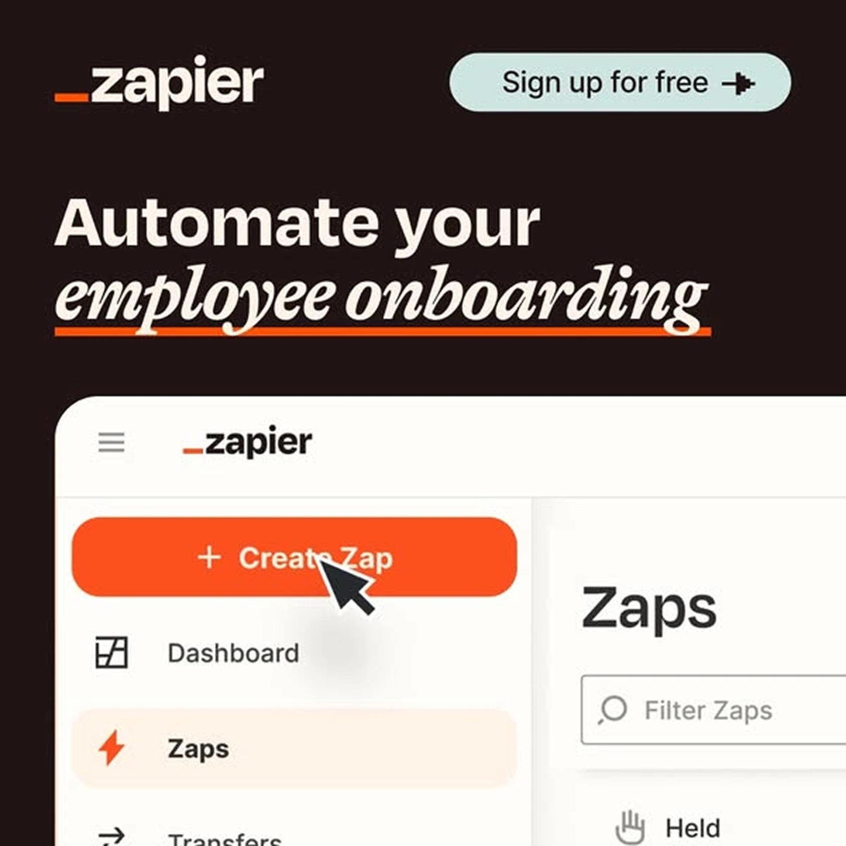
- Zapier pairs "Automate your employee onboarding" with the Zap-builder mid-construction, so the buyer watches the automation being built while reading the promise
When the headline and the screenshot describe the same use case, the ad stops being advertising and starts being evidence.
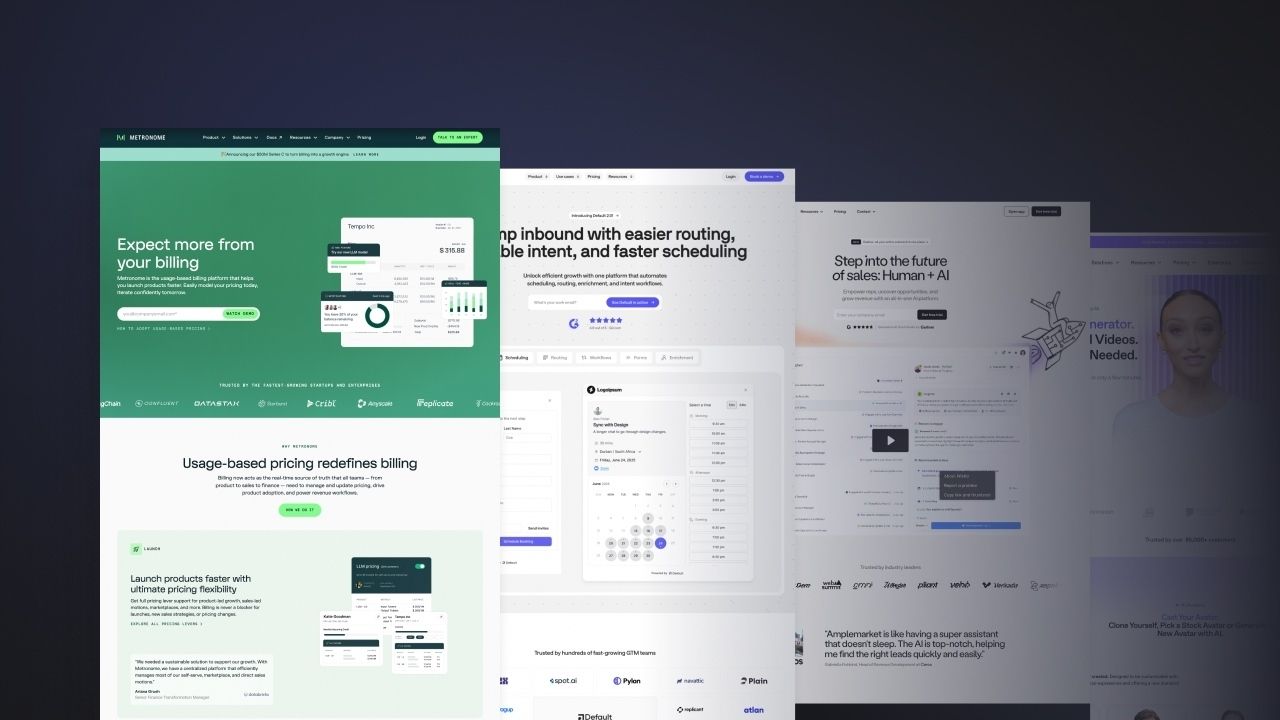
B2B SaaS ad format 2: Metric-first social proof
This format anchors the whole ad on one specific number from a real customer outcome. The metric sits at very large display type, the customer name attributes it underneath, the brand and CTA stay in a footer bar.
The number has to be specific. "Improved efficiency by 40 percent" doesn't convert because nobody can check it. Specific numbers attached to named customers convert because they feel real.
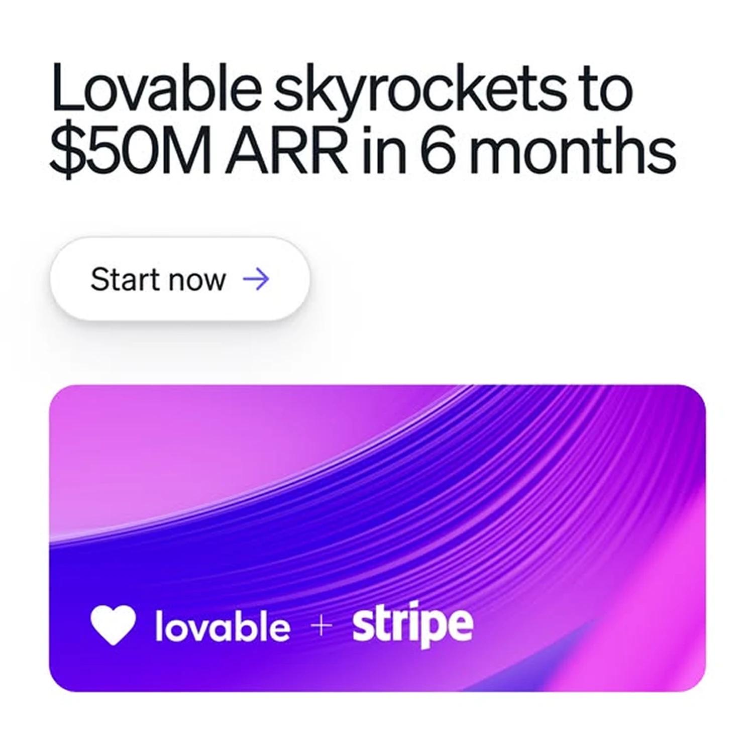
- Lovable runs "$50M ARR in 6 months" because the number is verifiable in public funding announcements
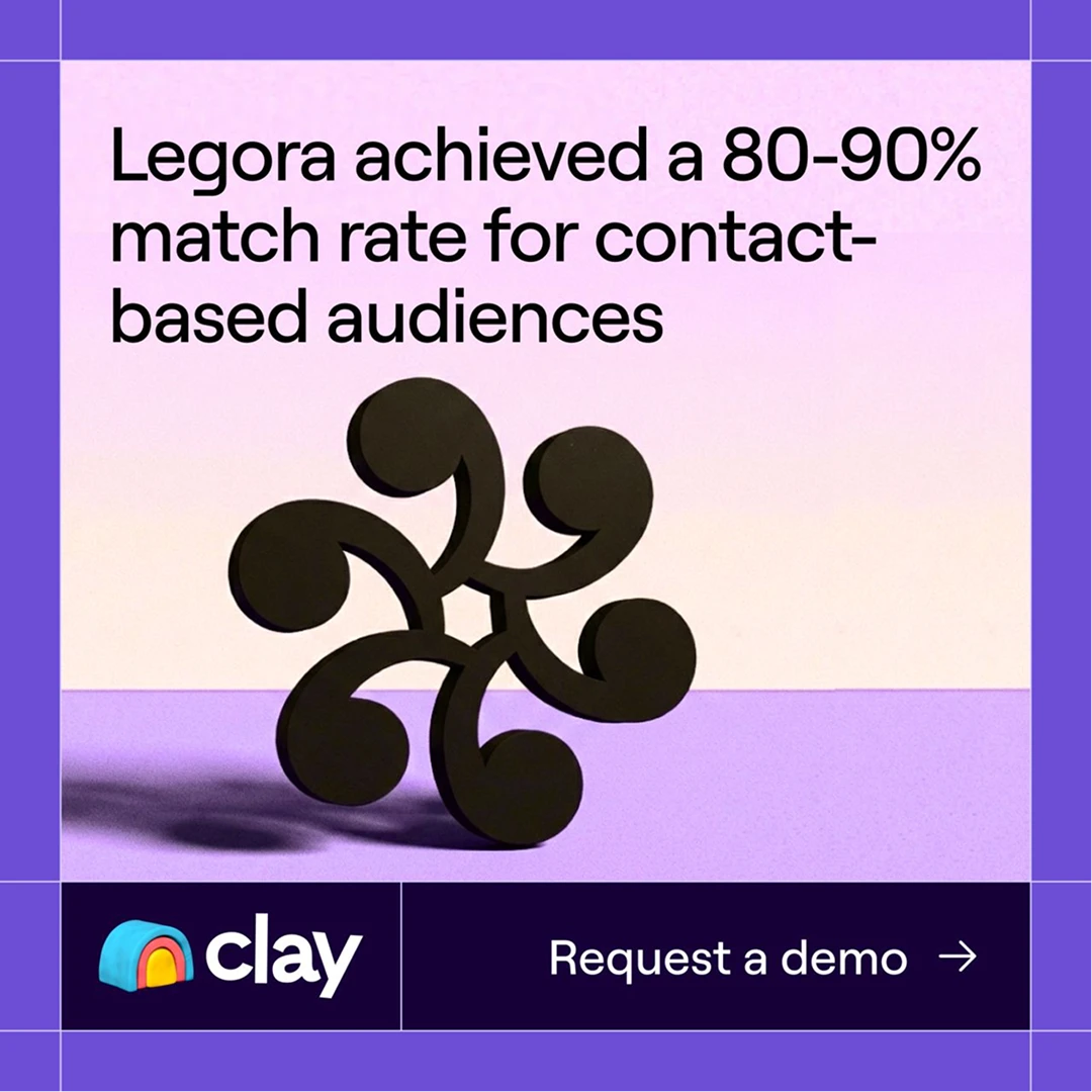
- Clay runs "80 to 90 percent match rate for contact-based audiences" because the number sounds like a real operator wrote it
The metric only carries the ad as far as the customer story carries the metric, which is why the best metric-first B2B SaaS ads come from accounts where customer success and marketing actually talk to each other.
B2B SaaS ad format 3: Product UI as the hero
Some products are their own best ad, if the UI is designed well enough to show in a 1:1 square.
This format skips the headline claim and leads with the product experience. It works for products where the UI is instantly legible and the value is visible without explanation.
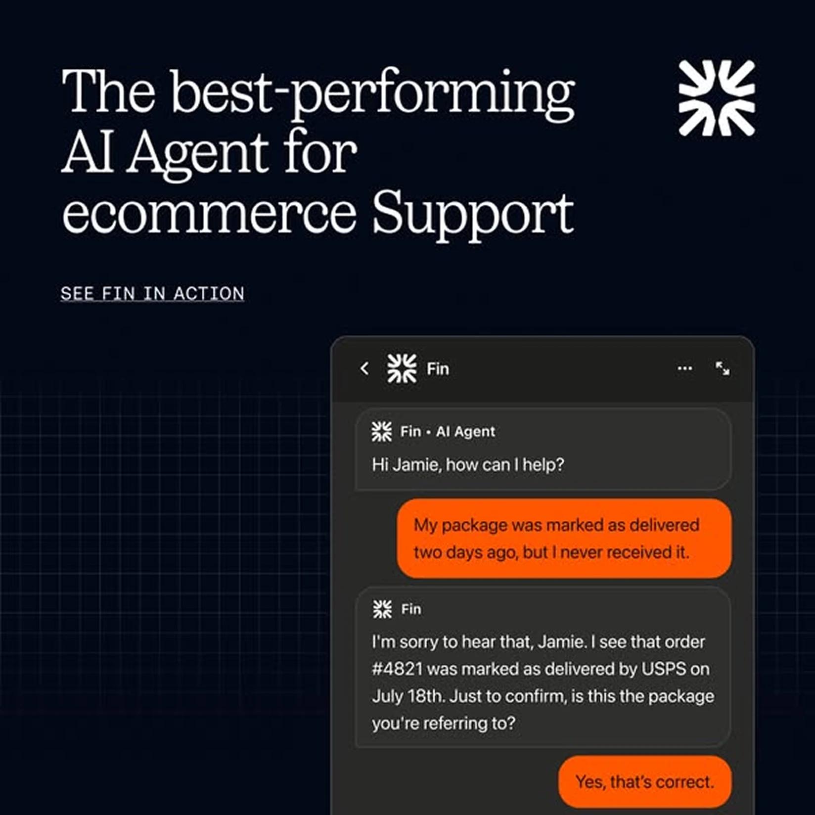
Intercom's Fin ads are the cleanest version of this format running right now. Dark navy background, serif headline top-left, Fin logo top-right. The right half of the frame is a real product chat where a customer reports a missing package and Fin replies with the order details. An ecommerce operator sees themselves in it before reading a word.
The risk: if your UI isn't legible at mobile size, it fails. Test it. Does the screenshot make sense at 375px wide, in one second of attention? If you need to zoom in, the format isn't right for this product.
B2B SaaS ad format 4: Pattern interrupt
The ad calls out a specific behaviour the buyer is doing right now and makes them feel slightly seen. Just a single image that breaks the visual template the rest of the feed is running.
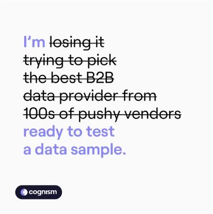
This format works because LinkedIn and Meta feeds are wallpapered with corporate ads. The pattern interrupt is whatever sits next to all of them looking nothing like them: a meme, a strikethrough, a yellow background, a crossed-out PDF icon. The visual contrast does the scroll-stopping work before the copy even loads.
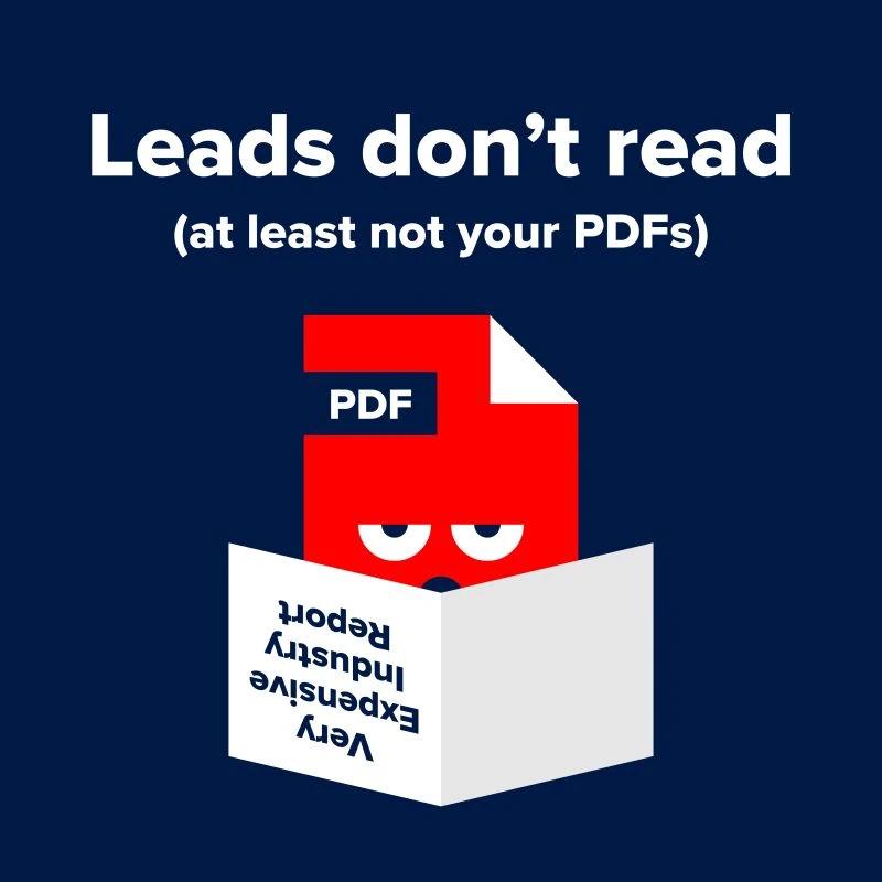
What makes it convert:
- A single call-out the buyer recognises in themselves ("you're still sending PDFs")
- A visual that doesn't look like a B2B ad. Meme format, scribble, handwritten note, strikethrough text
- One sharp line of copy that names the behaviour without explaining the product
- A low-friction CTA. Send us a file, claim a sample, take a quiz
B2B SaaS ad format 5: Resource or lead magnet
Used to drive top-of-funnel demand capture. The gated asset itself is the creative. The cover does most of the work: editorial background, large title, branded object in the centre, simple download CTA.
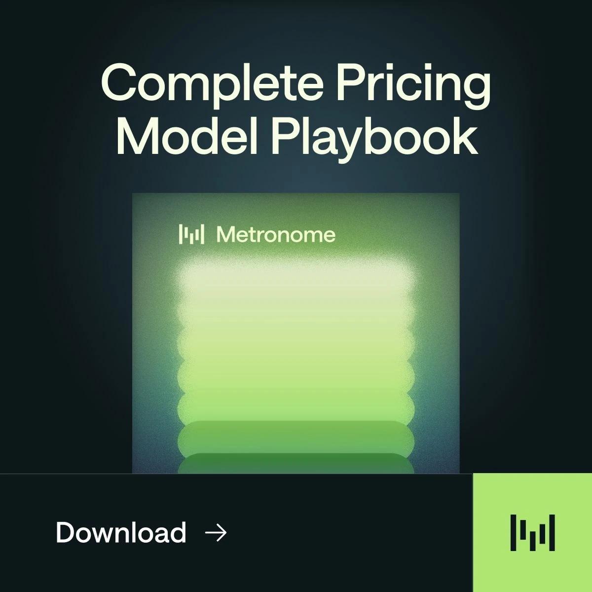
What makes this convert is perceived production quality. Covers that look like real industry reports outperform PDF-template covers by a wide margin. If it looks generic, nobody downloads. If it looks like something worth having, conversion rates jump.
The asset, the ad, and the landing page have to be built as one package. A polished cover with a thin landing page wastes the spend. This is where strong B2B SaaS content strategy and considered B2B SaaS web design make the difference: the resource is the product, the ad is the trailer, the landing page is where most conversion gets lost or saved.
B2B SaaS ad format 6: Event or livestream
The highest-urgency format, because the deadline is built into the creative. Coloured pill label above the headline, speaker photos with named job titles, a 3D branded object in the background tying the ad to the brand's wider system, and a clear date and time.
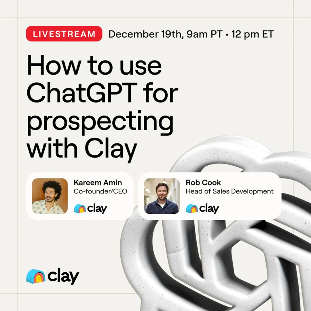
Clay's livestream ads show why this format only works when the brand is already running consistent creative. The 3D branded object is part of the same visual system Clay uses across content, so the ad inherits brand recognition instead of starting from cold attention.
What B2B SaaS ad visuals are doing
Across all 6 B2B SaaS ad formats, the visual does three jobs in parallel.
1. Stopping the scroll through contrast against the dominant feed colour, scale against the dominant thumbnail size, or unexpectedness against the dominant format.
2. Filtering the audience. Strong creative tells the wrong audience the ad is not for them as quickly as it tells the right audience it is.
3. Making the headline readable at thumbnail size. Screenshot the ad, scale to 200px wide, check the central claim still reads in one second. If the headline disappears, the ad is built for desktop preview, not real-feed conditions.
B2B SaaS ad copy rules that decide the click
B2B SaaS ad headlines that name the exact job the buyer is hiring for
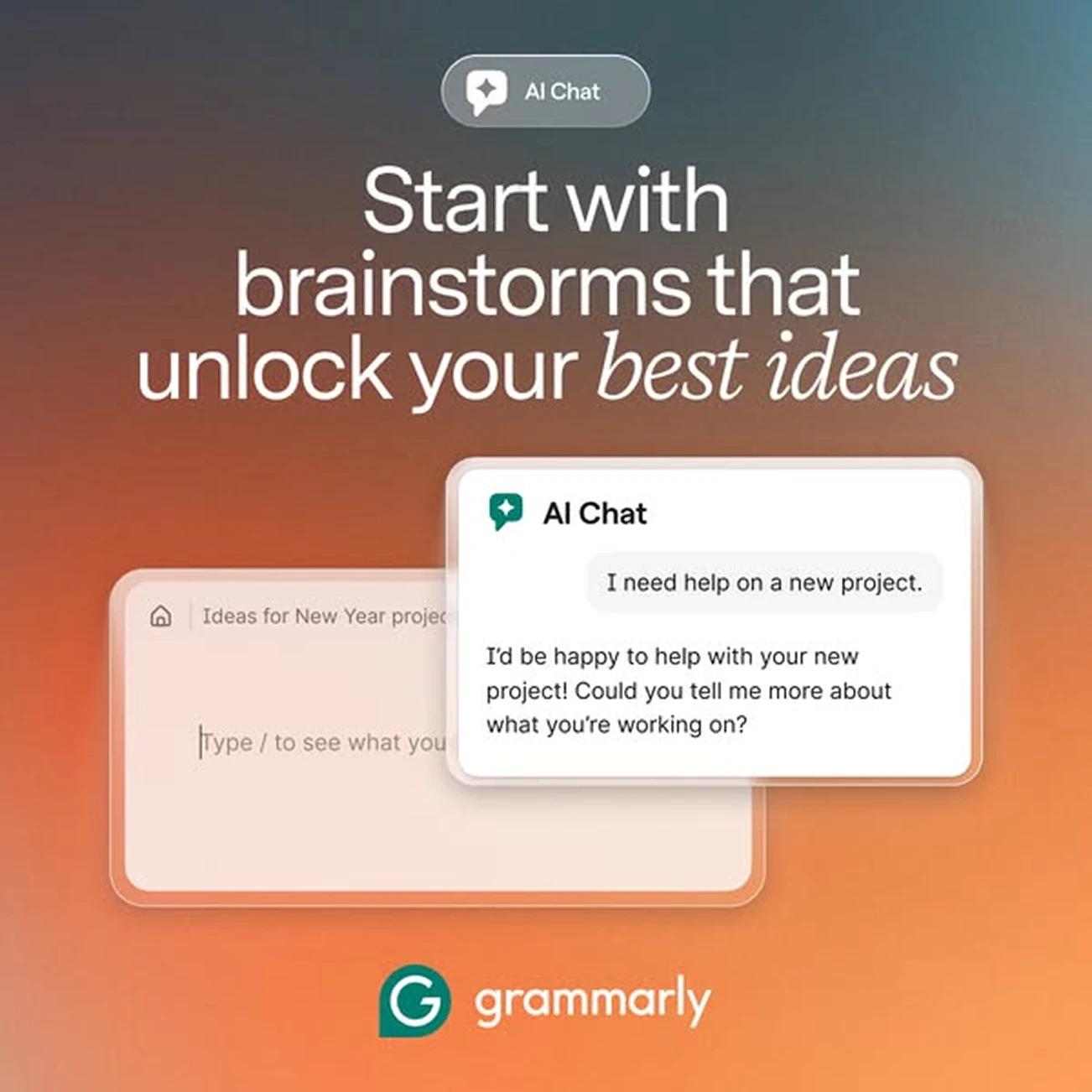
Headlines that name the exact job the buyer is hiring the product to do beat headlines that gesture at outcomes. "Automate your employee onboarding" beats "Work smarter, not harder" because the first one names the use case the buyer is shopping for. Grammarly's "Start with brainstorms that unlock your best ideas" beats "Write better" for the same reason.
Writing B2B SaaS ad copy in the buyer's words
The strongest B2B SaaS ad copy uses the words the buyer uses.
- "Workflow optimisation" is internal language. "Automate your employee onboarding" is buyer language
- "Data enrichment" is internal language. "80 to 90 percent match rate" is buyer language
Source headline language from sales calls, support tickets, and customer interviews, not the positioning document.
This is where strong B2B SaaS product marketing does upstream work. The headlines that convert are extracted from customer research and brought into the ad already pressure-tested.
Matching the B2B SaaS ad CTA to funnel stage
The classic mismatch: a top-of-funnel awareness ad with a "Book a sales call" CTA. The buyer hasn't warmed up to what the CTA is asking for, and the ad reads as pushy.
What to test first when launching B2B SaaS ad creative
Order matters more than volume. Format does more of the work than headline or visual treatment.
- Test format first. Run metric-first, product UI, and testimonial against the same audience and budget with copy held constant
- Test headline second. Once the format is locked, test specificity, framing, and use case angle
- Test visual treatment third. Background colour, UI versus abstract, static versus motion. Smaller effect than format
Most teams reverse this and test copy variations on the same template. Nothing moves, and they conclude testing doesn't work. Almost always, they tested the wrong variable first. The first thing we untangle when we take on B2B SaaS ad design work is testing order, because the roadmap matters more than the next round of creative.
The one thing most B2B SaaS teams skip in their ad brief
Production quality is rarely the constraint. Stripe runs blue gradients and white type. Clay runs editorial type on lavender. Lovable runs black sans-serif on white. None of it is a production showcase. All of it does one thing well.
What actually holds performance back is the brief. When the brief asks for brand awareness plus demo requests plus category education plus competitive differentiation in a single ad, the creative tries to do all four and does none of them well.
The brief structure that converts:
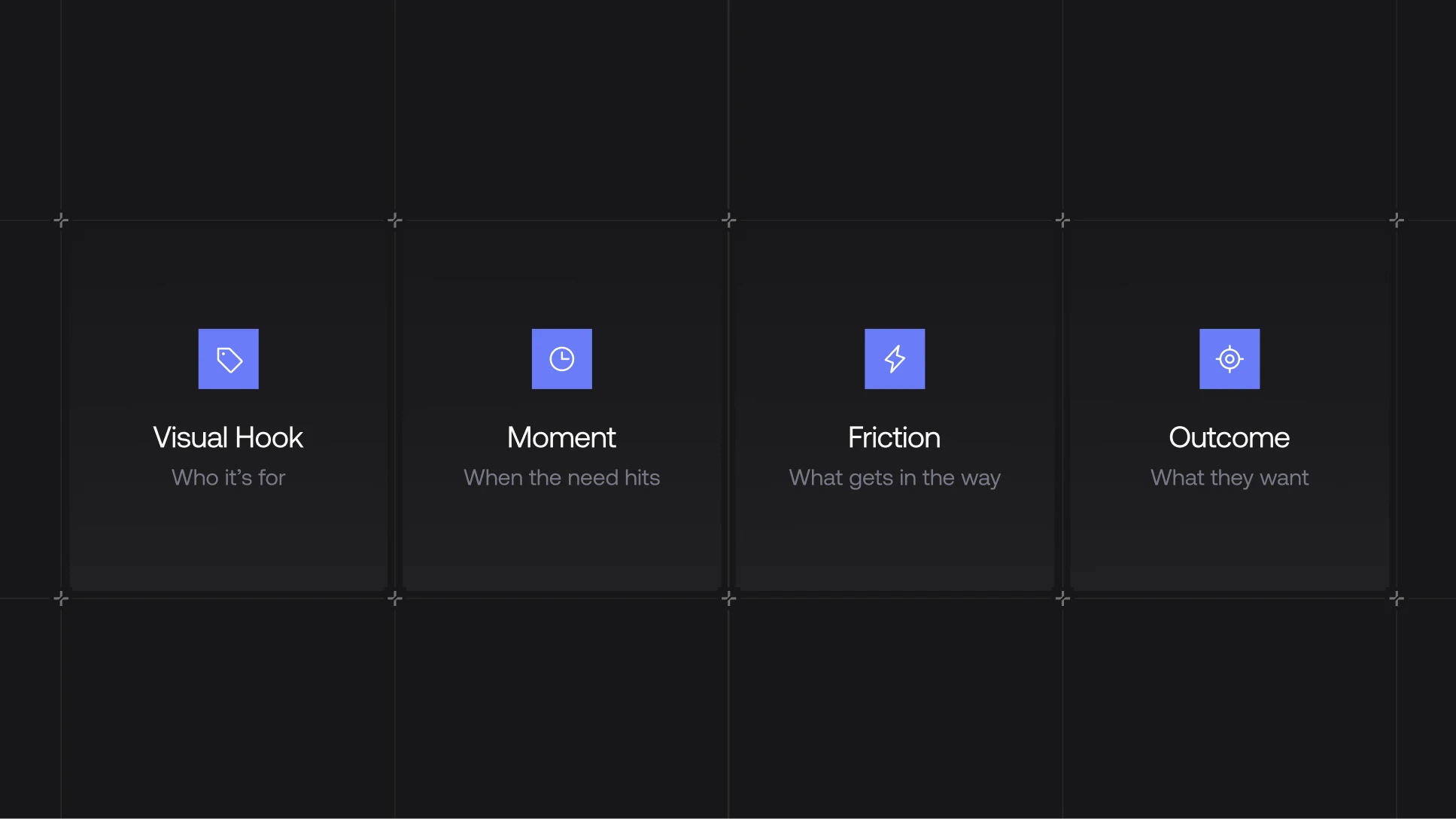
- One audience. Narrow enough that you could name three real people who fit it
- One moment in their working day when the problem is most acute
- One specific friction they're having in that moment
- One outcome the product is offering instead
If the brief is fuzzy, the creative will be fuzzy. If the brief is sharp, the creative has a real path to converting on a modest budget. Every ad design project we take on at Grafit starts with checking the brief, because that's where the budget is either earned or wasted.
Final note
Format does most of the work. Copy does some of it. Production does almost none.
What actually decides whether a B2B SaaS ad converts is whether the brief was honest about who it's for and what it's selling. Everything downstream of a fuzzy brief is wasted budget.
If that's something you want help with, we design B2B SaaS ads at Grafit.