


Your website looks great but it's not ranking. We've audited over 100 B2B tech sites where design and SEO were treated as separate projects, and the same eight mistakes kept showing up. Learn how to fix them before they cost you traffic.
Design affects SEO in two ways: user signals and crawlability. If people do not stay, scroll, click, or understand the page, or if Google and AI tools cannot reliably read it, rankings and conversions drop. Here is what you need to do:
- Write for scanning. Drop an H2 every 250 to 350 words and add a visual every 400 to 500 so the page stays readable.
- Build mobile-first by default. Google judges the mobile version first, and most traffic is mobile in B2B too.
- Make sure your key content is in the initial HTML. If your H1 and main copy only load through JavaScript, indexing gets slower and less reliable.
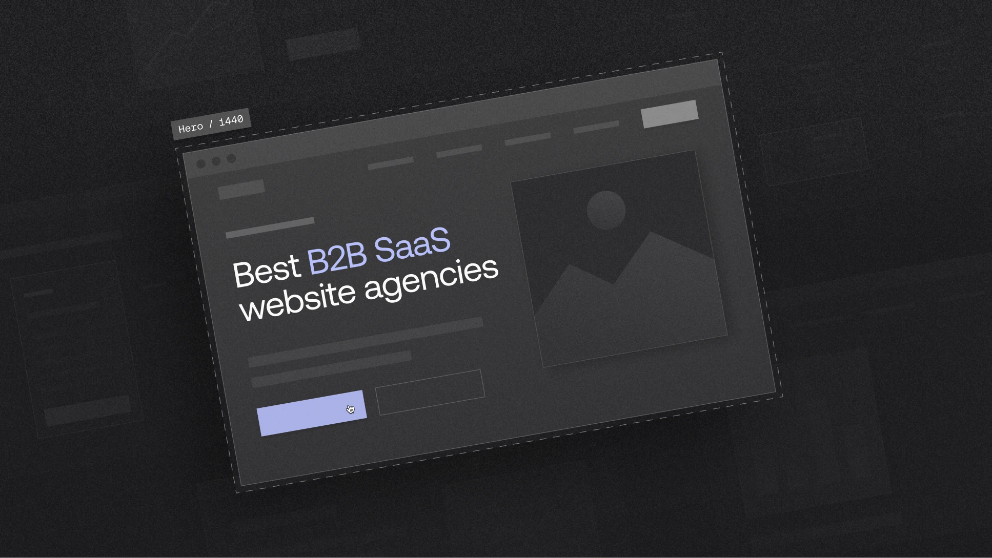
- Keep your hero tight. Aim for under 400px on desktop, because people decide fast. If the CTA is below the fold, you’re losing visitors before they even get the point.
- Add 2 to 3 internal links in every post. It helps readers move through the site and helps crawlers understand what matters.
The problem with web design most B2B SaaS companies face
Your website probably looks great. The design team put hard work into it, the brand feels fresh, the layout is clean. Everybody signed off and felt good about the launch. And then you check organic traffic in Search Console… and it hasn’t moved. Three months later, still nothing.
This is the part probably nobody warns you about during a web design process. Looking good and performing in search are two different things. You can have an award-worthy B2B website and Google ignores. And the other way around. You can write perfectly optimized content for B2B SEO, but if the web design confuses people or loads like it's 2009, visitors bounce before they finish reading your headline.
We've worked with over 100 tech brands that treated web design and B2B SEO strategy as two separate projects. One team made the website beautiful, and the other tried to make it rank, but those two teams never talked to each other.
The B2B brands that grow organic traffic don’t “add SEO later.” They build for humans and search engines from the same wireframe, on the same timeline.
This blog covers the specific design mistakes we see killing B2B SEO, over and over.
Why web design directly impacts B2B SEO
Most people think of SEO as a content game. Write better SaaS blogs, pick better B2B keywords, build some links. Okay yes, those things matter, but web design is the foundation everything sits on. If the foundation has cracks, the content work is a wasted effort. That’s why strategic design comes first.
Design impacts search performance through two separate mechanisms. Both need to work. If either one breaks, your rankings suffer regardless of how groundbreaking your writing is.
1. User signals: how visitors interact with your B2B website
When someone clicks a Google result and lands on your page, their behavior sends a signal. Did they stay? Did they scroll? Did they engage with something? Or did they smash that back button in two seconds flat? That behavior is Google asking one thing. Did this page deliver what that person wanted?
And your web design and content is the answer to that question. The layout, the visual hierarchy, load speed, where you put your CTAs, how easy the text is to scan. All of this determines whether your rankings move up or down. In GA4, you’ll see this reflected in engagement and bounce rate. A high bounce rate suggests the page isn’t meeting intent or encouraging interaction.
2. Crawlability: how search engines and LLMs access your B2B website
This is the technical side and it's where a lot of companies are losing ground without any idea it's happening. Can Google actually read your content? Are your internal links clear? Does your page structure make sense to a machine?
And it's not just about Google anymore. AI tools like Google's AI Overviews, Perplexity, and ChatGPT pull directly from your page structure. Tools like GetMentioned track whether your brand is being surfaced in answers across those major AI platforms, so you can see if your site structure is helping you get cited or getting ignored. A solid B2B SEO strategy needs that feedback loop because many SaaS teams have “good SEO” and still show up zero times in AI results.
8 common web design mistakes that hurt your B2B SEO strategy and how to avoid them
These are the issues we find most often when auditing B2B SaaS websites.
1. JavaScript-first builds that hurt B2B SEO
Let’s try this now. Go to your homepage and click into the address bar:
- Type
view-source:in front of your homepage URL and hit EnterExample:view-source:<https://yourdomain.com> - You’re now looking at the raw HTML Google gets on its first pass
- Press
Ctrl + F(orCmd + F) and search for:<h1to find your H1A key line from your main body copy (or look for<main,<p,<section)
So what do you do?
Get your key content into the initial HTML:
- headings
- body copy
- nav links
- CTAs
All of it needs to exist before JavaScript kicks in. Google can process JavaScript. But it's slower, less reliable, and goes through a separate queue. Use JavaScript for the fun stuff like animations and interactions. If you're running your website on Webflow, you're already ahead because Webflow renders server-side.
2. The 3-second rule and oversized hero sections
Everyone wants a dramatic first impression (fair enough, we also wanted that for our B2B website). If visitors have to scroll past a giant hero to understand what you do, many will leave first. Pages with hero sections over 800px tall have significantly higher bounce rates. For strategic design keep your pages:
- On desktop - under 400px.
- On mobile - under 300px.
And speed is the other half of this. A one-second delay in mobile load time can cut conversions by up to 20%. In B2B, where sales cycles are long and every qualified visitor matters, you really cannot afford that.
So what do you do?
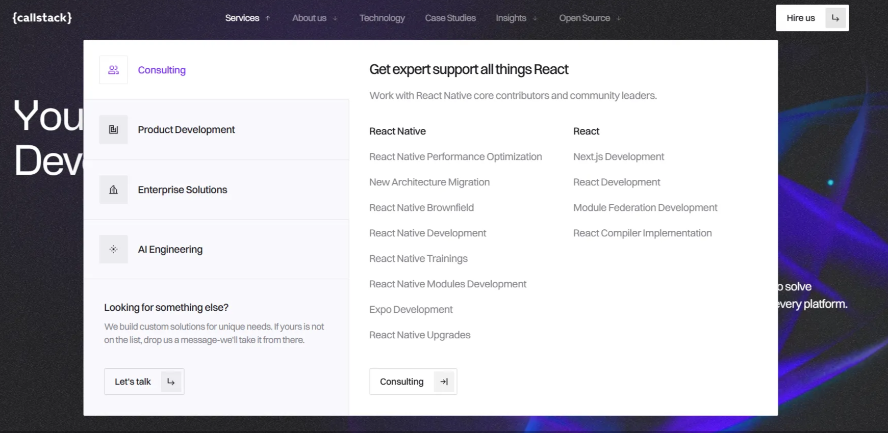
This all doesn't mean your hero needs to be boring. Here’s an example from our work with Callstack.
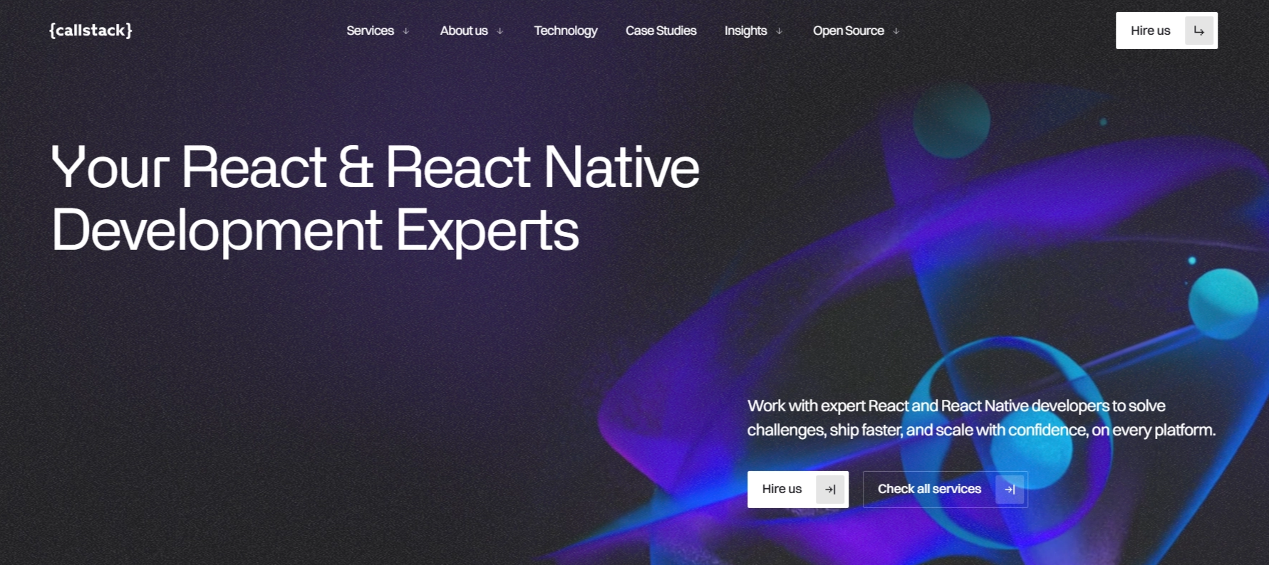
We led with a clear headline:
- “You React & React Native Development Experts” tells you who they are
- Keep the primary CTA visible without scrolling.
In the B2B tech website, compress images, use WebP or AVIF, lazy-load below the fold, cut scripts on initial load. Slow sites are almost always caused by a dozen of small things nobody questioned adding up.
3. Poor site structure and navigation
Internal links are one of the most powerful and most ignored tools in B2B SEO. They help with two critical things:
- They guide crawlers through your site (SEO)
- They guide readers to related content (UX)
AI tools don’t scan the whole internet. They prefer topic-specific, trusted sources over general platforms, and they’re more likely to surface pages that are easy to discover and clearly connected through internal links. Every blog post should have two to three contextual internal links. Not random links for the sake of it but the kind of link that makes someone think "oh good, I was wondering about that." Use descriptive anchor text such as "See our full guide on website content optimization".
Your overall site architecture matters too. Make sure your most important pages, services, case studies, conversion pages are reachable from the homepage and navigation. If Google can't find the page, it can't rank the page.
Have a look at how we helped Callstack with our web design services to rebuild their website into a performance-first, content-led growth asset that matched their reputation as React Native leaders. Instead of burying key pages, the header menu was structured around clear journeys (what Callstack does, how they do it, proof, and learning).
4. Missing or improper use of header tags (H1–H3)
Your heading structure is the outline of your page. In B2B web design especially, where pages cover complex products and multi-step processes, a clean heading structure does a massive work for your rankings.
When headings are clear and properly nested, search engines quickly understand what you're covering. When you have multiple H1s or you skip H2s, you’re handing Google and AI a jigsaw puzzle with half the pieces missing.
So what do you do about it?
Here’s what SEO expert Jules Davies (Founder at Scalerrs) flags. Designers swap an H1 for an H3 because they want a smaller font on the page. That fixes a visual problem by creating an SEO one. You need to remember that Google reads the HTML tag and humans see the CSS. Your H1 can be styled small, light, uppercase, whatever the brand needs. Keep the tag as H1 in the code and control the look with CSS. Other important things to keep in mind:
- One H1 per page. It describes what the page is about.
- H2s break content into sections that support the H1.
- H3s live inside H2 sections. Don't skip levels.
- And our web developers ask - please don't use headings to make text look bold. That is literally what CSS is for.
- For blog posts, aim for an H2 or H3 every 250 to 350 words. It creates a reading rhythm that works for humans and machines alike.
5. Poor B2B content hierarchy and hidden value
B2B SaaS content tends to run long. If someone lands on a 3,000-word article and can't tell within ten seconds whether it's worth their time, most of them won't wait around to find out. They'll just leave and Google will notice that.
So what do you do?
The single best fix for this is a key takeaways box near the top of the page, within the first 600px.
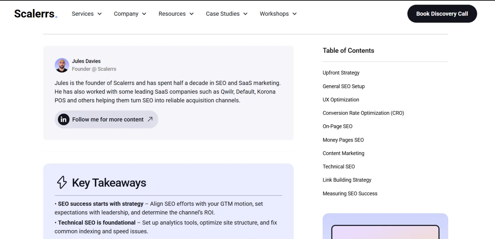
A good example is how Scalerrs does it on their SaaS SEO checklist page. Jules Davies puts a “Key Takeaways” section right up front, and pairs it with a table of contents so you can jump straight to the part you need. It’s simple, readable, and it respects the fact that most people are scanning before they commit.
To do the same on your site, work with the SaaS SEO team on your B2B SEO strategy to plan the hierarchy and structure. Add four to six bullet points that tell the reader exactly what they’ll learn, and link each one to the matching H2 section.
Match your content depth to user intent too. Commercial pages should be direct and get to the point fast. Guides and educational content should be thorough and cover the follow-up questions users naturally ask on the same topic.
And one of the best ways to cover those follow-up questions is with a well-structured FAQ section. A properly marked-up FAQ with schema can earn those expandable answer boxes right in Google or AI search results. That's free real estate on a busy page one.
6. B2B content that isn’t scannable for humans and AI bots
Even if your content hierarchy is solid, a wall of text will still lose people. Readers scan before they read. If they can't quickly pick out the key points, they leave.
The fix is straightforward. Make every page easy to skim:
- Short paragraphs.
- Bullet points where they help.
- Real numbers instead of vague claims.
- Visuals, screenshots, diagrams, data charts.
Aim for a visual element every 400 to 500 words. Place an H2 or H3 every 250 to 350 words to create a reading rhythm. And keep paragraphs to three or four sentences max. If a paragraph runs longer than that, it probably contains two ideas that deserve their own space. If your are not sure how to do it, check Apricot Studio and how, in their blog posts, their team of copywriters balance SaaS marketing know-how with clean text structure, and images that breaks up text and gives readers a visual anchor.
7. Non-mobile-friendly design
This number catches almost every B2B team off guard. Over 60% of global web traffic now comes from mobile devices. That includes B2B SaaS. Your buyer might sign the contract on a laptop, but their first visit to your site almost certainly happened on their phone. During a commute or between meetings.
Google pays a lot of attention to mobile. If mobile is slow, cluttered, or hard to use, your rankings take a hit across all devices. Strategic design for B2B websites in 2026 means desktop and mobile come as one package.
So what do you do?
Sturdy AI is a great example of what “strategic design” looks like:
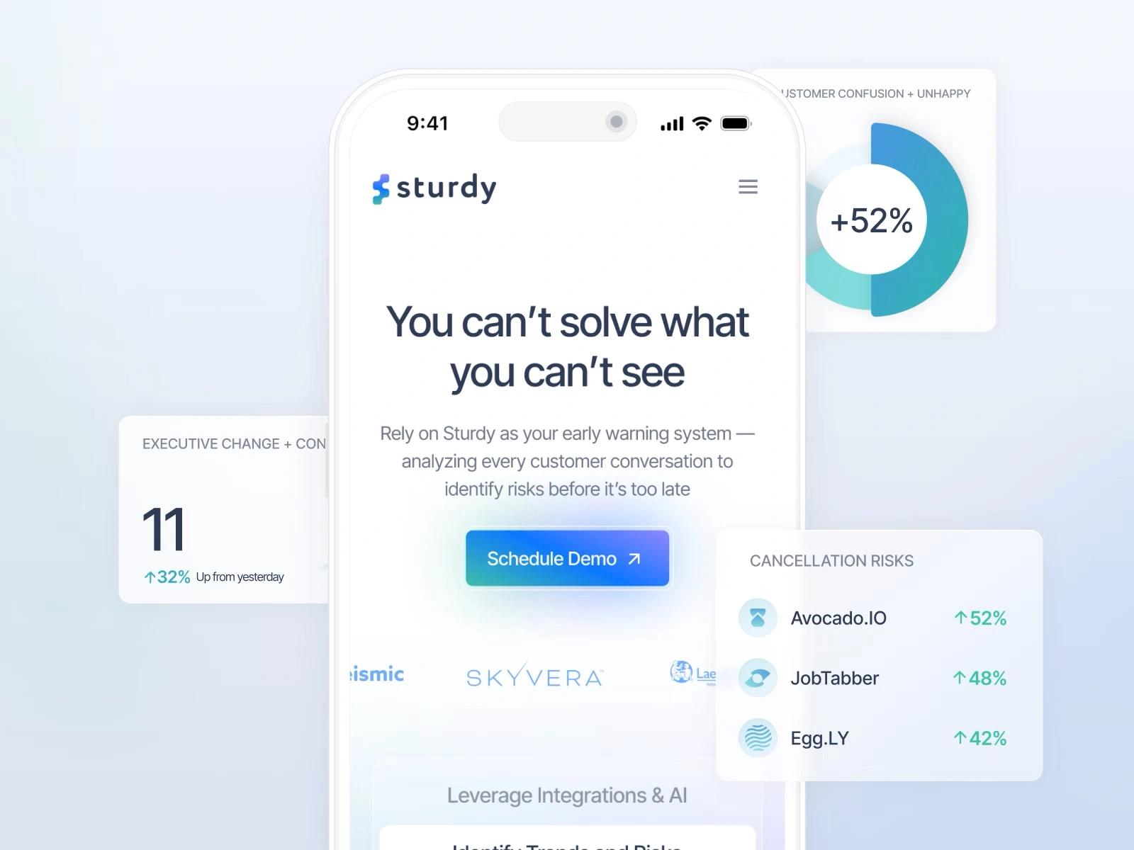
- Make sure above-the-fold content delivers real value without scrolling.
- Keep navigation to five to seven items max.
- And test on actual phones. Not browser dev tools.
Read the full case study here
8. CTAs that don’t complete your B2B website design
A 2,000-word blog post has one lonely "Book a Demo" button at the very bottom isn’t a conversion plan. Most readers never scroll that far. Most readers never scroll that far. And even the ones who do might not be ready for a demo, which is a serious commitment if you're still just looking around. One high-friction CTA at the bottom of a long article is not a strategy.
In strategic design, CTAs create engagement signals that support your B2B SEO strategy. But they only work when you place them on purpose and match them to what the reader is thinking in that moment. It’s one of those B2B web design details that separates sites that convert from sites that only look good.
What to do about it?
- Place CTAs throughout the content, tied to each section's topic. After a section about conversions, link to a relevant case study (same way as we are doing in this blog).
- Make them visible. Contrast, whitespace, clear copy. If a CTA blends into the page, it's not a CTA.
- Always pair "Book a Demo" with something lower commitment like "See Examples" or "Read a Case Study."
How strategic design prevents these B2B SEO mistakes
The real shift happens when B2B web design and SEO stop being separate conversations with separate teams. That's the approach we take. Not because we got lucky, but because the B2B SEO strategy and the design were never allowed to be in conflict.
When your web design process is B2B SEO-aware from the start, you build a system where every update makes your site a little bit stronger. Designers who understand heading hierarchy. Developers who know JavaScript should add polish. Content specialists who write for readers and crawlers. And an SEO and AEO strategy that shapes architecture and page templates before anyone opens Figma.
This is how we work and how we helped with our web design services Callstack that see a 176% conversion boost or Sturdy AI where website redesign resulted in a 2× increase in inbound leads. All within weeks of launch. Want to learn more? Check out our case studies and projects we’ve worked on.
The SEO checklist: audit your B2B website in 10 minutes
Run through this. If you answer "no" to more than three, you've got a short list of easy fixes.
Crawlability Check
- Type
view-source:before your URL - is H1 visible in raw HTML? - Do 2-3 internal links exist in every blog post?
- Are key pages linked from homepage/navigation?
User Signal Check
- Can users see value within 3 seconds (without scrolling)?
- Is there a key takeaway box in the first 600px?
- Do H2s clearly support the H1 topic?
- Are CTAs contextually relevant to each section?
Scannability Check
- Is there an H2/H3 every 250-350 words?
- Are visuals placed every 400-500 words?
- Do you use bullet points and short paragraphs?
What's next?
Want to know where your site actually stands? We run free website audits that show you exactly where design is helping or hurting your SEO.
Or start even smaller. Pick one thing from the checklist and fix it this week. Then measure what happens. You might be surprised what one structural change does for your traffic.