


























A SaaS website redesign always sounds like a fresh start. New visuals. Better messaging. Cleaner pages. A site that finally looks like the company you are today. But a redesign can also break things. It can remove the page that was converting. It can replace the CTA everyone complained about, even though it was the one people clicked. It can make the product story look sharper while making the buying journey harder to follow.
TL;DR
- Review conversion rate by traffic source to understand which channels need different messaging, proof, landing pages, or CTA paths.
- Interpret bounce and exit rates by page purpose, since leaving a blog post differs from abandoning pricing or demo pages.
- Use scroll depth and section engagement to verify whether visitors reach product explanations, proof, pricing, videos, and conversion prompts.
- Measure form completion and CTA clicks to identify friction after intent, then preserve effective elements and define tracking before launch.
Before opening Figma and redesigning your SaaS website, check these 5 CRO metrics to identify what's converting, where visitors drop, and what the new design should keep.
A SaaS website redesign always sounds like a fresh start. New visuals. Better messaging. Cleaner pages. A site that finally looks like the company you are today. But a redesign can also break things. It can remove the page that was converting. It can replace the CTA everyone complained about, even though it was the one people clicked. It can make the product story look sharper while making the buying journey harder to follow.
The point of reviewing CRO metrics before a redesign is to give your team answers to these 4 questions:
- What should stay?
- What should change?
- Where visitors are dropping off
- Where visitors show intent, but need more clarity, proof, or reassurance before converting?
Optimizing a SaaS website to increase conversion starts with understanding what the current site already does well.
5 CRO metrics to check before a SaaS website redesign
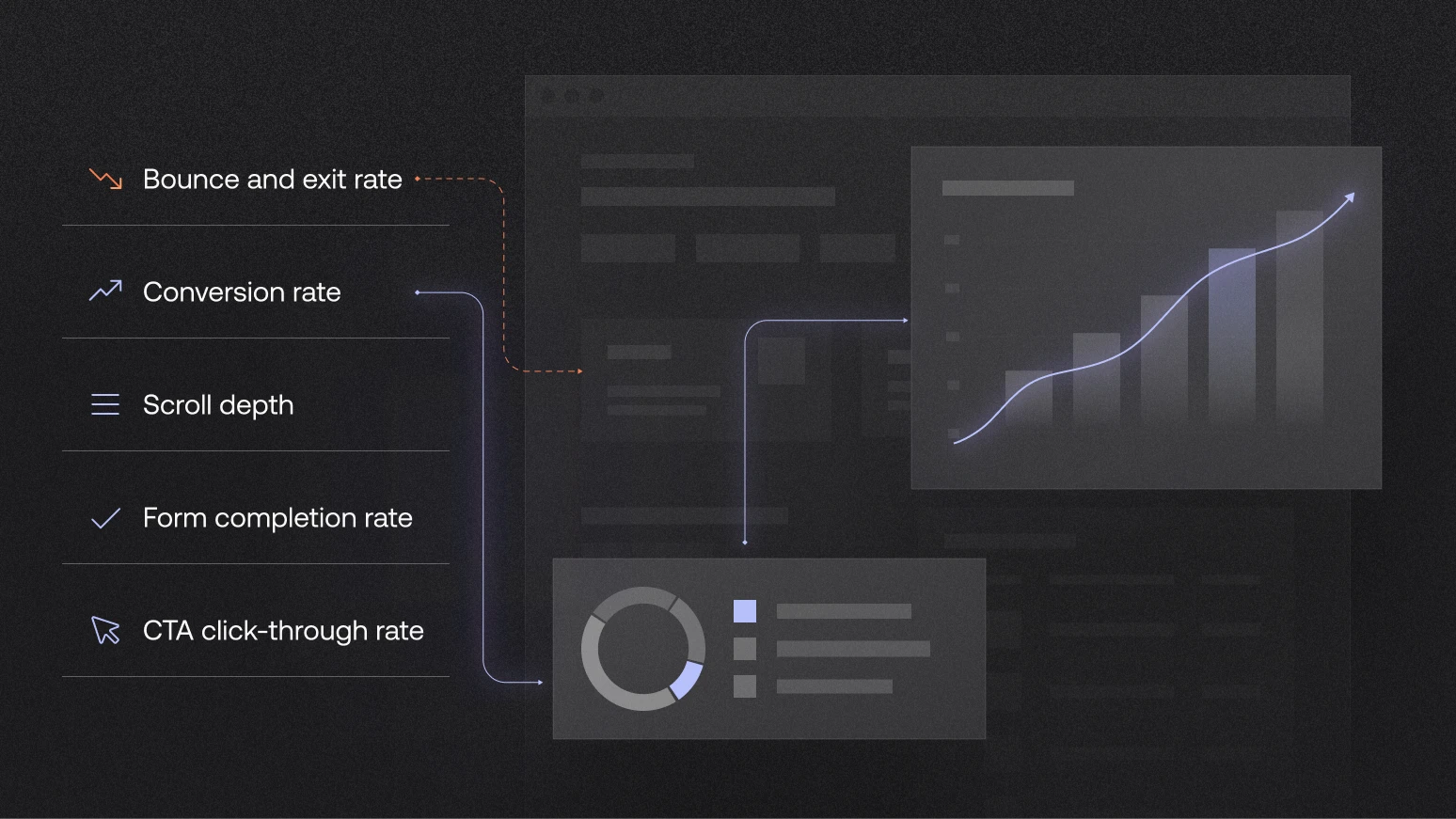
The CRO metrics to check before a SaaS website redesign are conversion rate by traffic source, bounce and exit rate, scroll depth, form completion rate, and CTA click-through rate. These metrics show where visitors come from, where they leave, what they see, and what they do before converting.
Run this check while the redesign brief is still open. Structured SaaS conversion rate optimization looks at the full customer journey from homepage to form. It keeps the discussion grounded in how buyers already use the site, not only in what the team wants to change. A page, CTA, or proof block can feel outdated internally and still help visitors take the next step.
1. Conversion rate by traffic source
Conversion rate by traffic source shows which channels bring visitors who convert. Before a SaaS website redesign, this helps the team see whether organic, paid, referral, direct, and returning visitors need different page messages, proof, or CTA paths.
This is where content strategy supports the web design. Each traffic source needs page messaging, proof, and CTA paths that match visitor intent.
How to check it:
In GA4, go to Reports → Acquisition → Traffic acquisition. Use Session source/medium or Session default channel group. Compare sessions, key events, and session key event rate. Then check where each traffic source lands, which CTAs visitors click, and where they leave.
2. Bounce rate and exit rate: where visitors leave before converting
Bounce rate and exit rate show where visitors leave before taking the next step.
- A high exit rate on a blog post can be normal because the visitor may have got the answer and left.
- A high exit rate on a pricing page needs a closer look because that page should usually help buyers continue.
A bounce or exit rate only makes sense when you read it by page type. The same metric can mean different things on different pages, so the redesign brief should reflect what each page is meant to do.
This is also why high-converting SaaS website pages do not all work the same way. Some pages explain. Some prove. Some help buyers compare. Some move visitors toward a form.
How to check it:
In GA4, go to Reports → Engagement → Pages and screens. Look at engagement rate, bounce rate, key events, and page path. For exits, use Explore and check which pages end the session most often.
3. Scroll depth and section engagement: what visitors see
Scroll depth and section engagement show whether visitors reach the parts of the page that explain and prove the product. For SaaS websites, this usually means the product explanation, use cases, social proof, case studies, pricing, demo video, and CTA section.
The useful question is: do visitors reach the sections that help them understand, trust, or act?
If visitors never reach the proof, the proof cannot support conversion. If they never reach the product explanation, they may leave without understanding what the product does. If they reach the CTA but do not click, the page may be asking for action too early. For technical SaaS products, the page order shapes how buyers understand the product, what they believe, and when they feel ready to act.
How to check it:
GA4 has a built-in scroll event, but it usually tracks when users reach around 90% of the page. For section-level insight, use GTM custom events, Hotjar, or Microsoft Clarity.
Track the sections that matter to the buying journey: product explanation reached, proof reached, pricing reached, demo video played, CTA viewed, and CTA clicked.
4. Form completion rate: where visitor intent breaks down
Form completion rate shows how many people who start a form actually submit it. This matters because the visitor clicked, started the form, and then something stopped them.
Form completion rate = form submissions ÷ form starts
If 100 people start a demo form and 28 submit it, the form completion rate is 28%
Before the redesign, check whether the form problem is really the form.
- Sometimes the page has not explained enough before asking for details
- Sometimes there is no proof near the highest-friction moment
- Sometimes the form works on desktop, but feels hard to complete on mobile
The goal is a clearer path from visitor intent to a sales conversation.
How to check it:
Track form_start and form_submit in GA4. Compare form starts, submissions, device type, page path, and lead quality in the CRM.
5. CTA click-through rate: which next steps visitors choose
CTA click-through rate shows which next steps visitors choose or ignore. This helps the team understand whether the CTA matches what the visitor is ready to do.
A visitor who skips “Book a demo” and clicks “View case studies” is not always a bad fit. They may need proof before speaking to sales. That tells the redesign team something useful: the page may need proof closer to the CTA.
A CTA is a promise, for example:
- “Book a demo” - asks for time
- “View case studies” - offers proof
- “See how it works” - offers clarity
CTA click-through rate is one of the key CRO metrics for SaaS websites. Good SaaS landing page CTAs make that next step clear before asking visitors to act.
How to check it:
Set up custom GA4 events through GTM for key CTA clicks, such as cta_demo_click, cta_case_study_click, cta_pricing_click, and cta_contact_click. Track page path, CTA text, CTA position, device, and traffic source.
What else should you check before a SaaS website redesign?
The 5 CRO metrics show where visitors convert, leave, scroll, click, and stop. Before the redesign brief is final, also check whether the website has a clear job and whether tracking is ready for the new site. A SaaS website built to drive demo requests should be measured differently from one built for product-led signup, enterprise evaluation, or content-led demand.
Website goal and conversion path
This is where B2B website structure connects with measurement. Each key page needs one job, one next step, and a way to check whether it works.
Tracking setup and behaviour data
Tracking needs to be part of the redesign scope. If the new site launches with unclear event names, broken form tracking, or no connection between submissions and CRM quality, the team will not know whether the redesign worked.
Before build starts, define the key events:
- CTA clicks
- Form starts
- Form submissions
- Pricing interactions
- Video plays
- Case study clicks
- Demo page visits
- Lead source and lead quality
GA4 gives the starting point, but it will not explain every hesitation. Heatmaps, session recordings, form analytics, and short user feedback can show what people try to click, where they scroll, and where they abandon the page.
How should CRO metrics shape the redesign brief?
CRO metrics should turn the redesign brief into a list of problems the new website needs to solve.
A weak brief says: “Make the website feel more modern.”
A useful brief says: “Pricing gets visits from returning users, but exits are high. The new pricing page needs stronger proof, clearer plan guidance, and a less demanding next step.”
That gives the design and copy team something to work with.
What the redesign brief should include
Before the brief goes anywhere, turn the CRO findings into a checklist the design, copy, and growth teams can use.
Pre-redesign CRO checklist:
- [ ] List the pages that already generate conversions.
- [ ] List the pages that assist conversions, even if they are not the final step.
- [ ] Identify which traffic sources bring visitors who convert.
- [ ] Find pages with traffic but weak next-step engagement.
- [ ] Mark the CTAs that get clicked and the CTAs visitors ignore.
- [ ] Check where visitors stop scrolling before reaching product explanation or proof.
- [ ] Review where forms lose people after they show intent.
- [ ] Identify proof sections that help reduce hesitation.
- [ ] Decide which sections should stay, move higher, be rewritten, or be tested.
- [ ] Define the events that need to be tracked on the new site.
The goal is not to protect the old website. The goal is to protect what already helps buyers move forward.
Planning a SaaS website redesign?
If your website gets traffic but does not create enough sales conversations, start with the conversion data. We can help you find what blocks buyers, protect what already converts, and turn the findings into a redesign brief your team can build from.
Start with a CRO audit before you redesign →