



























TL;DR
- Enterprise website design means designing a large website together with the components and CMS rules your editors use to build every page. A well-designed enterprise site lets each audience find what it needs and lets teams outside marketing publish without breaking the layout.
- Unlike standard websites, enterprise websites scale on two fronts. They serve different buyers for different products across regions, and dozens of editors publish to one shared set of templates.
- To create an enterprise website, start with the design system and a navigation built around how each audience buys. Give every section of the CMS an owner, and build page speed and accessibility into the components so every new page inherits them.
- Measure an enterprise website by the pipeline it sources and by how fast your team can publish a new page, and track both every month after launch.
Enterprise website design has to plan for the years after launch as much as for launch day.
Once the site goes live, teams across the company start adding pages to templates they didn't design, often for audiences the original brief never mentioned.
That means every design decision serves two people: the visitor looking for an answer, and the editor building the next page.
What Is Enterprise Website Design?
Enterprise website design is the practice of planning and building a website for a large organization, where hundreds of pages serve several audiences, and many teams publish to the same domain.
Instead of designing pages one by one, you design the parts your editors assemble pages from: reusable components, plus content types in your content management system (CMS). The same plan sets who can publish where.
All the basics of a high-performing B2B website still apply. Enterprise web design just makes them hold up across a few hundred pages and a few dozen editors.
How Enterprise Website Design Differs From a Standard Company Website
Editors and governance change the work most. Once several departments publish to one site, you're designing the parts they build pages from, plus the rules for using them.
The problem is, parts designed for one team break under many. A hero that fits one headline length breaks the first time product marketing writes a longer one. A menu built for one buyer leaves your security reviewer hunting for the compliance page.
If you're moving upmarket into larger accounts, your site is heading toward the enterprise column.
Core Principles of Enterprise Website Design
These six principles keep an enterprise site consistent as more teams publish to it, whichever platform you build on.
1. Organize the Site Around How Each Audience Buys
One enterprise domain has to answer buyers, existing customers, partners, and job candidates. A menu that mirrors your org chart makes each of them learn your internal structure before they find an answer.
Lead with use cases and industries, the way buyers describe their problem, and put product detail one level down. Use-case and feature pages each do a different job in that structure, so decide which one leads before anyone sketches a menu.
Then run a tree test: give users a text-only version of your menu and a task, and watch whether each audience finds the right page from the labels alone.
2. Build a Design System Before You Design Pages
A design system gives every team the same approved building blocks, so a regional landing page and a product launch page look like the same company and run on the same code.
Start with the blocks your teams request most, such as heroes, comparison tables, proof sections, and forms. Document when to use each one and which variants exist, so editors pick from options instead of briefing a designer.
Build the color and type tokens straight from your brand guidelines, and a brand update reaches every page at once.
3. Give Every Content Type a Model and Every Section an Owner
When every department can publish, consistency depends on the CMS more than on the design files. Store content as structured fields, and a case study can feed its own page and the matching industry page from one entry, with nobody copying text between them.
Pair the content model with publishing roles. Regional editors publish within their own section, while legal reviews only the templates that carry regulated claims.
4. Plan Integrations and Security in Discovery
On mobile, the 1,000 most popular sites load a median of 106 third-party requests, against 79 across all sites. Plus, most third parties pull in at least one more of their own. Each one is code your team didn't write, and any of them can slow a template or break a form.
List every system the site connects to before you choose a platform, with an owner and a fallback for each. Form routing into your customer relationship management (CRM) platform and consent rules for tracking change how templates behave, so they belong in the first wireframes. The same CRM connection can later power personalized landing pages.
Also, load heavy embeds such as chat or video only when a visitor interacts with them. And publish your security certifications where procurement can find them, because they'll look before they sign.
5. Hold Every Template to Core Web Vitals
Traffic doesn't buy a pass on Google's Core Web Vitals. In the 2025 Web Almanac, 51% of the top 1,000 sites pass on mobile, but the rate falls to 37% across the top 100,000, below the 48% average for the whole web.
The Almanac ties that dip to heavier features and third-party scripts on sites that give performance less sustained attention.
For enterprise websites, you win performance back with templates. In the same Almanac data, inner pages, which tend to follow templates, pass more often than home pages (56% vs. 45% on mobile).
Give each template a performance budget, with a page weight cap and a Largest Contentful Paint (LCP) under 2.5 seconds, and block pages that break it from publishing.
Mobile is where pass rates run lowest, so mobile-first design belongs in every template brief, along with a check for the design mistakes that slow B2B sites down.
6. Build Accessibility Into the Components
WebAIM's 2026 scan of the top million home pages found detectable WCAG failures on 95.9% of them. These six error types make up 96% of everything found:
- low-contrast text
- missing alt text
- unlabeled form fields
- empty links
- empty buttons
- missing page language.
Most of those failures live in components. Fix contrast in your color tokens and labels in your form component, and every page built from them inherits the fix. Aim for WCAG 2.2 level AA, the usual bar for commercial sites, and give your call-to-action buttons accessible names by default.
Add automated accessibility checks to publishing, and new pages can’t bring the errors back.
Enterprise Website Design Examples
Each example below takes one problem enterprise sites run into and shows how a live site handles it, so you can borrow the approach for your own build. A few are sites we've built at GRAFIT, so for those we can share the numbers, too.
1. Upwork: Two Audiences Split at the First Click

Upwork serves two audiences with opposite goals: companies hiring and freelancers looking for work. The homepage splits them straight away with "I want to hire" and "I want to work," and the menu also keeps the split with "Hire talent" and "Find work."
Behind that split, skill pages such as /hire/web-designers/ and job pages like /freelance-jobs/web-design/ run on shared templates, each carrying ratings and typical hourly rates as proof. Large accounts get their own route, since the Enterprise link leads to Lifted, the enterprise business Upwork launched in 2025.
If your site serves two audiences who want opposite things, borrow Upwork's move: split them at the first click, and let shared templates carry the pages underneath.
2. Quarterhill: Three Acquired Websites Merged Into One

Quarterhill grew through acquisitions and ended up with three separate websites and 120 unique subpages between them. Buyers had to work out what the combined company offered.
We merged the three into one site in 8 weeks. The main menu now groups everything Quarterhill sells into three product lines: Tolling, ITS (intelligent transportation systems), and Multi Modal.
The acquired brands, IRD and ETC, show up once, in a line about uniting under the Quarterhill name, and nowhere in the navigation. Investors get their own menu beside Company.
Donna Bergan, VP of Marketing at Quarterhill, summed up the result: "Grafit was our superpower when merging three websites into one, positioning us as a market leader and tech innovator. Their designs accomplished exactly that. We love our new look."
Start a post-acquisition merge where Quarterhill did: with what you sell. Build the menu around your product lines, and give the acquisition story one line instead of a place in the navigation.
3. Cloudflare: Security Answers Built Into the Site
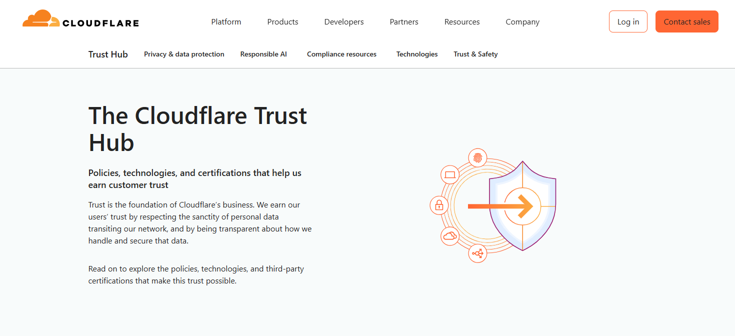
Cloudflare sells to everyone from solo developers to enterprise security teams. Large deals don't close until the buyer's security team signs off, so Cloudflare publishes the answers.
Its Trust Hub, linked from the Company menu and the footer, lists certifications including ISO 27001, ISO 27701, PCI DSS and SOC 2 Type II. A procurement reviewer can check compliance without emailing sales for a document pack.
You don't need Cloudflare's size to copy this. If security reviews slow your deals, a trust page linked from your menu and footer gives reviewers their answers before they have to ask.
4. Callstack: A Component System Marketing Runs on Its Own
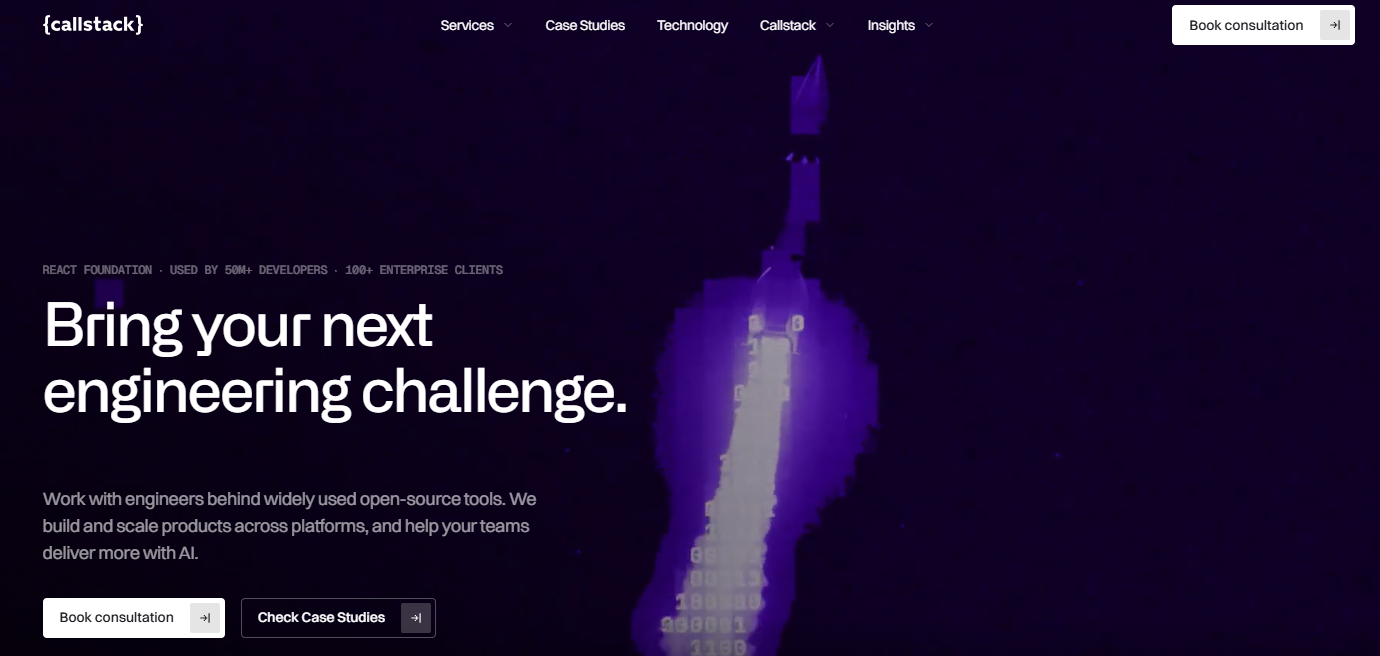
Callstack is a mid-market React Native consultancy with an enterprise-scale content load: 1,306 CMS items across 23 collections. We organized that content and rebuilt the site on a documented library of 208 reusable components, so marketing builds pages from approved parts.
Performance came with the system. Lighthouse scores rose from 34 to 90, and load time fell from 4.2 to 1.1 seconds. Conversion rate climbed 176%.
Mike Grabowski, Founder & CTO at Callstack, put the payoff in one line: "The component-based system and clear documentation mean our marketing team can spin up new pages in hours."
When your content outgrows your site, sort the CMS and build the component library in the same project, as Callstack did. Your marketing team gets approved parts to publish with, and the speed comes with the system.
5. Maersk: Customer Tools on the Marketing Site
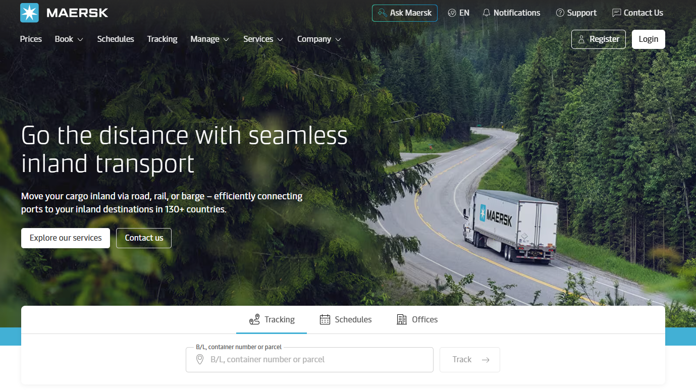
Maersk designed its homepage for visitors with a job to do. Tracking by bill of lading or container number sits at the top, next to a route search, while services and industry pages sit further down.
Registered customers book shipments on the same domain, so the tools and the marketing pages share one navigation and one visual style. A customer tracking a container and a prospect reading about a new service see the same company.
Look at why existing customers come back to your site. If it's to get a job done, like tracking a container, give that tool the top of the page. Then map the systems behind it before design starts, so it works on launch day.
6. IC Project: From WordPress to a Component System
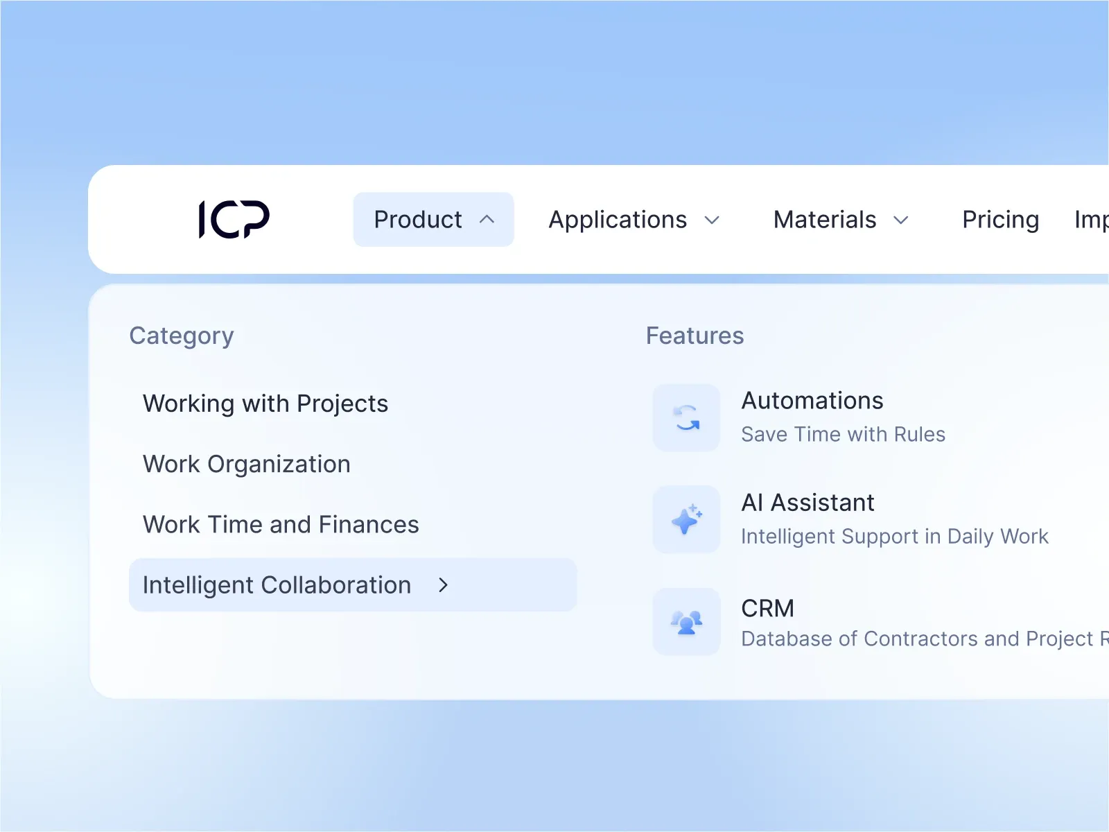
IC Project sells a mature project management platform against ClickUp, Asana, Trello, and Monday.com. Its WordPress site showed a fraction of the product, and every comparison or industry page took weeks and a developer.
We rebuilt the menu around how buyers shop: by capability or industry, or against the tool they use today. Every page comes from a library of 80+ components, from heroes and pricing to comparisons and FAQs. The templates carry proof too, so each new page launches with customer logos and results.
We shipped 50+ pages in one release, in Polish and English, with no downtime. Six months after launch, the same traffic brought in 36% more demo requests and 34% more returning users.
Comparison pages earn a spot in your menu when buyers weigh you against a named rival. For IC Project, a dedicated template turned comparison pages from weeks of developer work into something marketing ships on its own.
Consolidating several sites, or rebuilding one only developers can update?
Talk to our team about turning it into one system.
The Enterprise Website Design Process, Step by Step
Enterprise website projects run in six phases. Each one settles decisions the next depends on, so skipping a phase usually means redoing it after launch.
1. Run Discovery With Every Team That Will Publish
Agree on the site's goals and who owns each part of it before anyone opens a design file. Interview every team that will publish to the site, because each one brings requirements marketing can't see from the inside.
Record a baseline in the same phase. Capture the conversion rate optimization (CRO) metrics that matter before a redesign while the old site is still live, so you can show what the new one changed.
2. Audit Your Content and Information Architecture
Inventory every page before the design work starts. Pages with traffic or backlinks either stay or fold into a stronger page, and pages with neither can go, which shrinks both the build and the migration.
Map the pages you keep onto the audience paths from discovery, and give each one a content refresh before it moves.
3. Design the System and Test It With Real Content
Design the component library and the key templates together, then fill them with real content from the audit. The longest product name and the messiest comparison table will break layouts that placeholder text never touches.
Fix each break in the component, so every page that uses it gets the fix. Also, review the templates with the teams from discovery, since they're the ones who'll build pages with them.
4. Build the Content Model and Integrations
Set up the content model in the CMS before you build templates, so every template pulls from structured fields from the first page. The order is the same for Webflow development, Framer, or a headless build.
With the model in place, connect the systems from your discovery list and test each one with real form submissions.
5. Migrate, Test and Launch
Map every old URL to its closest new page, and test the redirects on staging before launch. Send retired pages to the nearest relevant page instead of the homepage, so visitors and search engines land somewhere useful.
Have each section's owner check their pages before launch, covering links, forms, tracking, and alt text. At enterprise scale, website migration is a project of its own, and our guide to redesigning without losing SEO rankings covers the search side.
📚 Further Reading: Website migration checklist: what to avoid when moving your B2B website.
6. Keep Improving the Site After Launch
Treat launch as the start of the site's working life. Set a monthly review with the section owners, and compare what shipped against what it did for pipeline.
At GRAFIT, this is where we recommend an ongoing partnership. After launch, we can stay embedded with your growth team, shipping landing pages for new campaigns and running CRO tests on the pages that carry pipeline. The site improves month by month, so there’s far less pressure to rebuild it every few years.
You can also start with the website project alone and add that support later, based on what your team needs.


How to Measure Enterprise Website Success
Measure the site against pipeline, then add the operating metrics that show whether it can keep growing.
A quarterly crawl for orphaned pages, plus a review date on every CMS item
Pipeline and conversion show whether the site works today. Publishing speed and content health show whether it'll still work in two years, because a site that takes weeks to change drifts toward another rebuild.
When conversion by path lags, start with these CRO best practices for SaaS or bring in a CRO partner.
Common Enterprise Website Design Mistakes to Avoid
Here are four mistakes that make an enterprise site harder to run after launch, with the fix for each.
1. Designing Page by Page Instead of as a System
Every page nobody mocked up becomes a new design job, and the site drifts with each one.
The pattern starts at sign-off. Stakeholders approve a set of page mockups, while the components behind them get far less scrutiny. The first time a regional team needs a page outside that set, a designer invents one.
The fix: put the component library on the approval agenda, next to the page designs.
2. Migrating Everything Without a Content Audit
Old pages carry old problems into the new design.
Teams under launch pressure often move every page across and plan to clean up later. The navigation then bends around legacy pages nobody reads, and the redirect map grows with every URL that should have retired.
The fix: decide each page's fate before you write the migration plan.
3. Treating Launch as the Finish Line
Sites get heavier every year unless someone owns performance after launch.
In the Almanac's 2025 page weight data, the median mobile home page grew 8.4% in a year, to 2.6 MB. Every new tag and campaign block adds weight, and without an owner, nobody takes any out.
The fix: make one person accountable for page weight and Core Web Vitals, and check both whenever a new template or tool goes live. If nobody in-house has the time, website maintenance support can cover it.
4. Leaving Marketing Dependent on Developers
When every change needs a ticket, campaigns either wait or go around the site.
A developer queue turns a one-line headline change into a wait of days. Marketing teams on a deadline then build pages in outside tools, and the brand splits across domains.
The fix: let developers own the system, and marketers own the pages, within the publishing roles you set in the CMS.
Further Reading: Our piece on why marketers are choosing Webflow shows how that split works day to day.
In-House Team or Enterprise Web Design Partner?
The answer depends on what your team already has, and what the next 12 months ask of the site.
Your in-house team is likely enough when:
- Marketing already builds pages from a documented design system
- Designers and developers work on the site full time, with room in their roadmap
- The work ahead is steady improvement, with no rebrand or merger planned
An outside partner helps when:
- You're consolidating several sites after acquisitions
- A rebrand has to land across the whole site on one date
- There's no design system yet, and building one would stall everything else
- A funding round or product launch sets a date you can't move
You can also combine the two: your team owns the roadmap, and a partner embedded in your growth team helps ship it, month after month.
We're one option for that kind of partnership. To compare others, see our list of the best enterprise web design agencies.
Build an Enterprise Website That Keeps Improving With GRAFIT
An enterprise site stays useful when your teams can build with it, and someone owns what ships next.
You can work with the GRAFIT team as your embedded growth design partner: one team for web design and development, landing pages, ad creative, and ongoing CRO, measured on pipeline. Or, start with a website project and add support as your needs grow.